 March 31st, 2020
  Prerana Kasar
 Bootstrap List Group
Bootstrap provides a better look and feels to the list of elements in a specific manner. The class .list-group is used to create list group.
Example: 1 Bootstrap List Group Example
<!DOCTYPE html>
<html>
<head>
    <title>Bootstrap List Group Example</title>
    <!-- link the bootstrap online or through CDN -->
    <link rel="stylesheet" href="https://maxcdn.bootstrapcdn.com/bootstrap/3.3.7/css/bootstrap.min.css" integrity="sha384-BVYiiSIFeK1dGmJRAkycuHAHRg32OmUcww7on3RYdg4Va+PmSTsz/K68vbdEjh4u" crossorigin="anonymous">
    <script src="https://ajax.googleapis.com/ajax/libs/jquery/3.4.1/jquery.min.js"></script>
 	<script src="https://maxcdn.bootstrapcdn.com/bootstrap/3.4.1/js/bootstrap.min.js">
  	</script>

</head>
<body>
	<div class="container">
		<h2>List Group Example</h2>
		<ul class="list-group">
			<li class="list-group-item">Milk</li>
			<li class="list-group-item">Hot Coffee</li>
			<li class="list-group-item">Tea</li>
			<li class="list-group-item">Cold Coffee</li>
		</ul>
	</div>
</body>
</html>
The above code used two classes .list-group and .list-group-item to <ul> and <li> respectively. And the below image is the resultant of list on the browser.

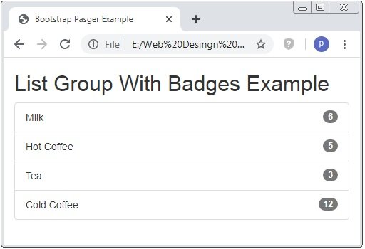
List Group With Badges
To create the list group with badges we use class .badge to <span> tag.
Example: 2 Bootstrap List Group With Badges Example
<!DOCTYPE html>
<html>
<head>
    <title>Bootstrap List Group Example</title>
    <!-- link the bootstrap online or through CDN -->
    <link rel="stylesheet" href="https://maxcdn.bootstrapcdn.com/bootstrap/3.3.7/css/bootstrap.min.css" integrity="sha384-BVYiiSIFeK1dGmJRAkycuHAHRg32OmUcww7on3RYdg4Va+PmSTsz/K68vbdEjh4u" crossorigin="anonymous">
    <script src="https://ajax.googleapis.com/ajax/libs/jquery/3.4.1/jquery.min.js"></script>
 	<script src="https://maxcdn.bootstrapcdn.com/bootstrap/3.4.1/js/bootstrap.min.js">
  	</script>

</head>
<body>
	<div class="container">
		<h2>List Group With Badges Example</h2>
		<ul class="list-group">
			<li class="list-group-item">Milk<span class="badge">6</span></li>
			<li class="list-group-item">Hot Coffee<span class="badge">5</span></li>
			<li class="list-group-item">Tea<span class="badge">3</span></li>
			<li class="list-group-item">Cold Coffee<span class="badge">12</span></li>
		</ul>
	</div>
</body>
</html>
The above code is used to create list group with badges.
List Group With Linked Items
To create hyperlinked list group than you have to use class .list-group to <div> tag instead of <ul> tag and .list-group-item to <a> tag instead of the <li> tag.
Example: 3 Bootstrap List Group With Linked Items Example
<!DOCTYPE html>
<html>
<head>
    <title>Bootstrap List Group Example</title>
    <!-- link the bootstrap online or through CDN -->
    <link rel="stylesheet" href="https://maxcdn.bootstrapcdn.com/bootstrap/3.3.7/css/bootstrap.min.css" integrity="sha384-BVYiiSIFeK1dGmJRAkycuHAHRg32OmUcww7on3RYdg4Va+PmSTsz/K68vbdEjh4u" crossorigin="anonymous">
    <script src="https://ajax.googleapis.com/ajax/libs/jquery/3.4.1/jquery.min.js"></script>
 	<script src="https://maxcdn.bootstrapcdn.com/bootstrap/3.4.1/js/bootstrap.min.js">
  	</script>

</head>
<body>
	<div class="container">
		<h2>List Group With Linked Items Example</h2>
		<div class="list-group">
			<a class="list-group-item">Milk</a>
			<a class="list-group-item">Hot Coffee</a>
			<a class="list-group-item">Tea</a>
			<a class="list-group-item">Cold Coffee</a>
		</div>
	</div>
</body>
</html>
The above code is used to create list group with linked items using classes with <div> and <a> tag instead of <ul> and <li> tags. And it have one additional feature of hover at light grey color.

Active List Group
To show that the opened or activated linked items .active class is used with the <a> tag.
Example: 4 Bootstrap Active List Group Example
<!DOCTYPE html>
<html>
<head>
    <title>Bootstrap List Group Example</title>
    <!-- link the bootstrap online or through CDN -->
    <link rel="stylesheet" href="https://maxcdn.bootstrapcdn.com/bootstrap/3.3.7/css/bootstrap.min.css" integrity="sha384-BVYiiSIFeK1dGmJRAkycuHAHRg32OmUcww7on3RYdg4Va+PmSTsz/K68vbdEjh4u" crossorigin="anonymous">
    <script src="https://ajax.googleapis.com/ajax/libs/jquery/3.4.1/jquery.min.js"></script>
 	<script src="https://maxcdn.bootstrapcdn.com/bootstrap/3.4.1/js/bootstrap.min.js">
  	</script>

</head>
<body>
	<div class="container">
		<h2>Active List Group Example</h2>
		<div class="list-group">
			<a class="list-group-item active">Milk</a>
			<a class="list-group-item">Hot Coffee</a>
			<a class="list-group-item">Tea</a>
			<a class="list-group-item">Cold Coffee</a>
		</div>
	</div>
</body>
</html>
The above code is used to create list group with linked items using classes with <div> and <a> tag. The class .active is used with <a> tag.

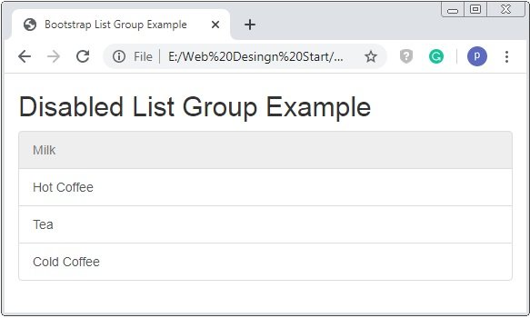
Disabled List Group Item
With the class .disabled the item of the list group is disabled or not clickable. And background-color of that list item is of grey color.
Example: 5 Bootstrap Disabled List Group Item Example
<!DOCTYPE html>
<html>
<head>
    <title>Bootstrap List Group Example</title>
    <!-- link the bootstrap online or through CDN -->
    <link rel="stylesheet" href="https://maxcdn.bootstrapcdn.com/bootstrap/3.3.7/css/bootstrap.min.css" integrity="sha384-BVYiiSIFeK1dGmJRAkycuHAHRg32OmUcww7on3RYdg4Va+PmSTsz/K68vbdEjh4u" crossorigin="anonymous">
    <script src="https://ajax.googleapis.com/ajax/libs/jquery/3.4.1/jquery.min.js"></script>
 	<script src="https://maxcdn.bootstrapcdn.com/bootstrap/3.4.1/js/bootstrap.min.js">
  	</script>

</head>
<body>
	<div class="container">
		<h2>Disabled List Group Example</h2>
		<div class="list-group">
			<a class="list-group-item disabled">Milk</a>
			<a class="list-group-item">Hot Coffee</a>
			<a class="list-group-item">Tea</a>
			<a class="list-group-item">Cold Coffee</a>
		</div>
	</div>
</body>
</html>
The above code is used to create disabled list group item. When you put hover on the disable list item is not clickable and show the red cross circle instead of hand cursor.
List Group with Contextual Classes
Using of the contextual classes list group items are more enhanced its look and feel. The contextual classes are .list-group-item-success, .list-group-item-info, .list-group-item-danger and .list-group-item-warning.
Example: 6 Bootstrap Contextual Class List Group Item Example
<!DOCTYPE html>
<html>
<head>
    <title>Bootstrap List Group Example</title>
    <!-- link the bootstrap online or through CDN -->
    <link rel="stylesheet" href="https://maxcdn.bootstrapcdn.com/bootstrap/3.3.7/css/bootstrap.min.css" integrity="sha384-BVYiiSIFeK1dGmJRAkycuHAHRg32OmUcww7on3RYdg4Va+PmSTsz/K68vbdEjh4u" crossorigin="anonymous">
    <script src="https://ajax.googleapis.com/ajax/libs/jquery/3.4.1/jquery.min.js"></script>
 	<script src="https://maxcdn.bootstrapcdn.com/bootstrap/3.4.1/js/bootstrap.min.js">
  	</script>

</head>
<body>
	<div class="container">
		<h2>Contextual Class List Group Example</h2>
		<div class="list-group">
			<a class="list-group-item list-group-item-success">Milk</a>
			<a class="list-group-item list-group-item-info">Hot Coffee</a>
			<a class="list-group-item list-group-item-danger">Tea</a>
			<a class="list-group-item list-group-item-warning">Cold Coffee</a>
		</div>
	</div>
</body>
</html>
The above code have different contextual classes applied to the <a> tag. Through this the diffrent background-color of list group items.

 Posted in
  Tags:
Tags: 


