 April 3rd, 2020
  Prerana Kasar
 Bootstrap Collapse
Collapse means that the content will hide and shown on the click. Collapse is used where a large amount of content will be shown.
The class .collapse is used to create the collapsible content
Example: 1 Bootstrap Collapse Example
<!DOCTYPE html>
<html>
<head>
<title>Bootstrap Collapse Example</title>
<!-- link the bootstrap online or through CDN -->
<link rel="stylesheet" href="https://maxcdn.bootstrapcdn.com/bootstrap/3.3.7/css/bootstrap.min.css" integrity="sha384-BVYiiSIFeK1dGmJRAkycuHAHRg32OmUcww7on3RYdg4Va+PmSTsz/K68vbdEjh4u" crossorigin="anonymous">
<script src="https://ajax.googleapis.com/ajax/libs/jquery/3.4.1/jquery.min.js"></script>
<script src="https://maxcdn.bootstrapcdn.com/bootstrap/3.4.1/js/bootstrap.min.js">
</script>
</head>
<body>
<div class="container">
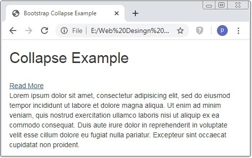
<h2>Collapse Example</h2><br />
<a href="#" data-target="#demo" data-toggle="collapse">Read More</a>
<div class="collapse" id="demo">
<p>Lorem ipsum dolor sit amet, consectetur adipisicing elit, sed do eiusmod tempor incididunt ut labore et dolore magna aliqua. Ut enim ad minim veniam, quis nostrud exercitation ullamco laboris nisi ut aliquip ex ea commodo consequat. Duis aute irure dolor in reprehenderit in voluptate velit esse cillum dolore eu fugiat nulla pariatur. Excepteur sint occaecat cupidatat non proident.</p>
</div>
</div>
</body>
</html>
On the above code, we use a link <a> tag. When you click on that link than the hidden paragraph will be displayed on the window of the browser.
The class .collapse is used to define the collpasible content and data-toggle=”collapse” attribute is used to hide/show the content data-target=”#id” attribute define which content is collapsible
Caution: By defualt collapse content is hidden and class .in is used to show collapsible content.
.in class
Example: 2 Bootstrap Collapse In Example
<!DOCTYPE html>
<html>
<head>
    <title>Bootstrap Collapse Example</title>
    <!-- link the bootstrap online or through CDN -->
    <link rel="stylesheet" href="https://maxcdn.bootstrapcdn.com/bootstrap/3.3.7/css/bootstrap.min.css" integrity="sha384-BVYiiSIFeK1dGmJRAkycuHAHRg32OmUcww7on3RYdg4Va+PmSTsz/K68vbdEjh4u" crossorigin="anonymous">
    <script src="https://ajax.googleapis.com/ajax/libs/jquery/3.4.1/jquery.min.js"></script>
 	<script src="https://maxcdn.bootstrapcdn.com/bootstrap/3.4.1/js/bootstrap.min.js">
  	</script>

</head>
<body>
	<div class="container">
		<h2>Collapse Example</h2><br />
		<a href="#" data-target="#demo" data-toggle="collapse">Read More</a>
		<div class="collapse in" id="demo">
			<p>Lorem ipsum dolor sit amet, consectetur adipisicing elit, sed do eiusmod	tempor incididunt ut labore et dolore magna aliqua. Ut enim ad minim veniam, quis nostrud exercitation ullamco laboris nisi ut aliquip ex ea commodo consequat. Duis aute irure dolor in reprehenderit in voluptate velit esse cillum dolore eu fugiat nulla pariatur. Excepteur sint occaecat cupidatat non proident.</p>
		</div>
	</div>
</body>
</html>
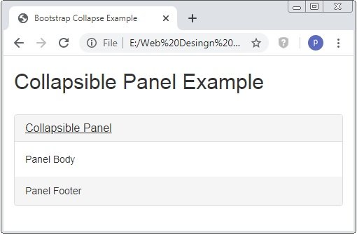
Collapsible Panel
Bootstrap provides the collapsible panel using the class .panel-collapse and .collapse.
Example: 3 Bootstrap Collapsible Panel Example
<!DOCTYPE html>
<html>
<head>
    <title>Bootstrap Collapse Example</title>
    <!-- link the bootstrap online or through CDN -->
    <link rel="stylesheet" href="https://maxcdn.bootstrapcdn.com/bootstrap/3.3.7/css/bootstrap.min.css" integrity="sha384-BVYiiSIFeK1dGmJRAkycuHAHRg32OmUcww7on3RYdg4Va+PmSTsz/K68vbdEjh4u" crossorigin="anonymous">
    <script src="https://ajax.googleapis.com/ajax/libs/jquery/3.4.1/jquery.min.js"></script>
 	<script src="https://maxcdn.bootstrapcdn.com/bootstrap/3.4.1/js/bootstrap.min.js">
  	</script>

</head>
<body>
	<div class="container">
		<h2>Collapsible Panel Example</h2><br />
		<div class="panel-group">
			<div class="panel panel-default">
				<div class="panel-heading">
					<h4 class="panel-title">
						<a href="#collapse1" data-toggle="collapse">Collapsible Panel</a>
					</h4>
				</div>
				<div class="panel-collapse collapse" id="collapse1">
					<div class="panel-body">Panel Body</div>
					<div class="panel-footer">Panel Footer</div>
				</div>
			</div>
		</div>
	</div>
</body>
</html>
On the above code, we use the class .panel-collapse and .collapse are applied to the panel to create the collapsible panel.
Collapsible List Group
To create the collapsible list group we have to use the collpasible panel.
Example: 4 Bootstrap Collapsible List Group Example
<!DOCTYPE html>
<html>
<head>
    <title>Bootstrap Collapse Example</title>
    <!-- link the bootstrap online or through CDN -->
    <link rel="stylesheet" href="https://maxcdn.bootstrapcdn.com/bootstrap/3.3.7/css/bootstrap.min.css" integrity="sha384-BVYiiSIFeK1dGmJRAkycuHAHRg32OmUcww7on3RYdg4Va+PmSTsz/K68vbdEjh4u" crossorigin="anonymous">
    <script src="https://ajax.googleapis.com/ajax/libs/jquery/3.4.1/jquery.min.js"></script>
 	<script src="https://maxcdn.bootstrapcdn.com/bootstrap/3.4.1/js/bootstrap.min.js">
  	</script>

</head>
<body>
	<div class="container">
		<h2>Collapsible List Group Example</h2><br />
		<div class="panel-group">
			<div class="panel panel-default">
				<div class="panel-heading">
					<h4 class="panel-title">
						<a href="#collapse1" data-toggle="collapse">Collapsible List Group</a>
					</h4>
				</div>
				<div class="panel-collapse collapse" id="collapse1">
					<ul class="list-group">
						<li class="list-group-item">List Item 1</li>
						<li class="list-group-item">List Item 2</li>
						<li class="list-group-item">List Item 3</li>
					</ul>
					<div class="panel-footer">Footer</div>
				</div>
			</div>
		</div>
	</div>
</body>
</html>
On the above code, we use the class .panel-collapse and .collapse are applied to the panel to create the collapsible list group with <ul> tag.

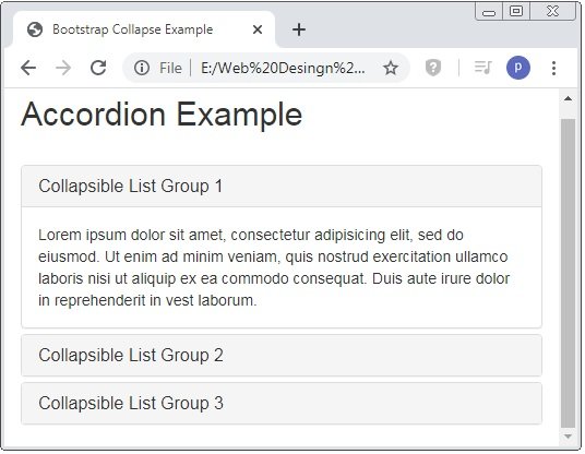
Accordion
Accordion is not any other element it just a group of the panel-groups. Accordion is used where the large content will showed.
Example: 5 Bootstrap Accordion Example
<!DOCTYPE html>
<html>
<head>
    <title>Bootstrap Collapse Example</title>
    <!-- link the bootstrap online or through CDN -->
    <link rel="stylesheet" href="https://maxcdn.bootstrapcdn.com/bootstrap/3.3.7/css/bootstrap.min.css" integrity="sha384-BVYiiSIFeK1dGmJRAkycuHAHRg32OmUcww7on3RYdg4Va+PmSTsz/K68vbdEjh4u" crossorigin="anonymous">
    <script src="https://ajax.googleapis.com/ajax/libs/jquery/3.4.1/jquery.min.js"></script>
 	<script src="https://maxcdn.bootstrapcdn.com/bootstrap/3.4.1/js/bootstrap.min.js">
  	</script>

</head>
<body>
	<div class="container">
		<h2>Accordion Example</h2><br />
		<div class="panel-group" id="accordion">
			<div class="panel panel-default">
				<div class="panel-heading">
					<h4 class="panel-title">
						<a href="#collapse1" data-toggle="collapse" data-parent="#accordion">Collapsible List Group 1</a>
					</h4>
				</div>
				<div class="panel-collapse collapse in" id="collapse1">
					<div class="panel-body">Lorem ipsum dolor sit amet, consectetur adipisicing elit, sed do eiusmod. Ut enim ad minim veniam,
					quis nostrud exercitation ullamco laboris nisi ut aliquip ex ea commodo	consequat. Duis aute irure dolor in reprehenderit in vest laborum.</div>
				</div>
			</div>
			<div class="panel panel-default">
				<div class="panel-heading">
					<h4 class="panel-title">
						<a href="#collapse2" data-toggle="collapse" data-parent="#accordion">Collapsible List Group 2</a>
					</h4>
				</div>
				<div class="panel-collapse collapse" id="collapse2">
					<div class="panel-body">Lorem ipsum dolor sit amet, consectetur adipisicing elit, sed do eiusmod. Ut enim ad minim veniam,
					quis nostrud exercitation ullamco laboris nisi ut aliquip ex ea commodo	consequat. Duis aute irure dolor in reprehenderit in vest laborum.</div>
				</div>
			</div>
			<div class="panel panel-default">
				<div class="panel-heading">
					<h4 class="panel-title">
						<a href="#collapse3" data-toggle="collapse" data-parent="#accordion">Collapsible List Group 3</a>
					</h4>
				</div>
				<div class="panel-collapse collapse" id="collapse3">
					<div class="panel-body">Lorem ipsum dolor sit amet, consectetur adipisicing elit, sed do eiusmod. Ut enim ad minim veniam,
					quis nostrud exercitation ullamco laboris nisi ut aliquip ex ea commodo	consequat. Duis aute irure dolor in reprehenderit in vest laborum.</div>
				</div>
			</div>
		</div>
	</div>
</body>
</html>
On the above code, we use the class .panel-collapse and .collapse are applied to the panel to create the accordion.
 Posted in
  Tags:
Tags: 


