 April 10th, 2020
  Prerana Kasar
 Bootstrap Navigation Bars
A navigation bar is a collection of navigated links. Bootstrap provides a different style of the navigation bar.
The navigation bar is create with the class .navbar navbar-default to <nav> tag.
Example: 1 Navigation Bar Example
<!DOCTYPE html>
<html>
<head>
    <title>Bootstrap Navbar Example</title>
    <!-- link the bootstrap online or through CDN -->
    <link rel="stylesheet" href="https://maxcdn.bootstrapcdn.com/bootstrap/3.3.7/css/bootstrap.min.css" integrity="sha384-BVYiiSIFeK1dGmJRAkycuHAHRg32OmUcww7on3RYdg4Va+PmSTsz/K68vbdEjh4u" crossorigin="anonymous">
    <script src="https://ajax.googleapis.com/ajax/libs/jquery/3.4.1/jquery.min.js"></script>
 	<script src="https://maxcdn.bootstrapcdn.com/bootstrap/3.4.1/js/bootstrap.min.js">
  	</script>

</head>
<body>
	<div class="container">
		<h2>Navigation Bar Example</h2><br />
		<nav class="navbar navbar-default">
			<div class="container-fluid">
				<div class="navbar-header">
					<a href="#" class="navbar-brand">Website Name</a>
				</div>
				<ul class="nav navbar-nav">
					<li class="active" ><a href="#home">Home</a></li>
					<li><a href="#about">About</a></li>
					<li><a href="#contact">Contact</a></li>
					<li><a href="#service">Service</a></li>
					<li><a href="#faq">FAQ's</a></li>
				</ul>
			</div>
		</nav>
	</div>
</body>
</html>
On the above code the class .nav and .nav-default to <nav> tag. To create the elements of the navbar using the class .nav navbar-nav to <ul> tag.

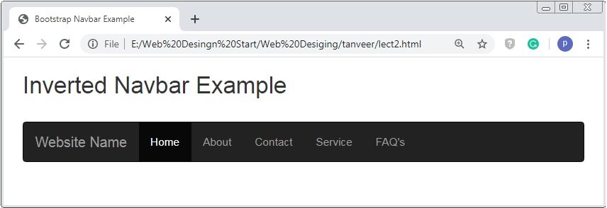
Inverted Navigation Bar
The default navbar is a light grey color. If you want a dark black color navigation bar instead of the default navigation bar. The class .navbar-inverse instead of navbar-default.
Example: 2 Inverted Navigation Bar Example
<!DOCTYPE html>
<html>
<head>
    <title>Bootstrap Navbar Example</title>
    <!-- link the bootstrap online or through CDN -->
    <link rel="stylesheet" href="https://maxcdn.bootstrapcdn.com/bootstrap/3.3.7/css/bootstrap.min.css" integrity="sha384-BVYiiSIFeK1dGmJRAkycuHAHRg32OmUcww7on3RYdg4Va+PmSTsz/K68vbdEjh4u" crossorigin="anonymous">
    <script src="https://ajax.googleapis.com/ajax/libs/jquery/3.4.1/jquery.min.js"></script>
 	<script src="https://maxcdn.bootstrapcdn.com/bootstrap/3.4.1/js/bootstrap.min.js">
  	</script>

</head>
<body>
	<div class="container">
		<h2>Inverted Navbar Example</h2><br />
		<nav class="navbar navbar-inverse">
			<div class="container-fluid">
				<div class="navbar-header">
					<a href="#" class="navbar-brand">Website Name</a>
				</div>
				<ul class="nav navbar-nav">
					<li class="active" ><a href="#home">Home</a></li>
					<li><a href="#about">About</a></li>
					<li><a href="#contact">Contact</a></li>
					<li><a href="#service">Service</a></li>
					<li><a href="#faq">FAQ's</a></li>
				</ul>
			</div>
		</nav>
	</div>
</body>
</html>
On the above code the class .nav and .nav-inverse to <nav> tag instead of nav-default tag. The whole code reamain same.
Navigation Bar With Dropdown
The class .dropdown is applied to the link element of navigation bar to create the dropdown. And some attribute like data-toggle=”dropdown”.
Example: 3 Dropdown Navbar Example
<!DOCTYPE html>
<html>
<head>
    <title>Bootstrap Navbar Example</title>
    <!-- link the bootstrap online or through CDN -->
    <link rel="stylesheet" href="https://maxcdn.bootstrapcdn.com/bootstrap/3.3.7/css/bootstrap.min.css" integrity="sha384-BVYiiSIFeK1dGmJRAkycuHAHRg32OmUcww7on3RYdg4Va+PmSTsz/K68vbdEjh4u" crossorigin="anonymous">
    <script src="https://ajax.googleapis.com/ajax/libs/jquery/3.4.1/jquery.min.js"></script>
 	<script src="https://maxcdn.bootstrapcdn.com/bootstrap/3.4.1/js/bootstrap.min.js">
  	</script>

</head>
<body>
	<div class="container">
		<h2>Dropdown Navbar Example</h2><br />
		<nav class="navbar navbar-inverse">
			<div class="container-fluid">
				<div class="navbar-header">
					<a href="#" class="navbar-brand">Website Name</a>
				</div>
				<ul class="nav navbar-nav">
					<li><a href="#home">Home</a></li>
					<li class="dropdown">
						<a class="dropdown-toggle" data-toggle="dropdown" href="#about">About
							<span class="caret"></span>
						</a>
						<ul class="dropdown-menu">
							<li><a href="#about1">About 1</a></li>
							<li><a href="#about2">About 2</a></li>
							<li><a href="#about3">About 3</a></li>
						</ul>
					</li>
					<li><a href="#contact">Contact</a></li>
					<li><a href="#service">Service</a></li>
					<li><a href="#faq">FAQ's</a></li>
				</ul>
			</div>
		</nav>
	</div>
</body>
</html>
On the above code the class .dropdown to the <li> tag and .dropdown-toggle to the <a> tag with attribute data-toggle=”dropdown”.

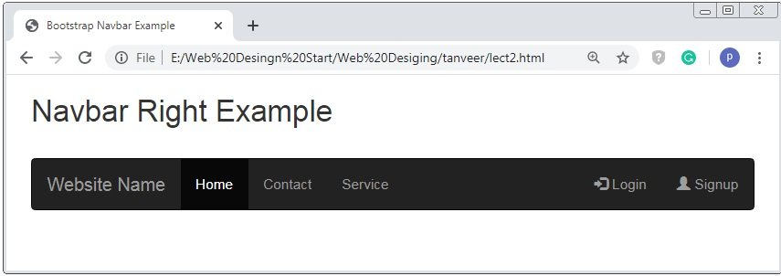
Bootstrap Navbar Right Aligned
To align the elements of the navigation bar is right so apply the class .navbar-right to the <ul> tag.
Example: 4 Navbar Right Example
<!DOCTYPE html>
<html>
<head>
    <title>Bootstrap Navbar Example</title>
    <!-- link the bootstrap online or through CDN -->
    <link rel="stylesheet" href="https://maxcdn.bootstrapcdn.com/bootstrap/3.3.7/css/bootstrap.min.css" integrity="sha384-BVYiiSIFeK1dGmJRAkycuHAHRg32OmUcww7on3RYdg4Va+PmSTsz/K68vbdEjh4u" crossorigin="anonymous">
    <script src="https://ajax.googleapis.com/ajax/libs/jquery/3.4.1/jquery.min.js"></script>
 	<script src="https://maxcdn.bootstrapcdn.com/bootstrap/3.4.1/js/bootstrap.min.js">
  	</script>

</head>
<body>
	<div class="container">
		<h2>Navbar Right Example</h2><br />
		<nav class="navbar navbar-inverse">
			<div class="container-fluid">
				<div class="navbar-header">
					<a href="#" class="navbar-brand">Website Name</a>
				</div>
				<ul class="nav navbar-nav">
					<li class="active"><a href="#home">Home</a></li>
					<li><a href="#contact">Contact</a></li>
					<li><a href="#service">Service</a></li>
				</ul>
				<ul class="nav navbar-nav navbar-right">
					<li><a href="#login"><span class="glyphicon glyphicon-log-in"></span> Login</a></li>
					<li><a href="#signup"><span class="glyphicon glyphicon-user"></span> Signup</a></li>
				</ul>
			</div>
		</nav>
	</div>
</body>
</html>
On the above code we use the class navbar-right is applied to <ul> tag to aligned the element of navigation bar.
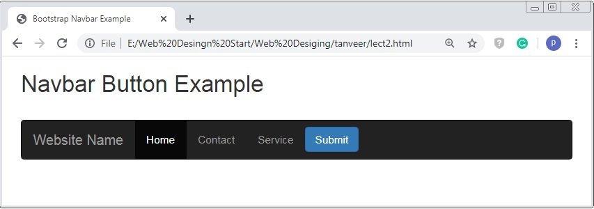
Bootstrap Navbar Buttons
To create the navigation with button the class .navbar-btn class is used. The class .navbar-btn is applied to the <button> tag.
Example: 5 Navbar Buttons Example
<!DOCTYPE html>
<html>
<head>
    <title>Bootstrap Navbar Example</title>
    <!-- link the bootstrap online or through CDN -->
    <link rel="stylesheet" href="https://maxcdn.bootstrapcdn.com/bootstrap/3.3.7/css/bootstrap.min.css" integrity="sha384-BVYiiSIFeK1dGmJRAkycuHAHRg32OmUcww7on3RYdg4Va+PmSTsz/K68vbdEjh4u" crossorigin="anonymous">
    <script src="https://ajax.googleapis.com/ajax/libs/jquery/3.4.1/jquery.min.js"></script>
 	<script src="https://maxcdn.bootstrapcdn.com/bootstrap/3.4.1/js/bootstrap.min.js">
  	</script>

</head>
<body>
	<div class="container">
		<h2>Navbar Right Example</h2><br />
		<nav class="navbar navbar-inverse">
			<div class="container-fluid">
				<div class="navbar-header">
					<a href="#" class="navbar-brand">Website Name</a>
				</div>
				<ul class="nav navbar-nav">
					<li class="active"><a href="#home">Home</a></li>
					<li><a href="#contact">Contact</a></li>
					<li><a href="#service">Service</a></li>
				</ul>
				<button class="btn btn-primary navbar-btn">Submit</button>
			</div>
		</nav>
	</div>
</body>
</html>
On the above code we use the class .navbar-btn is applied to <button> tag.
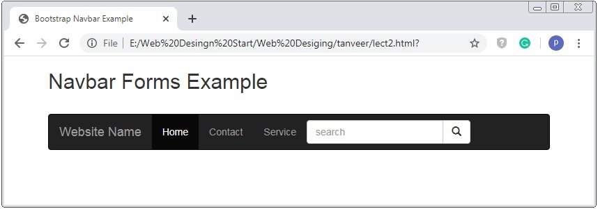
Bootstrap Navbar Forms
To create the form element inside the navigation bar the class .navbar-form to <form> tag.
Example: 5 Navbar Forms Example
<!DOCTYPE html>
<html>
<head>
    <title>Bootstrap Navbar Example</title>
    <!-- link the bootstrap online or through CDN -->
    <link rel="stylesheet" href="https://maxcdn.bootstrapcdn.com/bootstrap/3.3.7/css/bootstrap.min.css" integrity="sha384-BVYiiSIFeK1dGmJRAkycuHAHRg32OmUcww7on3RYdg4Va+PmSTsz/K68vbdEjh4u" crossorigin="anonymous">
    <script src="https://ajax.googleapis.com/ajax/libs/jquery/3.4.1/jquery.min.js"></script>
 	<script src="https://maxcdn.bootstrapcdn.com/bootstrap/3.4.1/js/bootstrap.min.js">
  	</script>

</head>
<body>
	<div class="container">
		<h2>Navbar Forms Example</h2><br />
		<nav class="navbar navbar-inverse">
			<div class="container-fluid">
				<div class="navbar-header">
					<a href="#" class="navbar-brand">Website Name</a>
				</div>
				<ul class="nav navbar-nav">
					<li class="active"><a href="#home">Home</a></li>
					<li><a href="#contact">Contact</a></li>
					<li><a href="#service">Service</a></li>
				</ul>
				<form class="navbar-form" action="">
					<div class="input-group">
						<input type="text" placeholder="search" class="form-control">
						<div class="input-group-btn">
							<button class="btn btn-default"><span class="glyphicon glyphicon-search"></span> </button>
						</div>
					</div>
				</form>
			</div>
		</nav>
	</div>
</body>
</html>
On the above code we use the class .navbar-form is applied to <form> tag.
Bootstrap Fixed Navigation Bar
The fixed navigation bar is attached to top and bottom position and free to scroll the whole page. The class navbar-fixed is used to fixed the navigation bar.
Example: 6 Fixed Navigation Bar Example
<!DOCTYPE html>
<html>
<head>
    <title>Bootstrap Navbar Example</title>
    <!-- link the bootstrap online or through CDN -->
    <link rel="stylesheet" href="https://maxcdn.bootstrapcdn.com/bootstrap/3.3.7/css/bootstrap.min.css" integrity="sha384-BVYiiSIFeK1dGmJRAkycuHAHRg32OmUcww7on3RYdg4Va+PmSTsz/K68vbdEjh4u" crossorigin="anonymous">
    <script src="https://ajax.googleapis.com/ajax/libs/jquery/3.4.1/jquery.min.js"></script>
 	<script src="https://maxcdn.bootstrapcdn.com/bootstrap/3.4.1/js/bootstrap.min.js">
  	</script>

</head>
<body>
	<div class="container">
		<nav class="navbar navbar-inverse navbar-fixed-top">
			<div class="container-fluid">
				<div class="navbar-header">
					<a href="#" class="navbar-brand">Website Name</a>
				</div>
				<ul class="nav navbar-nav">
					<li class="active"><a href="#home">Home</a></li>
					<li><a href="#contact">Contact</a></li>
					<li><a href="#service">Service</a></li>
				</ul>
				<form class="navbar-form" action="">
					<div class="input-group">
						<input type="text" placeholder="search" class="form-control">
						<div class="input-group-btn">
							<button class="btn btn-default"><span class="glyphicon glyphicon-search"></span> </button>
						</div>
					</div>
				</form>
			</div>
		</nav><br><br>
		<h2>Fixed Navigation Bar Example</h2>
	</div>
</body>
</html>
On the above code we use the class .navbar-fixed-top is applied to <nav> tag to fixed the navbar at the top position.
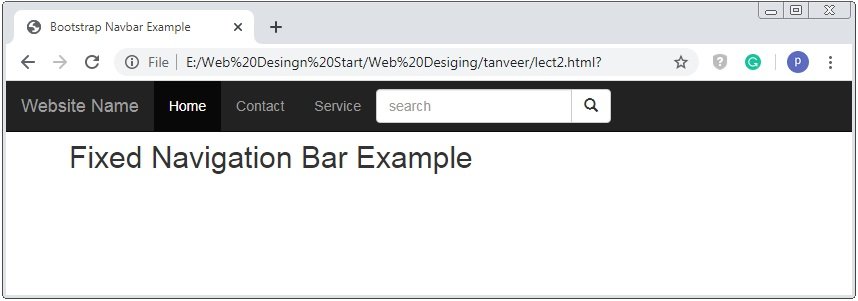
Caution:The class navbar-fixed-bottom is used create the bottom fixed navigation bar.
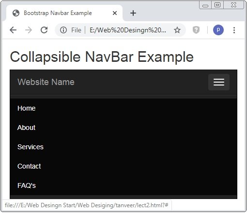
Bootstrap Collapsible Navigation Bar
The bootstrap provides a responsive nature to the elements. The navigation bar occupies the huge space for the small screen. Bootstrap provides hidden nature to the navbar and opened on it required.
Example: 8 Collapsible Navigation Bar Example
<!DOCTYPE html>
<html>
<head>
    <title>Bootstrap Navbar Example</title>
    <!-- link the bootstrap online or through CDN -->
    <link rel="stylesheet" href="https://maxcdn.bootstrapcdn.com/bootstrap/3.3.7/css/bootstrap.min.css" integrity="sha384-BVYiiSIFeK1dGmJRAkycuHAHRg32OmUcww7on3RYdg4Va+PmSTsz/K68vbdEjh4u" crossorigin="anonymous">
    <script src="https://ajax.googleapis.com/ajax/libs/jquery/3.4.1/jquery.min.js"></script>
 	<script src="https://maxcdn.bootstrapcdn.com/bootstrap/3.4.1/js/bootstrap.min.js">
  	</script>

</head>
<body>
	<div class="container">
		<h2>Collapsible NavBar Example</h2>
		<nav class="navbar navbar-inverse">
			<div class="container-fluid">
				<div class="navbar-header">
					<button type="button" class="navbar-toggle" data-toggle="collapse" data-target="#navi">
						<span class="icon-bar"></span>
						<span class="icon-bar"></span>
						<span class="icon-bar"></span>
					</button>
					 <a href="#" class="navbar-brand">Website Name</a>
				</div>
				<div class="collapse navbar-collapse" id="navi">
					<ul class="nav navbar-nav">
					 	<li class="active"><a href="#">Home</a></li>
					 	<li class="active"><a href="#">About</a></li>
					 	<li class="active"><a href="#">Services</a></li>
					 	<li class="active"><a href="#">Contact</a></li>
					 	<li class="active"><a href="#">FAQ's</a></li>
					</ul>
				</div>
			</div>
		</nav>
	</div>
</body>
</html>
On the above code we use the class .navbar-collapse and collapse to <ul> tag. A navigation bar is hidden on the small screen only 3 bars will show. When you click to the 3 bar the navigation will be displayed.
 Posted in
  Tags:
Tags: 


