 March 30th, 2020
  Prerana Kasar
 Bootstrap Progress Bar
A progress bar is used to define how the work is done and how that work is left. Where bootstrap enhances the look and feel of the normal progress bar.
The class .progress and .progress-bar is used to create progress bar.
Example: 1 Bootstrap Progress Bar Example
<!DOCTYPE html>
<html>
<head>
<title>Bootstrap Progress Bar Example</title>
<!-- link the bootstrap online or through CDN -->
<link rel="stylesheet" href="https://maxcdn.bootstrapcdn.com/bootstrap/3.3.7/css/bootstrap.min.css" integrity="sha384-BVYiiSIFeK1dGmJRAkycuHAHRg32OmUcww7on3RYdg4Va+PmSTsz/K68vbdEjh4u" crossorigin="anonymous">
<script src="https://ajax.googleapis.com/ajax/libs/jquery/3.4.1/jquery.min.js"></script>
<script src="https://maxcdn.bootstrapcdn.com/bootstrap/3.4.1/js/bootstrap.min.js">
</script>
</head>
<body>
<div class="container">
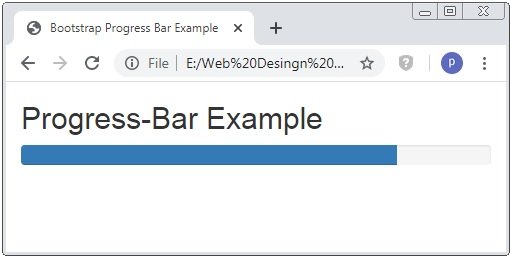
<h2>Progress-Bar Example</h2>
<div class="progress">
<div class="progress-bar" role="progress-bar" area-valuenow="80" area-valuemin="0" area-valuemax="100" style="width: 80%;">
<span class="sr-only">80% Complete</span>
</div>
</div>
</div>
</body>
</html>
Here we apply the .progress and .progress-bar to <div> tag and some other attribute like role area-valuenow|valuemin|valuemax to create the the progress bar with work done remaning and total work.
Bootstrap Progress Bar With Value
The above code shows the progress bar but does not show how much work is complete. The below code shows how we create the progress bar with the completed work value.
Example: 2 Bootstrap Progress Bar With Value Example
<!DOCTYPE html>
<html>
<head>
    <title>Bootstrap Progress Bar Example</title>
    <!-- link the bootstrap online or through CDN -->
    <link rel="stylesheet" href="https://maxcdn.bootstrapcdn.com/bootstrap/3.3.7/css/bootstrap.min.css" integrity="sha384-BVYiiSIFeK1dGmJRAkycuHAHRg32OmUcww7on3RYdg4Va+PmSTsz/K68vbdEjh4u" crossorigin="anonymous">
    <script src="https://ajax.googleapis.com/ajax/libs/jquery/3.4.1/jquery.min.js"></script>
 	<script src="https://maxcdn.bootstrapcdn.com/bootstrap/3.4.1/js/bootstrap.min.js">
  	</script>

</head>
<body>
	<div class="container">
		<h2>Progress-Bar Example</h2>
		<div class="progress">
			<div class="progress-bar" role="progress-bar" area-valuenow="80" area-valuemin="0" area-valuemax="100" style="width: 80%;">
				80%
			</div>
		</div>
	</div>
</body>
</html>
Here above both codes are same the second one code have just a difference is that we define the value of work done.

Bootstrap Progress Bars Color
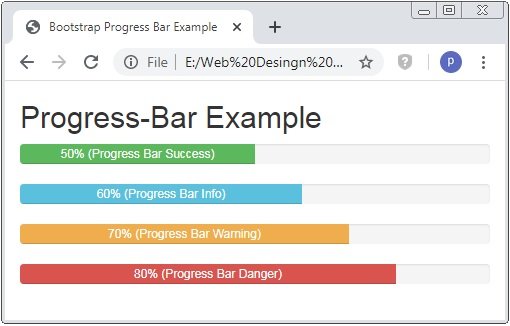
The default progress bar showed blue color. Using contextual class the colorful progress bar is created. The contextual classes are .progress-bar-success, progress-bar-info, progress-bar-warning and progress-bar-danger.
Example: 3 Bootstrap Progress Bar Color Example
<!DOCTYPE html>
<html>
<head>
    <title>Bootstrap Progress Bar Example</title>
    <!-- link the bootstrap online or through CDN -->
    <link rel="stylesheet" href="https://maxcdn.bootstrapcdn.com/bootstrap/3.3.7/css/bootstrap.min.css" integrity="sha384-BVYiiSIFeK1dGmJRAkycuHAHRg32OmUcww7on3RYdg4Va+PmSTsz/K68vbdEjh4u" crossorigin="anonymous">
    <script src="https://ajax.googleapis.com/ajax/libs/jquery/3.4.1/jquery.min.js"></script>
 	<script src="https://maxcdn.bootstrapcdn.com/bootstrap/3.4.1/js/bootstrap.min.js">
  	</script>

</head>
<body>
	<div class="container">
		<h2>Progress-Bar Example</h2>
		<div class="progress">
			<div class="progress-bar progress-bar-success" role="progress-bar" area-valuenow="50" area-valuemin="0" area-valuemax="100" style="width: 50%;">
				50% (Progress Bar Success)
			</div>
		</div>
		<div class="progress">
			<div class="progress-bar progress-bar-info" role="progress-bar" area-valuenow="60" area-valuemin="0" area-valuemax="100" style="width: 60%;">
				60% (Progress Bar Info)
			</div>
		</div>
		<div class="progress">
			<div class="progress-bar progress-bar-warning" role="progress-bar" area-valuenow="70" area-valuemin="0" area-valuemax="100" style="width: 70%;">
				70% (Progress Bar Warning)
			</div>
		</div>
		<div class="progress">
			<div class="progress-bar progress-bar-danger" role="progress-bar" area-valuenow="80" area-valuemin="0" area-valuemax="100" style="width: 80%;">
				80% (Progress Bar Danger)
			</div>
		</div>
	</div>
</body>
</html>
Here all contextual classes are used to created the color progress bar.
Bootstrap Striped Progress Bars
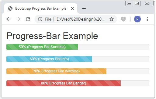
The class .progress-bar-striped is used to create the striped progress bar.
Example: 4 Bootstrap Striped Progress Bar Example
<!DOCTYPE html>
<html>
<head>
    <title>Bootstrap Progress Bar Example</title>
    <!-- link the bootstrap online or through CDN -->
    <link rel="stylesheet" href="https://maxcdn.bootstrapcdn.com/bootstrap/3.3.7/css/bootstrap.min.css" integrity="sha384-BVYiiSIFeK1dGmJRAkycuHAHRg32OmUcww7on3RYdg4Va+PmSTsz/K68vbdEjh4u" crossorigin="anonymous">
    <script src="https://ajax.googleapis.com/ajax/libs/jquery/3.4.1/jquery.min.js"></script>
 	<script src="https://maxcdn.bootstrapcdn.com/bootstrap/3.4.1/js/bootstrap.min.js">
  	</script>

</head>
<body>
	<div class="container">
		<h2>Progress-Bar Example</h2>
		<div class="progress">
			<div class="progress-bar progress-bar-success progress-bar-striped" role="progress-bar" area-valuenow="50" area-valuemin="0" area-valuemax="100" style="width: 50%;">
				50% (Progress Bar Success)
			</div>
		</div>
		<div class="progress">
			<div class="progress-bar progress-bar-info progress-bar-striped" role="progress-bar" area-valuenow="60" area-valuemin="0" area-valuemax="100" style="width: 60%;">
				60% (Progress Bar Info)
			</div>
		</div>
		<div class="progress">
			<div class="progress-bar progress-bar-warning progress-bar-striped" role="progress-bar" area-valuenow="70" area-valuemin="0" area-valuemax="100" style="width: 70%;">
				70% (Progress Bar Warning)
			</div>
		</div>
		<div class="progress">
			<div class="progress-bar progress-bar-danger progress-bar-striped" role="progress-bar" area-valuenow="80" area-valuemin="0" area-valuemax="100" style="width: 80%;">
				80% (Progress Bar Danger)
			</div>
		</div>
	</div>
</body>
</html>
Here all contextual classes and .progress-bar-striped class is applied to the <div> tag to create the striped progress bar.
Bootstrap Animated Progress Bar
The class .progress-bar-striped is used to create the striped progress bar but this progress bar is just seem a stoped and striped progress bar. Using of class . active it show as animated of ruined striped progress bar.
Example: 5 Bootstrap Animated Progress Bar Example
<!DOCTYPE html>
<html>
<head>
    <title>Bootstrap Progress Bar Example</title>
    <!-- link the bootstrap online or through CDN -->
    <link rel="stylesheet" href="https://maxcdn.bootstrapcdn.com/bootstrap/3.3.7/css/bootstrap.min.css" integrity="sha384-BVYiiSIFeK1dGmJRAkycuHAHRg32OmUcww7on3RYdg4Va+PmSTsz/K68vbdEjh4u" crossorigin="anonymous">
    <script src="https://ajax.googleapis.com/ajax/libs/jquery/3.4.1/jquery.min.js"></script>
 	<script src="https://maxcdn.bootstrapcdn.com/bootstrap/3.4.1/js/bootstrap.min.js">
  	</script>

</head>
<body>
	<div class="container">
		<h2>Animated Progress-Bar Example</h2>
		<div class="progress">
			<div class="progress-bar progress-bar-success progress-bar-striped active" role="progress-bar" area-valuenow="50" area-valuemin="0" area-valuemax="100" style="width: 50%;">
				50% (Progress Bar Success)
			</div>
		</div>
		<div class="progress">
			<div class="progress-bar progress-bar-info progress-bar-striped active" role="progress-bar" area-valuenow="60" area-valuemin="0" area-valuemax="100" style="width: 60%;">
				60% (Progress Bar Info)
			</div>
		</div>
		<div class="progress">
			<div class="progress-bar progress-bar-warning progress-bar-striped active" role="progress-bar" area-valuenow="70" area-valuemin="0" area-valuemax="100" style="width: 70%;">
				70% (Progress Bar Warning)
			</div>
		</div>
		<div class="progress">
			<div class="progress-bar progress-bar-danger progress-bar-striped active" role="progress-bar" area-valuenow="80" area-valuemin="0" area-valuemax="100" style="width: 80%;">
				80% (Progress Bar Danger)
			</div>
		</div>
	</div>
</body>
</html>
Here the code describe that how the animated progress bar is create and the below image is show the resultant progress bar but this image does not show the animation.

Bootstrap Stacked Progress Bars
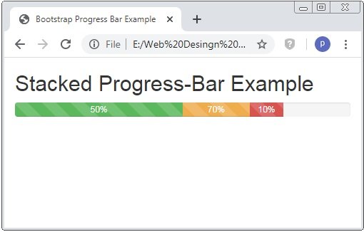
To create the multiple bars into single bar are called stacked progress bar.
Example: 5 Bootstrap Stacked Progress Bar Example
<!DOCTYPE html>
<html>
<head>
    <title>Bootstrap Progress Bar Example</title>
    <!-- link the bootstrap online or through CDN -->
    <link rel="stylesheet" href="https://maxcdn.bootstrapcdn.com/bootstrap/3.3.7/css/bootstrap.min.css" integrity="sha384-BVYiiSIFeK1dGmJRAkycuHAHRg32OmUcww7on3RYdg4Va+PmSTsz/K68vbdEjh4u" crossorigin="anonymous">
    <script src="https://ajax.googleapis.com/ajax/libs/jquery/3.4.1/jquery.min.js"></script>
 	<script src="https://maxcdn.bootstrapcdn.com/bootstrap/3.4.1/js/bootstrap.min.js">
  	</script>

</head>
<body>
	<div class="container">
		<h2>Stacked Progress-Bar Example</h2>
		<div class="progress">
			<div class="progress-bar progress-bar-success progress-bar-striped active" role="progress-bar" area-valuenow="50" area-valuemin="0" area-valuemax="100" style="width: 50%;">
				50%
			</div>
			<div class="progress-bar progress-bar-warning progress-bar-striped active" role="progress-bar" area-valuenow="70" area-valuemin="0" area-valuemax="100" style="width: 20%;">
				70%
			</div>
			<div class="progress-bar progress-bar-danger progress-bar-striped active" role="progress-bar" area-valuenow="80" area-valuemin="0" area-valuemax="100" style="width: 10%;">
				10%
			</div>
		</div>
	</div>
</body>
</html>
Here we create 2 different progress of work in a single bar.
 Posted in
  Tags:
Tags: 


