 March 27th, 2020
  Prerana Kasar
 Bootstrap Button
In Bootstrap the look and feel of the buttons are changed. The bootstrap provides seven types of buttons and these buttons have an individual purpose.
Bootstrap has different classes to different tag to create the buttons. There are seven different classes styles of buttons. The class .btn is used to create the button and classes .btn-default, btn-primary, .btn-success, .btn-info, .btn-warning, .btn-danger and .btn-link to create different style of buttons.
Example: 1 Bootstrap Button Example
<!DOCTYPE html>
<html>
<head>
    <title>Bootstrap Button Example</title>
    <!-- link the bootstrap online or through CDN -->
    <link rel="stylesheet" href="https://maxcdn.bootstrapcdn.com/bootstrap/3.3.7/css/bootstrap.min.css" integrity="sha384-BVYiiSIFeK1dGmJRAkycuHAHRg32OmUcww7on3RYdg4Va+PmSTsz/K68vbdEjh4u" crossorigin="anonymous">
    <script src="https://ajax.googleapis.com/ajax/libs/jquery/3.4.1/jquery.min.js"></script>
 	<script src="https://maxcdn.bootstrapcdn.com/bootstrap/3.4.1/js/bootstrap.min.js">
  	</script>

</head>
<body>
	<div class="container">
		<h2>Different Styles of Buttons</h2>
		<button type="button" class="btn">Basic</button>
  		<button type="button" class="btn btn-default">Default</button>
  		<button type="button" class="btn btn-primary">Primary</button>
 		<button type="button" class="btn btn-success">Success</button>
  		<button type="button" class="btn btn-info">Info</button>
  		<button type="button" class="btn btn-warning">Warning</button>
  		<button type="button" class="btn btn-danger">Danger</button>
  		<button type="button" class="btn btn-link">Link</button>
	</div>
</body>
</html>
This code have different styles of buttons in bootstrap. This buttons have different-different purpose.

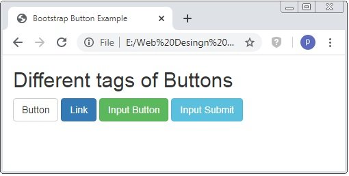
Bootstrap Buttons with Different Tags
Bootstrap has different classes to different tag to create the buttons. The tags are <a>, <button> and <input>.
Example: 2 Bootstrap Button Tags Example
<!DOCTYPE html>
<html>
<head>
    <title>Bootstrap Button Example</title>
    <!-- link the bootstrap online or through CDN -->
    <link rel="stylesheet" href="https://maxcdn.bootstrapcdn.com/bootstrap/3.3.7/css/bootstrap.min.css" integrity="sha384-BVYiiSIFeK1dGmJRAkycuHAHRg32OmUcww7on3RYdg4Va+PmSTsz/K68vbdEjh4u" crossorigin="anonymous">
    <script src="https://ajax.googleapis.com/ajax/libs/jquery/3.4.1/jquery.min.js"></script>
 	<script src="https://maxcdn.bootstrapcdn.com/bootstrap/3.4.1/js/bootstrap.min.js">
  	</script>

</head>
<body>
	<div class="container">
		<h2>Different tags of Buttons</h2>
  		<button type="button" class="btn btn-default">Button</button>
  		<a href="#" class="btn btn-primary" role="button">Link</a>
  		<input type="button" class="btn btn-success" value="Input Button">
  		<input type="submit" class="btn btn-info" value="Input Submit">
	</div>
</body>
</html>
This code have different tags to create the button styles in bootstrap.
Bootstrap Button Size
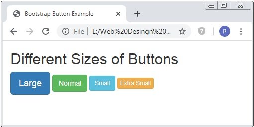
Bootstrap also have classes to set the size of the button. The bootstrap have 4 button sizes.
The classes are .btn-lg, .btn-md, .btn-sm and .btn-xs.
Example: 3 Bootstrap Button Sizes Example
<!DOCTYPE html>
<html>
<head>
    <title>Bootstrap Button Example</title>
    <!-- link the bootstrap online or through CDN -->
    <link rel="stylesheet" href="https://maxcdn.bootstrapcdn.com/bootstrap/3.3.7/css/bootstrap.min.css" integrity="sha384-BVYiiSIFeK1dGmJRAkycuHAHRg32OmUcww7on3RYdg4Va+PmSTsz/K68vbdEjh4u" crossorigin="anonymous">
    <script src="https://ajax.googleapis.com/ajax/libs/jquery/3.4.1/jquery.min.js"></script>
 	<script src="https://maxcdn.bootstrapcdn.com/bootstrap/3.4.1/js/bootstrap.min.js">
  	</script>

</head>
<body>
	<div class="container">
		<h2>Different Styles Of Buttons</h2>
  		<button type="button" class="btn btn-primary btn-lg">Large</button>
  		<button type="button" class="btn btn-success btn-md">Normal</button>
  		<button type="button" class="btn btn-info btn-sm">Small</button>
  		<button type="button" class="btn btn-warning btn-xs">Extra Small</button>

	</div>
</body>
</html>
This code have different classes of button size. The size are Large, Medium, Small and Extra-Small. The default size of the button is medium size.
Bootstrap Block Level Buttons
The full-width button is create by the bootstrap class .btn-block. The width of the button is depend on the parent element of the button.
Example: 4 Bootstrap Block-Level Button Example
<!DOCTYPE html>
<html>
<head>
    <title>Bootstrap Button Example</title>
    <!-- link the bootstrap online or through CDN -->
    <link rel="stylesheet" href="https://maxcdn.bootstrapcdn.com/bootstrap/3.3.7/css/bootstrap.min.css" integrity="sha384-BVYiiSIFeK1dGmJRAkycuHAHRg32OmUcww7on3RYdg4Va+PmSTsz/K68vbdEjh4u" crossorigin="anonymous">
    <script src="https://ajax.googleapis.com/ajax/libs/jquery/3.4.1/jquery.min.js"></script>
 	<script src="https://maxcdn.bootstrapcdn.com/bootstrap/3.4.1/js/bootstrap.min.js">
  	</script>

</head>
<body>
	<div class="container">
		<h2>Block-Level Button</h2>
  		<button type="button" class="btn btn-primary">Normal</button><br /><br />
  		<button type="button" class="btn btn-primary btn-block">Block-Level</button>
	</div>
</body>
</html>
This code have normal button and another button have class .btn-block.

Bootstrap Active and Disabled Buttons
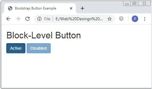
Through the class .active and .disactive the button are set to clickable or unlickable.
Example: 5 Bootstrap Active and Disabled Button Example
<!DOCTYPE html>
<html>
<head>
    <title>Bootstrap Button Example</title>
    <!-- link the bootstrap online or through CDN -->
    <link rel="stylesheet" href="https://maxcdn.bootstrapcdn.com/bootstrap/3.3.7/css/bootstrap.min.css" integrity="sha384-BVYiiSIFeK1dGmJRAkycuHAHRg32OmUcww7on3RYdg4Va+PmSTsz/K68vbdEjh4u" crossorigin="anonymous">
    <script src="https://ajax.googleapis.com/ajax/libs/jquery/3.4.1/jquery.min.js"></script>
 	<script src="https://maxcdn.bootstrapcdn.com/bootstrap/3.4.1/js/bootstrap.min.js">
  	</script>

</head>
<body>
	<div class="container">
		<h2>Block-Level Button</h2>
  		<button type="button" class="btn btn-primary active">Active</button>
  		<button type="button" class="btn btn-primary disabled">Disabled</button>
	</div>
</body>
</html>
Here the button the active button is clickable but when you put the cursor on the disabled button it seen red crosed circle and unable to click.
 Posted in
  Tags:
Tags: 


