 March 26th, 2020
  Prerana Kasar
 Bootstrap Alert
Boostrap alert class is used to create the alert box message. This class gives the different look and feel to the text. Also, you can create alert links.
Bootstrap alter works with the four contextual classes like .alert-success, .alert-info, .alert-warning and .alert-danger. Without these class only class .alert not work.
These contextual classes indicated different alerts or actions.
- alert-success : Indicates positive and successful action.
- alert-info : Indicates informative actions
- alert-warning : Indicates warning and need to actions
- alert-danger : Indicates dangerous actions.
Example: 1 Bootstrap Alert Example
<!DOCTYPE html>
<html>
<head>
<title>Bootstrap Well Example</title>
<!-- link the bootstrap online or through CDN -->
<link rel="stylesheet" href="https://maxcdn.bootstrapcdn.com/bootstrap/3.3.7/css/bootstrap.min.css" integrity="sha384-BVYiiSIFeK1dGmJRAkycuHAHRg32OmUcww7on3RYdg4Va+PmSTsz/K68vbdEjh4u" crossorigin="anonymous">
</head>
<body>
<div class="container">
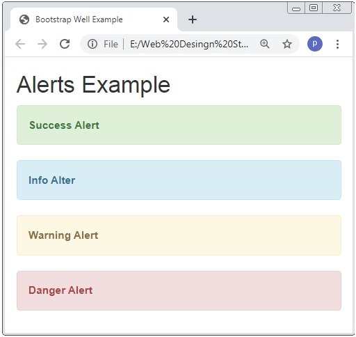
<h2>Alerts Example</h2>
<div class="alert alert-success">
<b>Success Alert</b>
</div>
<div class="alert alert-info">
<b>Info Alter</b>
</div>
<div class="alert alert-warning">
<b>Warning Alert</b>
</div>
<div class="alert alert-danger">
<b>Danger Alert</b>
</div>
</div>
</body>
</html>
The above code we use the .alert class with contextual classes. The different contextual class have different color and look and feel.
Alert Links
In Bootstrap we also create the alert links. To create the alert link the class .alert-link is used to the link tag.
Example: 2 Bootstrap Alert Link Example
<!DOCTYPE html>
<html>
<head>
    <title>Bootstrap Alert Example</title>
    <!-- link the bootstrap online or through CDN -->
    <link rel="stylesheet" href="https://maxcdn.bootstrapcdn.com/bootstrap/3.3.7/css/bootstrap.min.css" integrity="sha384-BVYiiSIFeK1dGmJRAkycuHAHRg32OmUcww7on3RYdg4Va+PmSTsz/K68vbdEjh4u" crossorigin="anonymous">

</head>
<body>
	<div class="container">
		<h2>Alerts Example</h2>
		<div class="alert alert-success">
			<b>Success Alert Link</b> <a href="#" class="alert-link">Click here</a>
		</div>
		<div class="alert alert-danger">
			<b>Danger Alert Link</b> <a href="#" class="alert-link">Click here</a>
		</div>
	</div>
</body>
</html>
The above code we use the .alert class with contextual classes and apply the class .alert-link to the <a> tag.

Closing Alerts
Bootstrap also provide class to close the alert link and box. To create the closing alert we have to use class .close and alert-dismissible.
Example: 3 Bootstrap Closing Alert Link Example
<!DOCTYPE html>
<html>
<head>
<title>Bootstrap Alert Example</title>
<!-- link the bootstrap online or through CDN -->
<link rel="stylesheet" href="https://maxcdn.bootstrapcdn.com/bootstrap/3.3.7/css/bootstrap.min.css" integrity="sha384-BVYiiSIFeK1dGmJRAkycuHAHRg32OmUcww7on3RYdg4Va+PmSTsz/K68vbdEjh4u" crossorigin="anonymous">
<script src="https://ajax.googleapis.com/ajax/libs/jquery/3.4.1/jquery.min.js"></script>
<script src="https://maxcdn.bootstrapcdn.com/bootstrap/3.4.1/js/bootstrap.min.js">
</script>
</head>
<body>
<div class="container">
<h2>Alerts Example</h2>
<div class="alert alert-success alert-dismissible">
<a href="#" class="close" data-dismiss="alert" aria-lable="close">×</a>
<b>Success Alert Closing Link</b>
</div>
</div>
</body>
</html>
The above code we use the create the closable alert. By using some other attributes. Please read careful the above code.

Caution: Here × is used to create the cross or closing icon.
Animated Alerts
When we close the alert by clicking on the cross icon the alert box close directly and it seen bad.
To improve this we use some classes to close the alert box nice and look better or attractive. The classes are .fade and .in.
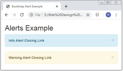
Example: 4 Bootstrap Animated Closing Alert Link Example
<!DOCTYPE html>
<html>
<head>
<title>Bootstrap Alert Example</title>
<!-- link the bootstrap online or through CDN -->
<link rel="stylesheet" href="https://maxcdn.bootstrapcdn.com/bootstrap/3.3.7/css/bootstrap.min.css" integrity="sha384-BVYiiSIFeK1dGmJRAkycuHAHRg32OmUcww7on3RYdg4Va+PmSTsz/K68vbdEjh4u" crossorigin="anonymous">
<script src="https://ajax.googleapis.com/ajax/libs/jquery/3.4.1/jquery.min.js"></script>
<script src="https://maxcdn.bootstrapcdn.com/bootstrap/3.4.1/js/bootstrap.min.js">
</script>
</head>
<body>
<div class="container">
<h2>Alerts Example</h2>
<div class="alert alert-info alert-dismissible fade in">
<a href="#" class="close" data-dismiss="alert">×</a>
<b>Info Alert Closing Link</b>
</div>
<div class="alert alert-warning alert-dismissible fade in">
<a href="#" class="close" data-dismiss="alert">×</a>
<b>Warning Alert Closing Link</b>
</div>
</div>
</body>
</html>
When you close the alert box with .fade, .in classes and without .fade .in classes. It seems the different.
 Posted in
  Tags:
Tags: 


