 May 1st, 2020
  Prerana Kasar
 Bootstrap Modal Dialog
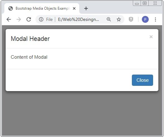
Bootstrap Modal is a popup box window which can be displayed on the top of that page. This modal box have header, content and footer part to define the heading content and footer part. The classes .modal and .modal-dialog are used to create the modal.
Example: 1 Bootstrap Modal Dialog Example
<!DOCTYPE html>
<html>
<head>
<title>Bootstrap Modal Dialog Example</title>
<!-- link the bootstrap online or through CDN -->
<link rel="stylesheet" href="https://maxcdn.bootstrapcdn.com/bootstrap/3.3.7/css/bootstrap.min.css" integrity="sha384-BVYiiSIFeK1dGmJRAkycuHAHRg32OmUcww7on3RYdg4Va+PmSTsz/K68vbdEjh4u" crossorigin="anonymous">
<script src="https://ajax.googleapis.com/ajax/libs/jquery/3.4.1/jquery.min.js"></script>
<script src="https://maxcdn.bootstrapcdn.com/bootstrap/3.4.1/js/bootstrap.min.js">
</script>
</head>
<body>
<div class="container">
<h2>Bootstrap Modal Dialog Example</h2>
<button type="button" class="btn btn-primary" data-toggle="modal" data-target="#myModal">Click to open Modal</button>
<div class="modal fade" id="myModal" role="dialog">
<div class="modal-dialog">
<div class="modal-content">
<div class="modal-header">
<button type="button" class="close" data-dismiss="modal">×</button>
<h4 class="modal-title">Modal Header</h4>
</div>
<div class="modal-body">
<p>Content of Modal</p>
</div>
<div class="modal-footer">
<button type="button" class="btn btn-primary" data-dismiss="modal">Close</button>
</div>
</div>
</div>
</div>
</div>
</body>
</html>
On the above code the classes .modal, .modal-dialog, .modal-body, .modal-content, .modal-header, .modal-footer are used to create the modal dialog. This class are applied to the containers.
Bootstrap Modal Dialog Classes
On the above example used the class modal are bring the content of the modal. Class .modal-dialog sets the dialog proper measurment. The class .modal-content sets the look and feel of the border and background-color and inside this we declared modals header, body content and footer.
The two attribute data-toogle=”modal” and data-target=”myModal” are trigger attribute which are used to open the dialog window and point out the id of modal respectively.
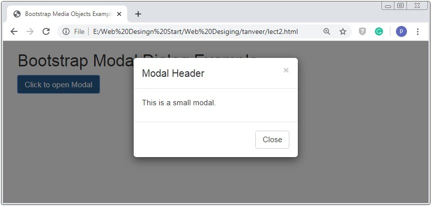
Bootstrap Modal Size
Bootstrap provide the various size classes to change the size of modal dialog. The classes .modal-sm for the small modal dialog and modal-lg for the large modal dialog. The default size of modal dialog is medium.
Small Size Modal Dialog
Example: 2 Bootstrap Modal Dialog Size Example
<!DOCTYPE html>
<html>
<head>
<title>Bootstrap Media Objects Example</title>
<!-- link the bootstrap online or through CDN -->
<link rel="stylesheet" href="https://maxcdn.bootstrapcdn.com/bootstrap/3.3.7/css/bootstrap.min.css" integrity="sha384-BVYiiSIFeK1dGmJRAkycuHAHRg32OmUcww7on3RYdg4Va+PmSTsz/K68vbdEjh4u" crossorigin="anonymous">
<script src="https://ajax.googleapis.com/ajax/libs/jquery/3.4.1/jquery.min.js"></script>
<script src="https://maxcdn.bootstrapcdn.com/bootstrap/3.4.1/js/bootstrap.min.js">
</script>
</head>
<body>
<div class="container">
<h2>Bootstrap Modal Dialog Example</h2>
<button type="button" class="btn btn-primary" data-toggle="modal" data-target="#myModal">Click to open Modal</button>
<div class="modal fade" id="myModal" role="dialog">
<div class="modal-dialog modal-sm">
<div class="modal-content">
<div class="modal-header">
<button type="button" class="close" data-dismiss="modal">×</button>
<h4 class="modal-title">Modal Header</h4>
</div>
<div class="modal-body">
<p>This is a small modal.</p>
</div>
<div class="modal-footer">
<button type="button" class="btn btn-default" data-dismiss="modal">Close</button>
</div>
</div>
</div>
</div>
</div>
</body>
</html>
On the above code the classes .modal-dialog and .modal-sm tob create the small size of modal.The width and the font size of the container and content is reduced.
Large Size Modal Dialog
Example: 3 Bootstrap Modal Dialog Size Example
<!DOCTYPE html>
<html>
<head>
<title>Bootstrap Media Objects Example</title>
<!-- link the bootstrap online or through CDN -->
<link rel="stylesheet" href="https://maxcdn.bootstrapcdn.com/bootstrap/3.3.7/css/bootstrap.min.css" integrity="sha384-BVYiiSIFeK1dGmJRAkycuHAHRg32OmUcww7on3RYdg4Va+PmSTsz/K68vbdEjh4u" crossorigin="anonymous">
<script src="https://ajax.googleapis.com/ajax/libs/jquery/3.4.1/jquery.min.js"></script>
<script src="https://maxcdn.bootstrapcdn.com/bootstrap/3.4.1/js/bootstrap.min.js">
</script>
</head>
<body>
<div class="container">
<h2>Bootstrap Modal Dialog Example</h2>
<button type="button" class="btn btn-primary" data-toggle="modal" data-target="#myModal">Click to open Modal</button>
<div class="modal fade" id="myModal" role="dialog">
<div class="modal-dialog modal-lg">
<div class="modal-content">
<div class="modal-header">
<button type="button" class="close" data-dismiss="modal">×</button>
<h4 class="modal-title">Modal Header</h4>
</div>
<div class="modal-body">
<p>This is a large modal.</p>
</div>
<div class="modal-footer">
<button type="button" class="btn btn-default" data-dismiss="modal">Close</button>
</div>
</div>
</div>
</div>
</div>
</body>
</html>
On the above code the classes .modal-dialog and .modal-lg to create the large size of modal.The width of the container is increased.

 Posted in
  Tags:
Tags: 


