 March 19th, 2019
  Nilesh Chaurasia
 CSS HTML Font Size Property
Every HTML elements have a default font size set in the web browser. And if you want to modify the font size of any Element with the help of font-size property.
CSS Font Size in px, pt, em, percent, Responsive or vw Units
px(pixel), em, percent, rem, pt(point) and other relative lengths are the units used to specify the value to the font-size property.
Font Size with px (pixels)
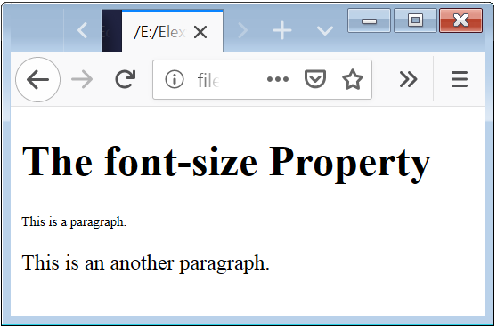
The default font-size of paragraph or body element is 16px in pixels. Pixel is an absolute value(fixed value).
Example 1 – set the size value in px
<!DOCTYPE html>
<html>
  <head>
	<style>
		.a
		{
		  font-size: 10px;
		}
	</style>
  </head>
  <body>
	<h1>The font-size Property</h1>
	<p class="a">This is a paragraph.</p>
	<p>This is an another paragraph.</p>
  </body>
</html>
Here above code shows that how can you set the font size to any of Element.
Font Size Percent
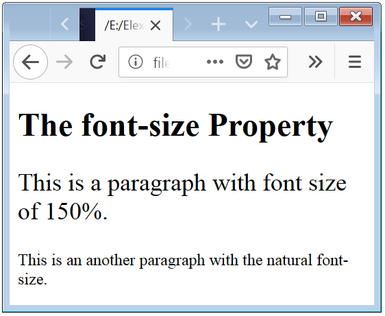
The natural font-size of an HTML Element in percent formate is 100%. And if you want to change the font size than you have set the percent value. If you specify percent more than 100% than text is bigger, or if you specify percent less than 100% than text is smaller. Percent is a relative value(font-size related to the parrent font-size).
Example 2 – Set Size in Percent Value
<!DOCTYPE html>
<html>
  <head>
	<style>
		.a
		{
		  font-size: 150%;
		}
	</style>
  </head>
  <body>
	<h1>The font-size Property</h1>
	<p class="a">This is a paragraph with font size of 150%.</p>
	<p>This is an another paragraph with the natural font-size.</p>
  </body>
</html>
Here above code shows that how can you set the font size to any Element in perecent formate.
Font Size em
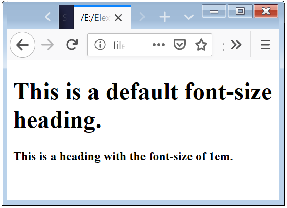
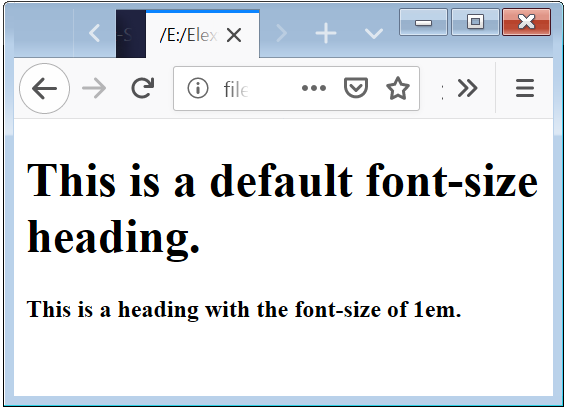
em is also a relative unit of font-size. Basically 1em = 16px. And em unit is depending on the font-size of body. Means that if you change the font-size of body, body{ font-size: 20px; }, than 1em = 20px. Thats why em is a relative unit.
Example 3 – Set the Size in em
<!DOCTYPE html>
<html>
  <head>
	<style>
		.a
		{
		  font-size: 1em;
		}
	</style>
  </head>
  <body>
	<h1>This is a default font-size heading.</h1>
	<h1 class="a">This is a heading with the font-size of 1em.</h1>
  </body>
</html>
Here above code shows that how you can set font-size in the em unit. And how it work actually.
Font Size point(pt)
Point(pt) is an absolute unit of font-size. Naturally the font-size of paragraph element in pixel formate is 16px. So 12pt = 16px.
Example 4 – Set Font Size in point(pt)
<!DOCTYPE html>
<html>
  <head>
	<style>
		.a
		{
		  font-size: 12pt;
		}
		.b
		{
		  font-size: 8pt;
		}
	</style>
  </head>
  <body>
	<p>This is a default font-size paragraph in pixel.</p>
	<p class="a">This is a paragraph with the font-size of 12pt.</p>
	<p class="b">This is a paragraph with the font-size of 8pt.</p>
  </body>
</html>
In the above code we define two different values to specify the font-size of the paragraph element. Where first paragraph have default font-size value.
Font Size Responsive or vw unit
Responsive means that text will resize based on the width of browser window. Viewport specify in terms of the width of browser. If you change the width of browser window than font-size will be changed and this makes font-size responsive.
Example 5 – Font Size Responsive Behavior
<!DOCTYPE html>
<html>
  <head>
	<style>
		.a
		{
		  font-size: 4vw;
		}
		.b
		{
		  font-size: 2vw;
		}
	</style>
  </head>
  <body>
	<p>This is a default font-size paragraph in pixel.</p>
	<p class="a">This is a paragraph with the font-size of 4vw.</p>
	<p class="b">This is a paragraph with the font-size of 2vw.</p>
  </body>
</html>
In the above code we define two different values to specify the font-size of the paragraph element. Where first paragraph have default font-size value.
You have to try by yourself to know what in actually viewport work. You have to change the size of the browser widow.

 Posted in
  Tags:
Tags: 


