 April 3rd, 2020
  Prerana Kasar
 Bootstrap Tabs And Pills
Bootstrap provides the navigation bar in the form of Tabs and Pills. The class nav-tabs and nav-pills are used to create tabs and pills.
Menus
Menus are created by the undordered list <ul> tag. Using the class .list-inline is used to create the horizontal list.
Example: 1 Bootstrap Menus Example
<!DOCTYPE html>
<html>
<head>
    <title>Bootstrap Menus Example</title>
    <!-- link the bootstrap online or through CDN -->
    <link rel="stylesheet" href="https://maxcdn.bootstrapcdn.com/bootstrap/3.3.7/css/bootstrap.min.css" integrity="sha384-BVYiiSIFeK1dGmJRAkycuHAHRg32OmUcww7on3RYdg4Va+PmSTsz/K68vbdEjh4u" crossorigin="anonymous">
    <script src="https://ajax.googleapis.com/ajax/libs/jquery/3.4.1/jquery.min.js"></script>
 	<script src="https://maxcdn.bootstrapcdn.com/bootstrap/3.4.1/js/bootstrap.min.js">
  	</script>

</head>
<body>
	<div class="container">
		<h2>Menus Example</h2><br />
		<ul class="list-inline">
			<li><a href="#">Home</a></li>
			<li><a href="#">About</a></li>
			<li><a href="#">Contact Us</a></li>
			<li><a href="#">Portfolio</a></li>
			<li><a href="#">Services</a></li>
		</ul>
	</div>
</body>
</html>
On the above code the class .list-inline to <ul> tag to create horizontal menus.

Tabs
Menus are created by the undordered list <ul> tag. Using the class .list-inline is used to create the horizontal list.
Example: 2 Bootstrap Tabs Example
<!DOCTYPE html>
<html>
<head>
<title>Bootstrap Tabs Example</title>
<!-- link the bootstrap online or through CDN -->
<link rel="stylesheet" href="https://maxcdn.bootstrapcdn.com/bootstrap/3.3.7/css/bootstrap.min.css" integrity="sha384-BVYiiSIFeK1dGmJRAkycuHAHRg32OmUcww7on3RYdg4Va+PmSTsz/K68vbdEjh4u" crossorigin="anonymous">
<script src="https://ajax.googleapis.com/ajax/libs/jquery/3.4.1/jquery.min.js"></script>
<script src="https://maxcdn.bootstrapcdn.com/bootstrap/3.4.1/js/bootstrap.min.js">
</script>
</head>
<body>
<div class="container">
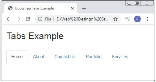
<h2>Tabs Example</h2><br />
<ul class="nav nav-tabs">
<li class="active"><a href="#">Home</a></li>
<li><a href="#">About</a></li>
<li><a href="#">Contact Us</a></li>
<li><a href="#">Portfolio</a></li>
<li><a href="#">Services</a></li>
</ul>
</div>
</body>
</html>
On the above code the class .nav & .nav-tabs is used to create the tabs.
Tabs With Dropdown Menu
Bootstrap also provide the dropdown menu with the tabs.
Example: 3 Bootstrap Tabs With Dropdown Menu Example
<!DOCTYPE html>
<html>
<head>
    <title>Bootstrap Tabs Example</title>
    <!-- link the bootstrap online or through CDN -->
    <link rel="stylesheet" href="https://maxcdn.bootstrapcdn.com/bootstrap/3.3.7/css/bootstrap.min.css" integrity="sha384-BVYiiSIFeK1dGmJRAkycuHAHRg32OmUcww7on3RYdg4Va+PmSTsz/K68vbdEjh4u" crossorigin="anonymous">
    <script src="https://ajax.googleapis.com/ajax/libs/jquery/3.4.1/jquery.min.js"></script>
 	<script src="https://maxcdn.bootstrapcdn.com/bootstrap/3.4.1/js/bootstrap.min.js">
  	</script>

</head>
<body>
	<div class="container">
		<h2>Tabs Example</h2><br />
		<ul class="nav nav-tabs">
			<li class="active"><a href="#">Home</a></li>
			<li class="dropdown">
				<a class="dropdown-toggle" data-toggle="dropdown" href="#">About
					<span class="caret"></span>
				</a>
				<ul class="dropdown-menu">
      				<li><a href="#">About 1</a></li>
     				<li><a href="#">About 2</a></li>
      				<li><a href="#">About 3</a></li>
    			</ul>
			</li>
			<li><a href="#">Contact Us</a></li>
			<li><a href="#">Portfolio</a></li>
			<li><a href="#">Services</a></li>
		</ul>
	</div>
</body>
</html>
On the above code the class .nav & .nav-tabs is used to create the tabs. And class .dropdown is used to create the dropdown menus.

Pills
Pills is also a form of the navigation bar. To create the pill bootstrap provides class .nav-pills.
Example: 4 Bootstrap Pills Example
<!DOCTYPE html>
<html>
<head>
<title>Bootstrap Pills Example</title>
<!-- link the bootstrap online or through CDN -->
<link rel="stylesheet" href="https://maxcdn.bootstrapcdn.com/bootstrap/3.3.7/css/bootstrap.min.css" integrity="sha384-BVYiiSIFeK1dGmJRAkycuHAHRg32OmUcww7on3RYdg4Va+PmSTsz/K68vbdEjh4u" crossorigin="anonymous">
<script src="https://ajax.googleapis.com/ajax/libs/jquery/3.4.1/jquery.min.js"></script>
<script src="https://maxcdn.bootstrapcdn.com/bootstrap/3.4.1/js/bootstrap.min.js">
</script>
</head>
<body>
<div class="container">
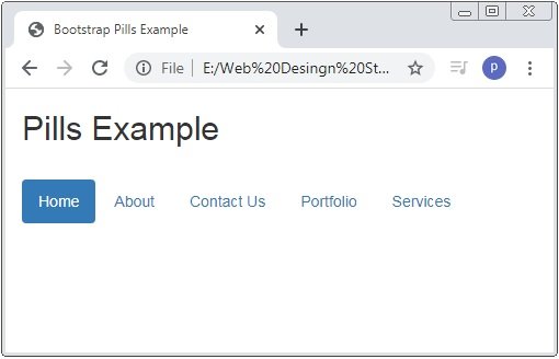
<h2>Pills Example</h2><br />
<ul class="nav nav-pills">
<li class="active"><a href="#">Home</a></li>
<li><a href="#">About</a></li>
<li><a href="#">Contact Us</a></li>
<li><a href="#">Portfolio</a></li>
<li><a href="#">Services</a></li>
</ul>
</div>
</body>
</html>
On the above code the class .nav & .nav-pills is used to create the pills with <ul> tag.
Vertical Pills
Pills are created normaly horizontally but if you want to create vertical pills used class .nav-stacked.
Example: 5 Bootstrap Vertical Pills Example
<!DOCTYPE html>
<html>
<head>
<title>Bootstrap Pills Example</title>
<!-- link the bootstrap online or through CDN -->
<link rel="stylesheet" href="https://maxcdn.bootstrapcdn.com/bootstrap/3.3.7/css/bootstrap.min.css" integrity="sha384-BVYiiSIFeK1dGmJRAkycuHAHRg32OmUcww7on3RYdg4Va+PmSTsz/K68vbdEjh4u" crossorigin="anonymous">
<script src="https://ajax.googleapis.com/ajax/libs/jquery/3.4.1/jquery.min.js"></script>
<script src="https://maxcdn.bootstrapcdn.com/bootstrap/3.4.1/js/bootstrap.min.js">
</script>
</head>
<body>
<div class="container">
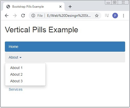
<h2>Vertical Pills Example</h2><br />
<ul class="nav nav-pills nav-stacked">
<li class="active"><a href="#">Home</a></li>
<li><a href="#">About</a></li>
<li><a href="#">Contact Us</a></li>
<li><a href="#">Portfolio</a></li>
<li><a href="#">Services</a></li>
</ul>
</div>
</body>
</html>
On the above code the class .nav, .nav-pills and nav-stacked is used to create the vertical pills.

Vertical Pills With Dropdown Menu
Pills is also created with the dropdown similar to tabs.
Example: 6 Bootstrap Vertical Pills With Dropdown Menu Example
<!DOCTYPE html>
<html>
<head>
    <title>Bootstrap Pills Example</title>
    <!-- link the bootstrap online or through CDN -->
    <link rel="stylesheet" href="https://maxcdn.bootstrapcdn.com/bootstrap/3.3.7/css/bootstrap.min.css" integrity="sha384-BVYiiSIFeK1dGmJRAkycuHAHRg32OmUcww7on3RYdg4Va+PmSTsz/K68vbdEjh4u" crossorigin="anonymous">
    <script src="https://ajax.googleapis.com/ajax/libs/jquery/3.4.1/jquery.min.js"></script>
 	<script src="https://maxcdn.bootstrapcdn.com/bootstrap/3.4.1/js/bootstrap.min.js">
  	</script>

</head>
<body>
	<div class="container">
		<h2>Vertical Pills Example</h2><br />
		<ul class="nav nav-pills nav-stacked">
			<li class="active"><a href="#">Home</a></li>
			<li class="dropdown">
				<a data-toggle="dropdown" class="dropdown-toogle" href="#">About
					<span class="caret"></span>
				</a>
				<ul class="dropdown-menu">
					<li><a href="#">About 1</a></li>
					<li><a href="#">About 2</a></li>
					<li><a href="#">About 3</a></li>
				</ul>
			</li>
			<li><a href="#">Contact Us</a></li>
			<li><a href="#">Portfolio</a></li>
			<li><a href="#">Services</a></li>
		</ul>
	</div>
</body>
</html>
On the above code the class .nav, .nav-pills and nav-stacked is used to create the vertical pills. And class .dropdown is used to create dropdown menus.
Centered Tabs and Pills
In bootstrap the class .nav-justified is used to create the centered tabs and pills.
Example: 7 Bootstrap Centered Tabs And Pills Example
<!DOCTYPE html>
<html>
<head>
    <title>Bootstrap Pills Example</title>
    <!-- link the bootstrap online or through CDN -->
    <link rel="stylesheet" href="https://maxcdn.bootstrapcdn.com/bootstrap/3.3.7/css/bootstrap.min.css" integrity="sha384-BVYiiSIFeK1dGmJRAkycuHAHRg32OmUcww7on3RYdg4Va+PmSTsz/K68vbdEjh4u" crossorigin="anonymous">
    <script src="https://ajax.googleapis.com/ajax/libs/jquery/3.4.1/jquery.min.js"></script>
 	<script src="https://maxcdn.bootstrapcdn.com/bootstrap/3.4.1/js/bootstrap.min.js">
  	</script>

</head>
<body>
	<div class="container">
		<h2>Centered Tabs Example</h2><br />
		<ul class="nav nav-tabs nav-justified">
			<li class="active"><a href="#">Home</a></li>
			<li><a href="#">About</a></li>
			<li><a href="#">Contact Us</a></li>
			<li><a href="#">Portfolio</a></li>
			<li><a href="#">Services</a></li>
		</ul>
			<h2>Centered Pills Example</h2><br />
		<ul class="nav nav-pills nav-justified">
			<li class="active"><a href="#">Home</a></li>
			<li><a href="#">About</a></li>
			<li><a href="#">Contact Us</a></li>
			<li><a href="#">Portfolio</a></li>
			<li><a href="#">Services</a></li>
		</ul>

	</div>
</body>
</html>

Toggleable / Dynamic Tabs
To create the toggleable tabs the data-toggle”tab” attribute is used. And class .tab-content ans class.tab-pane inside it to the <div> tag.
Example: 8 Toggleable / Dynamic Tabs Example
<!DOCTYPE html>
<html>
<head>
<title>Bootstrap Pills Example</title>
<!-- link the bootstrap online or through CDN -->
<link rel="stylesheet" href="https://maxcdn.bootstrapcdn.com/bootstrap/3.3.7/css/bootstrap.min.css" integrity="sha384-BVYiiSIFeK1dGmJRAkycuHAHRg32OmUcww7on3RYdg4Va+PmSTsz/K68vbdEjh4u" crossorigin="anonymous">
<script src="https://ajax.googleapis.com/ajax/libs/jquery/3.4.1/jquery.min.js"></script>
<script src="https://maxcdn.bootstrapcdn.com/bootstrap/3.4.1/js/bootstrap.min.js">
</script>
</head>
<body>
<div class="container">
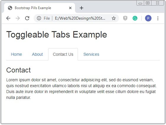
<h2>Toggleable Tabs Example</h2><br />
<ul class="nav nav-tabs">
<li class="active"><a data-toggle="tab" href="#home">Home</a></li>
<li><a data-toggle="tab" href="#about">About</a></li>
<li><a data-toggle="tab" href="#contact">Contact Us</a></li>
<li><a data-toggle="tab" href="#services">Services</a></li>
</ul>
<div class="tab-content">
<div class="tab-pane fade in active" id="home">
<h3>Home</h3>
<p>Lorem ipsum dolor sit amet, consectetur adipisicing elit, sed do eiusmod veniam, quis nostrud exercitation ullamco laboris nisi ut aliquip ex ea commodo consequat. Duis aute irure dolor in reprehenderit in voluptate velit esse cillum dolore eu fugiat nulla pariatur.</p>
</div>
<div class="tab-pane fade" id="about">
<h3>About</h3>
<p>Lorem ipsum dolor sit amet, consectetur adipisicing elit, sed do eiusmod veniam, quis nostrud exercitation ullamco laboris nisi ut aliquip ex ea commodo consequat. Duis aute irure dolor in reprehenderit in voluptate velit esse cillum dolore eu fugiat nulla pariatur.</p>
</div>
<div class="tab-pane fade" id="contact">
<h3>Contact</h3>
<p>Lorem ipsum dolor sit amet, consectetur adipisicing elit, sed do eiusmod veniam, quis nostrud exercitation ullamco laboris nisi ut aliquip ex ea commodo consequat. Duis aute irure dolor in reprehenderit in voluptate velit esse cillum dolore eu fugiat nulla pariatur.</p>
</div><div class="tab-pane fade" id="services">
<h3>Services</h3>
<p>Lorem ipsum dolor sit amet, consectetur adipisicing elit, sed do eiusmod veniam, quis nostrud exercitation ullamco laboris nisi ut aliquip ex ea commodo consequat. Duis aute irure dolor in reprehenderit in voluptate velit esse cillum dolore eu fugiat nulla pariatur.</p>
</div>
</div>
</div>
</body>
</html>
On the above code the class .tab-pane is wraped by the .tab-content class and with having a unique id. And the attribute data-toggle=”tab” to <a> tag.
Toggleable / Dynamic Pills
To create toggleable pills is similar to toggleable tabs but just one difference is that the value of attribute data-toggle=”pill” instead of “tab”.
Example: 9 Toggleable / Dynamic Pills Example
<!DOCTYPE html>
<html>
<head>
    <title>Bootstrap Pills Example</title>
    <!-- link the bootstrap online or through CDN -->
    <link rel="stylesheet" href="https://maxcdn.bootstrapcdn.com/bootstrap/3.3.7/css/bootstrap.min.css" integrity="sha384-BVYiiSIFeK1dGmJRAkycuHAHRg32OmUcww7on3RYdg4Va+PmSTsz/K68vbdEjh4u" crossorigin="anonymous">
    <script src="https://ajax.googleapis.com/ajax/libs/jquery/3.4.1/jquery.min.js"></script>
 	<script src="https://maxcdn.bootstrapcdn.com/bootstrap/3.4.1/js/bootstrap.min.js">
  	</script>

</head>
<body>
	<div class="container">
		<h2>Toggleable Pills Example</h2><br />
		<ul class="nav nav-pills">
			<li class="active"><a data-toggle="pill" href="#home">Home</a></li>
			<li><a data-toggle="pill" href="#about">About</a></li>
			<li><a data-toggle="pill" href="#contact">Contact Us</a></li>
			<li><a data-toggle="pill" href="#services">Services</a></li>
		</ul>
		<div class="tab-content">
			<div class="tab-pane fade in active" id="home">
				<h3>Home</h3>
				<p>Lorem ipsum dolor sit amet, consectetur adipisicing elit, sed do eiusmod veniam, quis nostrud exercitation ullamco laboris nisi ut aliquip ex ea commodo	consequat. Duis aute irure dolor in reprehenderit in voluptate velit esse cillum dolore eu fugiat nulla pariatur.</p>
			</div>
			<div class="tab-pane fade" id="about">
				<h3>About</h3>
				<p>Lorem ipsum dolor sit amet, consectetur adipisicing elit, sed do eiusmod veniam, quis nostrud exercitation ullamco laboris nisi ut aliquip ex ea commodo	consequat. Duis aute irure dolor in reprehenderit in voluptate velit esse cillum dolore eu fugiat nulla pariatur.</p>
			</div>
			<div class="tab-pane fade" id="contact">
				<h3>Contact</h3>
				<p>Lorem ipsum dolor sit amet, consectetur adipisicing elit, sed do eiusmod veniam, quis nostrud exercitation ullamco laboris nisi ut aliquip ex ea commodo	consequat. Duis aute irure dolor in reprehenderit in voluptate velit esse cillum dolore eu fugiat nulla pariatur.</p>
			</div><div class="tab-pane fade" id="services">
				<h3>Services</h3>
				<p>Lorem ipsum dolor sit amet, consectetur adipisicing elit, sed do eiusmod veniam, quis nostrud exercitation ullamco laboris nisi ut aliquip ex ea commodo	consequat. Duis aute irure dolor in reprehenderit in voluptate velit esse cillum dolore eu fugiat nulla pariatur.</p>
			</div>
		</div>

	</div>
</body>
</html>
On the above code the class .tab-pane is wraped by the .tab-content class and with having a unique id. And the attribute data-toggle=”pills” to <a> tag which is wraped by the <li> tag.

 Posted in
  Tags:
Tags: 


