 March 24th, 2020
  Prerana Kasar
 Bootstrap 3 Images
In Bootstrap 3 Images their different classes used to style the image. And also make the image attractive and responsive also. Here you also create an image gallery.
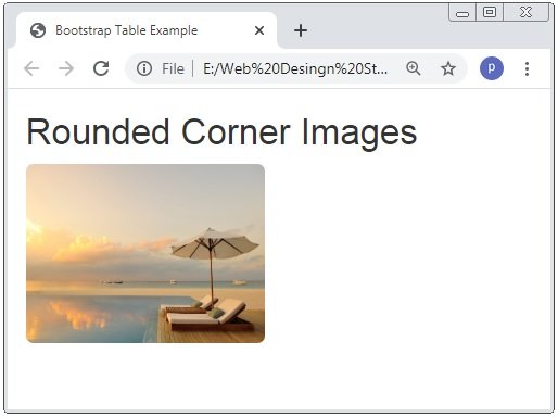
Bootstrap Rounded Corner Images
The .img-rounded class is used to make the corner round of any image.
Example: 1 Bootstrap Rounded Corner Image Example
<!DOCTYPE html>
<html>
<head>
    <title>Bootstrap Table Example</title>
    <!-- link the bootstrap online or through CDN -->
    <link rel="stylesheet" href="https://maxcdn.bootstrapcdn.com/bootstrap/3.3.7/css/bootstrap.min.css" integrity="sha384-BVYiiSIFeK1dGmJRAkycuHAHRg32OmUcww7on3RYdg4Va+PmSTsz/K68vbdEjh4u" crossorigin="anonymous">

</head>
<body>
   <div class="container">
       <h2>Rounded Corner Images</h2>
       <img src="Img/banner3.jpg" class="img-rounded" width="200" height="150">
    </div>
</body>
</html>
Here we apply class .img-rounded class to the <img> tag than the all corner of the image are round.
Bootstrap Circle Shape Images
The .img-circle class is used to make the shape of image is circular.
Example: 2 Bootstrap Circular Shape Image Example
<!DOCTYPE html>
<html>
<head>
    <title>Bootstrap Table Example</title>
    <!-- link the bootstrap online or through CDN -->
    <link rel="stylesheet" href="https://maxcdn.bootstrapcdn.com/bootstrap/3.3.7/css/bootstrap.min.css" integrity="sha384-BVYiiSIFeK1dGmJRAkycuHAHRg32OmUcww7on3RYdg4Va+PmSTsz/K68vbdEjh4u" crossorigin="anonymous">

</head>
<body>
   <div class="container">
       <h2>Circle Image</h2>
       <img src="Img/banner3.jpg" class="img-circle" width="150" height="150">
    </div>
</body>
</html>
Here we apply class .img-rounded class to the <img> tag than the all corner of the image are round.

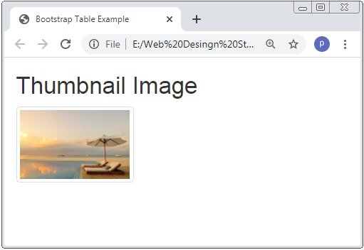
Bootstrap Thumbnail Images
The .img-thumbnail class is used to make a light boundary to all sides of the image and have some padding.
Example: 3 Bootstrap Thumbnail Shape Image Example
<!DOCTYPE html>
<html>
<head>
    <title>Bootstrap Table Example</title>
    <!-- link the bootstrap online or through CDN -->
    <link rel="stylesheet" href="https://maxcdn.bootstrapcdn.com/bootstrap/3.3.7/css/bootstrap.min.css" integrity="sha384-BVYiiSIFeK1dGmJRAkycuHAHRg32OmUcww7on3RYdg4Va+PmSTsz/K68vbdEjh4u" crossorigin="anonymous">

</head>
<body>
   <div class="container">
       <h2>Thumbnail Image</h2>
       <img src="Img/banner3.jpg" class="img-thumbnail" width="150" height="150">
    </div>
</body>
</html>
Here we apply class .img-thumbnail class to the <img> tag than the all sides of the image are around by the light border.
Bootstrap Responsive Images
The .img-responsive class is used to make images responsive. Where responsive means that the size of the image is resize according to the browser window.
Example: 4 Bootstrap Responsive Image Example
<!DOCTYPE html>
<html>
<head>
    <title>Bootstrap Table Example</title>
    <!-- link the bootstrap online or through CDN -->
    <link rel="stylesheet" href="https://maxcdn.bootstrapcdn.com/bootstrap/3.3.7/css/bootstrap.min.css" integrity="sha384-BVYiiSIFeK1dGmJRAkycuHAHRg32OmUcww7on3RYdg4Va+PmSTsz/K68vbdEjh4u" crossorigin="anonymous">

</head>
<body>
   <div class="container">
       <h2>Rsponsive Image</h2>
       <img src="Img/banner3.jpg" class="img-responsive" width="150" height="150">
    </div>
</body>
</html>
Here we apply class .img-responsive class to the <img> tag than the size of the image adjust according to the browser window.
Here if want to check the responsiveness of the image than you have the decrease the size of the browser’s window.
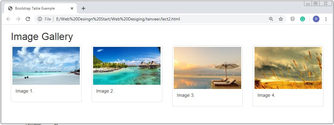
Bootstrap Image Gallery Or Bootstrap Image Grid
The bootstrap image gallery means that more than 2 images are added to the columns of grid system.
Lets we create the gallery of 4 number of images. In the 3
Example: 5 Bootstrap Image Gallery Example
<!DOCTYPE html>
<html>
<head>
    <title>Bootstrap Table Example</title>
    <!-- link the bootstrap online or through CDN -->
    <link rel="stylesheet" href="https://maxcdn.bootstrapcdn.com/bootstrap/3.3.7/css/bootstrap.min.css" integrity="sha384-BVYiiSIFeK1dGmJRAkycuHAHRg32OmUcww7on3RYdg4Va+PmSTsz/K68vbdEjh4u" crossorigin="anonymous">

</head>
<body>
   <div class="container">
       <h2>Image Gallery</h2>
       <div class="row">
       		<div class="col-md-3">
       			<div class="thumbnail">
       				<a href="Img/banner3.jpg" target="_blank">
       					<img src="Img/banner.jpg" width="100%">
       					<div class="caption">
       						<p>Image 1.</p>
       					</div>
       				</a>
       			</div>
       		</div>
       		<div class="col-md-3">
       			<div class="thumbnail">
       				<a href="Img/banner3.jpg" target="_blank">
       					<img src="Img/banner2.jpg" width="100%">
       					<div class="caption">
       						<p>Image 2.</p>
       					</div>
       				</a>
       			</div>
       		</div>
       		<div class="col-md-3">
       			<div class="thumbnail">
       				<a href="Img/banner3.jpg" target="_blank">
       					<img src="Img/banner3.jpg" width="100%">
       					<div class="caption">
       						<p>Image 3.</p>
       					</div>
       				</a>
       			</div>
       		</div>
       		<div class="col-md-3">
       			<div class="thumbnail">
       				<a href="Img/banner5.jpg" target="_blank">
       					<img src="Img/banner5.jpg" width="100%">
       					<div class="caption">
       						<p>Image 4.</p>
       					</div>
       				</a>
       			</div>
       		</div>
       </div>

    </div>
</body>
</html>
Here we apply class .img-responsive class to the <img> tag than the size of the image adjust according to the browser window.
Here if want to check the responsiveness of the image than you have the decrease the size of the browser’s window.
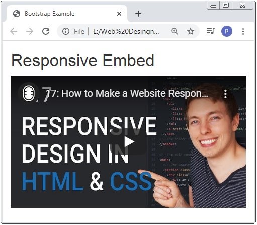
Bootstrap Responsive Embeds
The Bootstrap Responsive Embeds are used where we want responsive videos and slideshows embed which are based on the width of the parent and define the spect ratio to the container.
Here the classes embed-responsive and embed-responsive-12by7 are applied to the <iframe>, <embed>, <video> and <object> elements.
In the below code we use class .embed-responsive-item to the <iframe> tag and the ratio of 16:9.
Example: 6 Bootstrap Responsive Embeds Example
<!DOCTYPE html>
<html lang="en">
	<head>
		<title>Bootstrap Example</title>
		<link rel="stylesheet" href="https://maxcdn.bootstrapcdn.com/bootstrap/3.4.1/css/bootstrap.min.css">
		<script src="https://ajax.googleapis.com/ajax/libs/jquery/3.4.1/jquery.min.js"></script>
		<script src="https://maxcdn.bootstrapcdn.com/bootstrap/3.4.1/js/bootstrap.min.js"></script>
	</head>
<body>

	<div class="container">
  		<h2>Responsive Embed</h2>
 		<div class="embed-responsive embed-responsive-16by9">
    		<iframe class="embed-responsive-item" src="https://www.youtube.com/embed/ZYV6dYtz4HA"></iframe>
  		</div>
	</div>
</body>
</html>
Here we apply class .embed-responsive and .embed-responsive-16by9 class to the <iframe> tag and you have to check that this responsiveness of the video by the resizing of the browser windows.
 Posted in
  Tags:
Tags: 


