 April 1st, 2020
  Prerana Kasar
 Bootstrap Dropdowns
In bootstrap, dropdown means unfolding the menu items when required. The class .drowpdown is applied to the container tag.
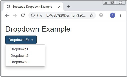
Example: 1 Bootstrap Dropdown Example
<!DOCTYPE html>
<html>
<head>
    <title>Bootstrap Dropdown Example</title>
    <!-- link the bootstrap online or through CDN -->
    <link rel="stylesheet" href="https://maxcdn.bootstrapcdn.com/bootstrap/3.3.7/css/bootstrap.min.css" integrity="sha384-BVYiiSIFeK1dGmJRAkycuHAHRg32OmUcww7on3RYdg4Va+PmSTsz/K68vbdEjh4u" crossorigin="anonymous">
    <script src="https://ajax.googleapis.com/ajax/libs/jquery/3.4.1/jquery.min.js"></script>
 	<script src="https://maxcdn.bootstrapcdn.com/bootstrap/3.4.1/js/bootstrap.min.js">
  	</script>

</head>
<body>
	<div class="container">
		<h2>Dropdown Example</h2>
		<div class="dropdown">
			<button class="btn btn-primary dropdown-toggle" type="button" data-toggle="dropdown">Dropdown Ex.
				<span class="caret"></span>
			</button>
			<ul class="dropdown-menu">
				<li><a href="#">Dropdown1</a></li>
				<li><a href="#">Dropdown2</a></li>
				<li><a href="#">Dropdown3</a></li>
			</ul>
		</div>
	</div>
</body>
</html>
On the above code, the class .dropdown to specify the dropdown menus and .dropdown-menu class is used to create the dropdown menu. Where the class .dropdown-toggle and data-toggle=”dropdown” is applied to open the dropdown menu.
Dropdown Divider
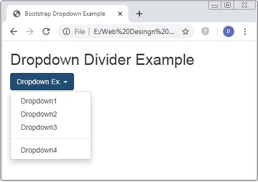
In bootstrap, the class .divider is used to create the partition line between the dropdown menu. It creates a light grey color horizontal line.
Example: 2 Bootstrap Dropdown Divider Example
<!DOCTYPE html>
<html>
<head>
    <title>Bootstrap Dropdown Example</title>
    <!-- link the bootstrap online or through CDN -->
    <link rel="stylesheet" href="https://maxcdn.bootstrapcdn.com/bootstrap/3.3.7/css/bootstrap.min.css" integrity="sha384-BVYiiSIFeK1dGmJRAkycuHAHRg32OmUcww7on3RYdg4Va+PmSTsz/K68vbdEjh4u" crossorigin="anonymous">
    <script src="https://ajax.googleapis.com/ajax/libs/jquery/3.4.1/jquery.min.js"></script>
 	<script src="https://maxcdn.bootstrapcdn.com/bootstrap/3.4.1/js/bootstrap.min.js">
  	</script>

</head>
<body>
	<div class="container">
		<h2>Dropdown Divider Example</h2>
		<div class="dropdown">
			<button class="btn btn-primary dropdown-toggle" type="button" data-toggle="dropdown">Dropdown Ex.
				<span class="caret"></span>
			</button>
			<ul class="dropdown-menu">
				<li><a href="#">Dropdown1</a></li>
				<li><a href="#">Dropdown2</a></li>
				<li><a href="#">Dropdown3</a></li>
				<li class="divider"></li>
				<li><a href="#">Dropdown4</a></li>
			</ul>
		</div>
	</div>
</body>
</html>
On the above code, the class .divider is applied to the <li> tag to create the partition line or divider between the list of menu..
Dropdown Header
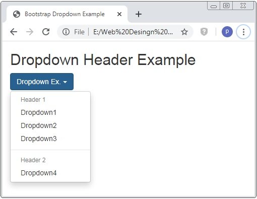
In bootstrap, the class .dropdown-header is used to create header of dropdown menu.
Example: 3 Bootstrap Dropdown Header Example
<!DOCTYPE html>
<html>
<head>
    <title>Bootstrap Dropdown Example</title>
    <!-- link the bootstrap online or through CDN -->
    <link rel="stylesheet" href="https://maxcdn.bootstrapcdn.com/bootstrap/3.3.7/css/bootstrap.min.css" integrity="sha384-BVYiiSIFeK1dGmJRAkycuHAHRg32OmUcww7on3RYdg4Va+PmSTsz/K68vbdEjh4u" crossorigin="anonymous">
    <script src="https://ajax.googleapis.com/ajax/libs/jquery/3.4.1/jquery.min.js"></script>
 	<script src="https://maxcdn.bootstrapcdn.com/bootstrap/3.4.1/js/bootstrap.min.js">
  	</script>

</head>
<body>
	<div class="container">
		<h2>Dropdown Header Example</h2>
		<div class="dropdown">
			<button class="btn btn-primary dropdown-toggle" type="button" data-toggle="dropdown">Dropdown Ex.
				<span class="caret"></span>
			</button>
			<ul class="dropdown-menu">
				<li class="dropdown-header">Header 1</li>
				<li><a href="#">Dropdown1</a></li>
				<li><a href="#">Dropdown2</a></li>
				<li><a href="#">Dropdown3</a></li>
				<li class="divider"></li>
				<li class="dropdown-header">Header 2</li>
				<li><a href="#">Dropdown4</a></li>
			</ul>
		</div>
	</div>
</body>
</html>
On the above code, the class .dropdown-header is applied to the <li> tag to create the header of the dropdown.
Disable and Active items of Dropdown
In bootstrap, the classes .disabled and .active is used to specify the item of the dropdown menu is opened and unable to open it.
Example: 4 Bootstrap Disable and Active items of Dropdown Example
<!DOCTYPE html>
<html>
<head>
    <title>Bootstrap Dropdown Example</title>
    <!-- link the bootstrap online or through CDN -->
    <link rel="stylesheet" href="https://maxcdn.bootstrapcdn.com/bootstrap/3.3.7/css/bootstrap.min.css" integrity="sha384-BVYiiSIFeK1dGmJRAkycuHAHRg32OmUcww7on3RYdg4Va+PmSTsz/K68vbdEjh4u" crossorigin="anonymous">
    <script src="https://ajax.googleapis.com/ajax/libs/jquery/3.4.1/jquery.min.js"></script>
 	<script src="https://maxcdn.bootstrapcdn.com/bootstrap/3.4.1/js/bootstrap.min.js">
  	</script>

</head>
<body>
	<div class="container">
		<h2>Disable and Active items Example</h2>
		<div class="dropdown">
			<button class="btn btn-primary dropdown-toggle" type="button" data-toggle="dropdown">Dropdown Ex.
				<span class="caret"></span>
			</button>
			<ul class="dropdown-menu">
				<li><a href="#">Dropdown1</a></li>
				<li class="disabled"><a href="#">Dropdown2</a></li>
				<li><a href="#">Dropdown3</a></li>
				<li class="active"><a href="#">Dropdown4</a></li>
			</ul>
		</div>
	</div>
</body>
</html>
On the above code, the class .disabled is applied to the <li> tag to create the unclickable dropdown menu and class .active is to specify the opened dropdown menu.

Dropdown Position
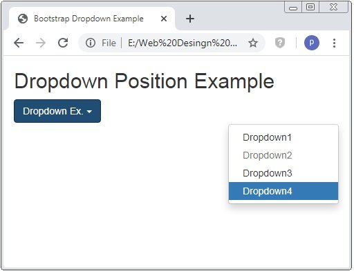
In bootstrap, we also positioned the dropdown menus. The class .dropdown-menu-right is used opened dropdown menus to the right side.
Example: 5 Bootstrap Dropdown Position Example
<!DOCTYPE html>
<html>
<head>
    <title>Bootstrap Dropdown Example</title>
    <!-- link the bootstrap online or through CDN -->
    <link rel="stylesheet" href="https://maxcdn.bootstrapcdn.com/bootstrap/3.3.7/css/bootstrap.min.css" integrity="sha384-BVYiiSIFeK1dGmJRAkycuHAHRg32OmUcww7on3RYdg4Va+PmSTsz/K68vbdEjh4u" crossorigin="anonymous">
    <script src="https://ajax.googleapis.com/ajax/libs/jquery/3.4.1/jquery.min.js"></script>
 	<script src="https://maxcdn.bootstrapcdn.com/bootstrap/3.4.1/js/bootstrap.min.js">
  	</script>

</head>
<body>
	<div class="container">
		<h2>Dropdown Position Example</h2>
		<div class="dropdown">
			<button class="btn btn-primary dropdown-toggle" type="button" data-toggle="dropdown">Dropdown Ex.
				<span class="caret"></span>
			</button>
			<ul class="dropdown-menu dropdown-menu-right">
				<li><a href="#">Dropdown1</a></li>
				<li class="disabled"><a href="#">Dropdown2</a></li>
				<li><a href="#">Dropdown3</a></li>
				<li class="active"><a href="#">Dropdown4</a></li>
			</ul>
		</div>
	</div>
</body>
</html>
On the above code, the class .dropdown-menu-right is applied to the <uli> tag to opened dropdown right side. The below image shows how the dropdown menu is opened.
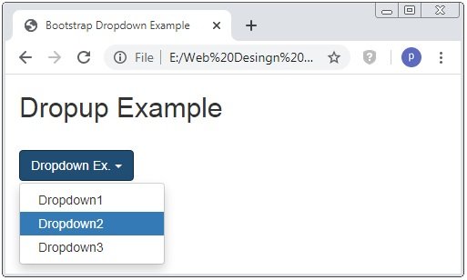
Dropup
Bootstrap provides the the class .dropup to open the dropdown menu upwards instead of downwards.
Example: 6 Bootstrap Dropup Example
<!DOCTYPE html>
<html>
<head>
    <title>Bootstrap Dropdown Example</title>
    <!-- link the bootstrap online or through CDN -->
    <link rel="stylesheet" href="https://maxcdn.bootstrapcdn.com/bootstrap/3.3.7/css/bootstrap.min.css" integrity="sha384-BVYiiSIFeK1dGmJRAkycuHAHRg32OmUcww7on3RYdg4Va+PmSTsz/K68vbdEjh4u" crossorigin="anonymous">
    <script src="https://ajax.googleapis.com/ajax/libs/jquery/3.4.1/jquery.min.js"></script>
 	<script src="https://maxcdn.bootstrapcdn.com/bootstrap/3.4.1/js/bootstrap.min.js">
  	</script>

</head>
<body>
	<div class="container">
		<h2>Dropup Example</h2><br />
		<div class="dropup">
			<button class="btn btn-primary dropdown-toggle" type="button" data-toggle="dropdown">Dropdown Ex.
				<span class="caret"></span>
			</button>
			<ul class="dropdown-menu">
				<li><a href="#">Dropdown1</a></li>
				<li class="active"><a href="#">Dropdown2</a></li>
				<li><a href="#">Dropdown3</a></li>
			</ul>
		</div>
	</div>
</body>
</html>
On the above code, the class .dropup is applied to the <divi> tag instead of class .dropdown.

Dropdown Accessibility
Bootstrap provides the attribute such as role and aria improve the accessibility for the people.
Example: 7 Bootstrap Dropdown Accessibility Example
<!DOCTYPE html>
<html>
<head>
    <title>Bootstrap Dropdown Example</title>
    <!-- link the bootstrap online or through CDN -->
    <link rel="stylesheet" href="https://maxcdn.bootstrapcdn.com/bootstrap/3.3.7/css/bootstrap.min.css" integrity="sha384-BVYiiSIFeK1dGmJRAkycuHAHRg32OmUcww7on3RYdg4Va+PmSTsz/K68vbdEjh4u" crossorigin="anonymous">
    <script src="https://ajax.googleapis.com/ajax/libs/jquery/3.4.1/jquery.min.js"></script>
 	<script src="https://maxcdn.bootstrapcdn.com/bootstrap/3.4.1/js/bootstrap.min.js">
  	</script>

</head>
<body>
	<div class="container">
		<h2>Dropup Example</h2><br />
		<div class="dropdown">
			<button class="btn btn-primary dropdown-toggle" type="button" data-toggle="dropdown">Dropdown Ex.
				<span class="caret"></span>
			</button>
			<ul class="dropdown-menu" role="menu" aria-labelledby="menu1">
				<li role="presentation"><a role="menuitem" href="#">Dropdown1</a></li>
				<li role="presentation" class="active"><a role="menuitem" href="#">Dropdown2</a></li>
				<li role="presentation"><a role="menuitem" href="#">Dropdown3</a></li>
			</ul>
		</div>
	</div>
</body>
</html>
On the above code, role and aria arribute is used to improve the accessibility.
 Posted in
  Tags:
Tags: 


