 April 17th, 2020
  Prerana Kasar
 Bootstrap Form Inputs
Bootstrap inputs classes enhance look and feel of the all HTML5 input types like text, password, textarea, radio, checkbox etc.
Example: 1 Bootstrap Inputs Example
<!DOCTYPE html>
<html>
<head>
    <title>Bootstrap Inputs Example</title>
    <!-- link the bootstrap online or through CDN -->
    <link rel="stylesheet" href="https://maxcdn.bootstrapcdn.com/bootstrap/3.3.7/css/bootstrap.min.css" integrity="sha384-BVYiiSIFeK1dGmJRAkycuHAHRg32OmUcww7on3RYdg4Va+PmSTsz/K68vbdEjh4u" crossorigin="anonymous">
    <script src="https://ajax.googleapis.com/ajax/libs/jquery/3.4.1/jquery.min.js"></script>
 	<script src="https://maxcdn.bootstrapcdn.com/bootstrap/3.4.1/js/bootstrap.min.js">
  	</script>

</head>
<body>
	<div class="container">
		<h2>Bootstrap Inputs Example</h2>
		<form action="#">
			<div class="form-group">
				<label for="usr">Name:</label>
				<input type="text" class="form-control" placeholder="Enter your name">
			</div>
			<div class="form-group">
				<label for="email">Email Id:</label>
				<input type="email" class="form-control" placeholder="Enter your email id">
			</div>
			<div class="form-group">
				<label for="password">Password:</label>
				<input type="password" class="form-control" placeholder="Enter your password">
			</div>
			<button type="submit" class="btn btn-primary">Submit</button>
		</form>
	</div>
</body>
</html>
Here we use the <form> tag with the input types text, email and password. Class .form-control is applied to the input tag to enhance the style of input types.

Bootstrap Textarea
Bootstrap enhance the look of the textarea input type with lightgrey color border and adjustable size.
Example: 2 Bootstrap Textarea Example
<!DOCTYPE html>
<html>
<head>
    <title>Bootstrap Forms Example</title>
    <!-- link the bootstrap online or through CDN -->
    <link rel="stylesheet" href="https://maxcdn.bootstrapcdn.com/bootstrap/3.3.7/css/bootstrap.min.css" integrity="sha384-BVYiiSIFeK1dGmJRAkycuHAHRg32OmUcww7on3RYdg4Va+PmSTsz/K68vbdEjh4u" crossorigin="anonymous">
    <script src="https://ajax.googleapis.com/ajax/libs/jquery/3.4.1/jquery.min.js"></script>
 	<script src="https://maxcdn.bootstrapcdn.com/bootstrap/3.4.1/js/bootstrap.min.js">
  	</script>

</head>
<body>
	<div class="container">
		<h2>Bootstrap Textarea Example</h2>
		<form action="#">
			<div class="form-group">
				<label for="usr">Name:</label>
				<input type="text" class="form-control" placeholder="Enter your name">
			</div>
			<div class="form-group">
				<label for="email">Email Id:</label>
				<input type="email" class="form-control" placeholder="Enter your email id">
			</div>
			<div class="form-group">
				<label for="text">Address</label>
				<textarea class="form-control"></textarea>
			</div>
			<button type="submit" class="btn btn-primary">Submit</button>
		</form>
	</div>
</body>
</html>
Here we use the <textarea> tag with class form-control to create the textarea where user put the large numbers of word like address comments etc.

Bootstrap Checkboxes
Bootstrap provides the class .checkbox to create the checkboxes. Checkboxes is used to select the options. To create linear checkbox apply the .checkbox-inline.
Example: 3 Bootstrap Checkboxes Example
<!DOCTYPE html>
<html>
<head>
    <title>Bootstrap Forms Example</title>
    <!-- link the bootstrap online or through CDN -->
    <link rel="stylesheet" href="https://maxcdn.bootstrapcdn.com/bootstrap/3.3.7/css/bootstrap.min.css" integrity="sha384-BVYiiSIFeK1dGmJRAkycuHAHRg32OmUcww7on3RYdg4Va+PmSTsz/K68vbdEjh4u" crossorigin="anonymous">
    <script src="https://ajax.googleapis.com/ajax/libs/jquery/3.4.1/jquery.min.js"></script>
 	<script src="https://maxcdn.bootstrapcdn.com/bootstrap/3.4.1/js/bootstrap.min.js">
  	</script>

</head>
<body>
	<div class="container">
		<h2>Bootstrap Checkbox Example</h2>
		<h4>Select the milk containing product</h4>
		<form action="#">
			<div class="checkbox">
				<label><input type="checkbox">Milk</label>
			</div>
			<div class="checkbox">
				<label><input type="checkbox">Curd</label>
			</div>
			<div class="checkbox">
				<label><input type="checkbox">Cake</label>
			</div>
			<div class="checkbox">
				<label><input type="checkbox">Chips</label>
			</div>
		</form>
	</div>
</body>
</html>
Here we use the input type checkbox which is wrapped by the container tag with class .checkbox.

Caution: The class .checkbox-inline is used to create the liner checkboxes or options are in a line only.
Example: 4 Bootstrap Inline Checkboxes Example
<!DOCTYPE html>
<html>
<head>
<title>Bootstrap Forms Example</title>
<!-- link the bootstrap online or through CDN -->
<link rel="stylesheet" href="https://maxcdn.bootstrapcdn.com/bootstrap/3.3.7/css/bootstrap.min.css" integrity="sha384-BVYiiSIFeK1dGmJRAkycuHAHRg32OmUcww7on3RYdg4Va+PmSTsz/K68vbdEjh4u" crossorigin="anonymous">
<script src="https://ajax.googleapis.com/ajax/libs/jquery/3.4.1/jquery.min.js"></script>
<script src="https://maxcdn.bootstrapcdn.com/bootstrap/3.4.1/js/bootstrap.min.js">
</script>
</head>
<body>
<div class="container">
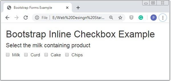
<h2>Bootstrap Inline Checkbox Example</h2>
<h4>Select the milk containing product</h4>
<form action="#">
<label class="checkbox-inline"><input type="checkbox">Milk</label>
<label class="checkbox-inline"><input type="checkbox">Curd</label>
<label class="checkbox-inline"><input type="checkbox">Cake</label>
<label class="checkbox-inline"><input type="checkbox">Chips</label>
</form>
</div>
</body>
</html>
Here we apply the .checkbox-inline instead of the class .checkbox. The above code is used to create the checkbox inline.
Bootstrap Radio Buttons
To select only one option radio button is used. The class .radio is applied to the container tag. And the input type radio is used.
Example: 5 Bootstrap Radio Buttons Example
<!DOCTYPE html>
<html>
<head>
<title>Bootstrap Forms Example</title>
<!-- link the bootstrap online or through CDN -->
<link rel="stylesheet" href="https://maxcdn.bootstrapcdn.com/bootstrap/3.3.7/css/bootstrap.min.css" integrity="sha384-BVYiiSIFeK1dGmJRAkycuHAHRg32OmUcww7on3RYdg4Va+PmSTsz/K68vbdEjh4u" crossorigin="anonymous">
<script src="https://ajax.googleapis.com/ajax/libs/jquery/3.4.1/jquery.min.js"></script>
<script src="https://maxcdn.bootstrapcdn.com/bootstrap/3.4.1/js/bootstrap.min.js">
</script>
</head>
<body>
<div class="container">
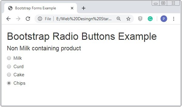
<h2>Bootstrap Radio Buttons Example</h2>
<h4>Non Milk containing product</h4>
<form action="#">
<div class="radio">
<label><input type="radio">Milk</label>
</div>
<div class="radio">
<label><input type="radio">Curd</label>
</div>
<div class="radio">
<label><input type="radio">Cake</label>
</div>
<div class="radio">
<label><input type="radio">Chips</label>
</div>
</form>
</div>
</body>
</html>
On the above code the input type radio is used with the class .radio to the container tag and below imag shows the radio button.
Warning: Similarly to .checkbox-inline class, the class radio-inline is used to create the linear radio button .
Bootstrap Select List
The select list is used to pick or short-out the options. The value of for attribute sell is used to pick only one option where as <select> tag with multiple attribute is applied to select the multiple options of the given list.
Example: 6 Bootstrap Select List Example
<!DOCTYPE html>
<html>
<head>
    <title>Bootstrap Forms Example</title>
    <!-- link the bootstrap online or through CDN -->
    <link rel="stylesheet" href="https://maxcdn.bootstrapcdn.com/bootstrap/3.3.7/css/bootstrap.min.css" integrity="sha384-BVYiiSIFeK1dGmJRAkycuHAHRg32OmUcww7on3RYdg4Va+PmSTsz/K68vbdEjh4u" crossorigin="anonymous">
    <script src="https://ajax.googleapis.com/ajax/libs/jquery/3.4.1/jquery.min.js"></script>
 	<script src="https://maxcdn.bootstrapcdn.com/bootstrap/3.4.1/js/bootstrap.min.js">
  	</script>

</head>
<body>
	<div class="container">
		<h2>Bootstrap Select List Example</h2><br>
		<form action="#">
			<div class="form-group">
				<label>Single Select List</label>
				<select class="form-control">
					<option>First</option>
					<option>Second</option>
					<option>Third</option>
					<option>Fourth</option>
					<option>Fifth</option>
					<option>Sixth</option>
				</select>
			</div>
		</form>
	</div>
</body>
</html>
On the above code select tag is used with the class .form-control. Here we only pick one option only from the list.

Multiple Select List
Example: 7 Bootstrap Multiple Select List Example
<!DOCTYPE html>
<html>
<head>
    <title>Bootstrap Forms Example</title>
    <!-- link the bootstrap online or through CDN -->
    <link rel="stylesheet" href="https://maxcdn.bootstrapcdn.com/bootstrap/3.3.7/css/bootstrap.min.css" integrity="sha384-BVYiiSIFeK1dGmJRAkycuHAHRg32OmUcww7on3RYdg4Va+PmSTsz/K68vbdEjh4u" crossorigin="anonymous">
    <script src="https://ajax.googleapis.com/ajax/libs/jquery/3.4.1/jquery.min.js"></script>
 	<script src="https://maxcdn.bootstrapcdn.com/bootstrap/3.4.1/js/bootstrap.min.js">
  	</script>

</head>
<body>
	<div class="container">
		<h2>Bootstrap Select List Example</h2><br>
		<form action="#">
			<div class="form-group">
				<label>Multiple Select List</label>
				<select multiple class="form-control">
					<option>First</option>
					<option>Second</option>
					<option>Third</option>
					<option>Fourth</option>
					<option>Fifth</option>
					<option>Sixth</option>
				</select>
			</div>
		</form>
	</div>
</body>
</html>
On the above code select tag is used with the class .form-control. Here we pick out multiple list items with the use of multiple attribute.

 Posted in
  Tags:
Tags: 


