 May 15th, 2020
  Prerana Kasar
 Bootstrap Scrollspy
The bootstrap scrollspy is used to automatically change of navigation link when the page is scroll down. The attribute data-spy with value scroll is applied to the body.
Example: 1 Bootstrap Scrollspy Example
<!DOCTYPE html>
<html>
<head>
    <title>Bootstrap Media Objects Example</title>
    <!-- link the bootstrap online or through CDN -->
    <link rel="stylesheet" href="https://maxcdn.bootstrapcdn.com/bootstrap/3.3.7/css/bootstrap.min.css" integrity="sha384-BVYiiSIFeK1dGmJRAkycuHAHRg32OmUcww7on3RYdg4Va+PmSTsz/K68vbdEjh4u" crossorigin="anonymous">
    <script src="https://ajax.googleapis.com/ajax/libs/jquery/3.4.1/jquery.min.js"></script>
 	<script src="https://maxcdn.bootstrapcdn.com/bootstrap/3.4.1/js/bootstrap.min.js">
  	</script>
  	<style>
  		body
  		{
  			position: relative;
  		}
  		#section1
  		{
  			padding-top: 50px;
  			height: 300px;
  			background-color: blue;
  			color: white;
  		}
  		#section2
  		{
  			padding-top: 50px;
  			height: 300px;
  			background-color: green;
  			color: white;
  		}
  		#section3
  		{
  			padding-top: 50px;
  			height: 300px;
  			background-color: teal;
  			color: white;
  		}
  		#section4
  		{
  			padding-top: 50px;
  			height: 300px;
  			background-color: yellow;
  			color: white;
  		}
  	</style>
</head>
<body data-spy="scroll" data-target=".navbar">
	<nav class="navbar navbar-inverse navbar-fixed-top">
		<div class="container-fluid">
			<div class="navbar-header">
				<button type="button" class="navbar-toggle" data-target="collapse" data-target="#myNavbar">
					<span class="icon-bar"></span>
          			<span class="icon-bar"></span>
         			<span class="icon-bar"></span>
				</button>
			</div>
		</div>
		<div class="collapse navbar-collapse" id="myNavbar">
			<ul class="nav navbar-nav">
          		<li><a href="#section1">Home</a></li>
          		<li><a href="#section2">About</a></li>
          		<li><a href="#section3">Contact Us</a></li>
                <li><a href="#section4">Portfolio</a></li>
            </ul>
		</div>
	</nav>
	<div id="section1" class="container-fluid">
  		<h1>Home</h1>
  		<p>Lorem ipsum dolor sit amet, consectetur adipisicing elit, sed do eiusmod
  		tempor incididunt ut labore et dolore magna aliqua. Ut enim ad minim veniam,
  		quis nostrud exercitation ullamco laboris nisi.</p>
	</div>
	<div id="section2" class="container-fluid">
  		<h1>About</h1>
  		<p>Lorem ipsum dolor sit amet, consectetur adipisicing elit, sed do eiusmod
  		tempor incididunt ut labore et dolore magna aliqua. Ut enim ad minim veniam,
  		quis nostrud exercitation ullamco laboris nisi.</p>
	</div>
	<div id="section3" class="container-fluid">
  		<h1>Contact Us</h1>
  		<p>Lorem ipsum dolor sit amet, consectetur adipisicing elit, sed do eiusmod
  		tempor incididunt ut labore et dolore magna aliqua. Ut enim ad minim veniam,
  		quis nostrud exercitation ullamco laboris nisi.</p>
	</div>
	<div id="section4" class="container-fluid">
  		<h1>Portfolio</h1>
  		<p>Lorem ipsum dolor sit amet, consectetur adipisicing elit, sed do eiusmod
  		tempor incididunt ut labore et dolore magna aliqua. Ut enim ad minim veniam,
  		quis nostrud exercitation ullamco laboris nisi.</p>
	</div>
</body>
</html>
On the above code the attribute data-spy is applied to the body tag and make target to the nav tag.

On the above example the attribute data-spy with the value scroll is applied to the body tag. Than apply data-target attribute with a value of class applied to the navigation bar.
The scrollable element must have match the Id of links of navigation bar item list.
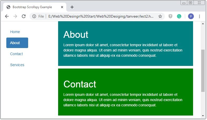
Scrollspy Vertical Menu
Scrollspy Vertical menu have vertical navigation-bar with the scrollspy functionality.
Example: 2 Bootstrap Vertical Menu Scrollspy Example
<!DOCTYPE html>
<html>
<head>
    <title>Bootstrap Media Objects Example</title>
    <!-- link the bootstrap online or through CDN -->
    <link rel="stylesheet" href="https://maxcdn.bootstrapcdn.com/bootstrap/3.3.7/css/bootstrap.min.css" integrity="sha384-BVYiiSIFeK1dGmJRAkycuHAHRg32OmUcww7on3RYdg4Va+PmSTsz/K68vbdEjh4u" crossorigin="anonymous">
    <script src="https://ajax.googleapis.com/ajax/libs/jquery/3.4.1/jquery.min.js"></script>
 	<script src="https://maxcdn.bootstrapcdn.com/bootstrap/3.4.1/js/bootstrap.min.js">
  	</script>
  	<style type="text/css">
  		body
  		{
  			position: relative;
  		}
  		#section1
  		{
  			padding-top: 50px;
  			height: 300px;
  			background-color: blue;
  			color: white;
  		}
  		#section2
  		{
  			padding-top: 50px;
  			height: 300px;
  			background-color: green;
  			color: white;
  		}
  		#section3
  		{
  			padding-top: 50px;
  			height: 300px;
  			background-color: teal;
  			color: white;
  		}
  		#section4
  		{
  			padding-top: 50px;
  			height: 300px;
  			background-color: yellow;
  			color: white;
  		}
  	</style>
</head>
<body data-spy="scroll" data-target=".navbar">
	<nav class="navbar navbar-inverse navbar-fixed-top">
		<div class="container-fluid">
			<div class="navbar-header">
				<button type="button" class="navbar-toggle" data-target="collapse" data-target="#myNavbar">
					<span class="icon-bar"></span>
          			<span class="icon-bar"></span>
         			<span class="icon-bar"></span>
				</button>
			</div>
		</div>
		<div class="collapse navbar-collapse" id="myNavbar">
			<ul class="nav navbar-nav">
          		<li><a href="#section1">Home</a></li>
          		<li><a href="#section2">About</a></li>
          		<li><a href="#section3">Contact Us</a></li>
                <li><a href="#section4">Portfolio</a></li>
            </ul>
		</div>
	</nav>
	<div id="section1" class="container-fluid">
  		<h1>Home</h1>
  		<p>Lorem ipsum dolor sit amet, consectetur adipisicing elit, sed do eiusmod
  		tempor incididunt ut labore et dolore magna aliqua. Ut enim ad minim veniam,
  		quis nostrud exercitation ullamco laboris nisi.</p>
	</div>
	<div id="section2" class="container-fluid">
  		<h1>About</h1>
  		<p>Lorem ipsum dolor sit amet, consectetur adipisicing elit, sed do eiusmod
  		tempor incididunt ut labore et dolore magna aliqua. Ut enim ad minim veniam,
  		quis nostrud exercitation ullamco laboris nisi.</p>
	</div>
	<div id="section3" class="container-fluid">
  		<h1>Contact Us</h1>
  		<p>Lorem ipsum dolor sit amet, consectetur adipisicing elit, sed do eiusmod
  		tempor incididunt ut labore et dolore magna aliqua. Ut enim ad minim veniam,
  		quis nostrud exercitation ullamco laboris nisi.</p>
	</div>
	<div id="section4" class="container-fluid">
  		<h1>Portfolio</h1>
  		<p>Lorem ipsum dolor sit amet, consectetur adipisicing elit, sed do eiusmod
  		tempor incididunt ut labore et dolore magna aliqua. Ut enim ad minim veniam,
  		quis nostrud exercitation ullamco laboris nisi.</p>
	</div>
</body>
</html>
On the above code the attribute data-spy is applied to the body tag and make target to the nav tag.
 Posted in
  Tags:
Tags: 


