 April 18th, 2019
  Nilesh Chaurasia
 CSS Forms Design
CSS form design is used to change the look and feel of the HTML Form by the use of some CSS Properties.
Example 1 – Basic HTML form with input text box, and submit button
<!DOCTYPE html>
<html>
  <head>
	<style>

	</style>
  </head>

  <body>
	<div>
	  <form>
		<label for="fname">First Name</label>
		<input type="text" id="fname" name="firstname" placeholder="Your name..">
		<input type="submit" value="Submit">
	  </form>
	</div>
  </body>
</html>
In the above code, we used two input fields one is an input text box and another is a submit button.
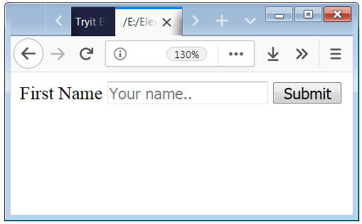
The above screenshot shows how the default form looks.
If you want to change the look and feel of the default HTML Form so you have to apply some particular CSS Properties on the input box and submit button.
Example 2 – HTML forms style with basic CSS properties
<!DOCTYPE html>
<html>
  <head>
  	<style>
		.form
		{
			background-color: #FACC5F;
			 padding: 10px;
		}
		input[type=text]
		{
			width: 100%;
			padding: 7px 10px;
			margin: 6px 0;
			display: inline-block;
			border: 1px solid black;
			border-radius: 4px;
			box-sizing: border-box;
			font-Weight: 100;
			font-size: 15px;
		}
		form label
		{
			font-Weight: 800;
			font-size: 20px;
		}
		input[type=submit]
		{
			width: 120px;
			margin: 0 auto;
			background-color:grey;
			color: white;
			padding: 10px 15px;
			border: none;
			border-radius: 4px;
		}
		.submit
		{
			text-align:center;
		}
	</style>
  </head>

  <body>
	<div class="form">
	  <form>
		<label for="fname">First Name</label>
		<input type="text" id="fname" name="firstname" placeholder="Your First Name..">
		<label for="lname">Last Name</label>
		<input type="text" id="lname" name="lastname" placeholder="Your Last Name..">
		<div class="submit"><input type="submit" value="Submit"></div>
	  </form>
	</div>
  </body>
</html>
In the above code, we have used CSS Properties to enhance the look of the HTML Form.

HTML Form Drop Down Design Example
The below code shows how to apply the CSS Properties to design the Drop-Down input form element.
Example 3 – Style a Drop Down element.
<!DOCTYPE html>
<html>
  <head>
  	<style>
		.dropdown
		{
			font-size: 14px;
			height: 35px;
			width: 420px
			background-color: red;
		}
		select
		{
			background-color: #add3a0;
		}
	</style>
  </head>

  <body>
	<div class="form">
	  <form>
	     <select name="Result" id="Result" class="dropdown">
			<option value="0">Please Select One Option</option>
			<option value="1">First Class</option>
			<option value="2">Second Class</option>
			<option value="3">Third Class</option>
			<option value="4">Fourth Class</option>
			<option value="5">Others</option>
		 </select>
	  </form>
	</div>
  </body>
</html>
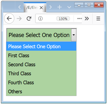
You also change the color of the options. The below code is used to apply the color to the options.
Example 4 – Drop-Down style with colors
<!DOCTYPE html>
<html>
  <head>
  	<style>
		.dropdown
		{
			font-size: 14px;
			height: 35px;
			width: 220px
		}
		select
		{
			background-color: #308b7d;
		}
		select option[value="0"]
		{
			background-color:   #117868;
		}
		select option[value="1"]
		{
			background-color:  #249281;
		}
		select option[value="2"]
		{
			background-color:  #34a997;
		}
		select option[value="3"]
		{
			background-color:  #49ceb9;
		}
		select option[value="4"]
		{
			background-color: #79e5d4;
		}
		select option[value="5"]
		{
			background-color: #93ebde;
		}
	</style>
  </head>

  <body>
	<div class="form">
	  <form>
	     <select name="Result" id="Result" class="dropdown">
			<option value="0">Please Select One Option</option>
			<option value="1">First Class</option>
			<option value="2">Second Class</option>
			<option value="3">Third Class</option>
			<option value="4">Fourth Class</option>
			<option value="5">Others</option>
		 </select>
	  </form>
	</div>
  </body>
</html>

HTML Input Type Textarea Design Examples
Textarea is not an input type. It is a tag <textarea>. Textarea means that area where you can write a message.
Example 5 – Textarea HTML tag design
<!DOCTYPE html>
<html>
  <head>
  	<style>
		textarea
		{
			height: 100px;
			padding: 10px 15px;
			border: 2px solid darkblack;
			background-color: white;
			font-size: 14px;
			resize: vertical;
		}
	</style>
  </head>

  <body>
	<div>
	  <form>
	    <textarea>Write Some text here.....</textarea>
	  </form>
	</div>
  </body>
</html>
In the above code, we apply some css properties to the <textarea> tag to improve the looks.

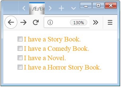
HTML Checkbox Design Example with CSS Style Property
The default look of the checkbox is not appealing, with the use of CSS Properties you can improve the look and feel of checkbox.
Example 6 – Checkbox design example
<!DOCTYPE html>
<html>
  <head>
  	<style>
		.checkbox
		{
			padding-left: 17px;
			margin-bottom: 10px;
			font-size: 14px;
			color: orange;
			cursor: pointer;
		}
	</style>
  </head>

  <body>
	<div>
	  <form>
	    <label class="checkbox">
			<input type="checkbox" name="book1" value="Story">I have a Story Book.
		</label>
			<br />
		<label class="checkbox">
			<input type="checkbox" name="book2" value="Comedy">I have a Comedy Book.
		</label>
			<br />
		<label class="checkbox">
			<input type="checkbox" name="book3" value="Novel">I have a Novel.
		</label>
			<br />
		<label class="checkbox">
			<input type="checkbox" name="book4" value="Horror">I have a Horror Story Book.
		</label>
	  </form>
	</div>
  </body>
</html>
In the above code, we apply some css properties to the checkbox box input.
Radio Button Input Design with CSS
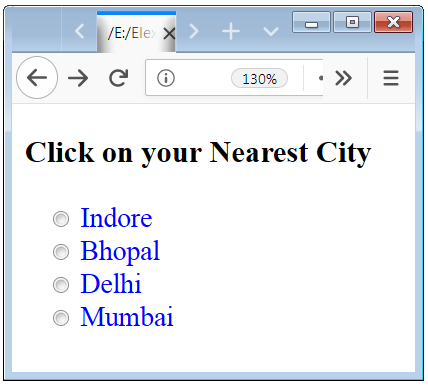
The default visualization of the Radio Button is not appealing, with the use of CSS Properties you can improve the visualization of Radio Button.
Example 7 – Radio Button design example with CSS Style Properties
<!DOCTYPE html>
<html>
  <head>
  	<style>
		.radio
		{
			padding-left: 12px;
			margin-bottom: 8px;
			font-size: 17px;
			color: blue;
			cursor: pointer;
		}
	</style>
  </head>

  <body>
	<div>
	  <form>
	   <h3>Click on your Nearest City</h3>
	    <label class="radio">
			<input type="radio" name="city" value="Indore"> Indore
		</label>
			<br />
		<label class="radio">
			 <input type="radio" name="city" value="Bhopal"> Bhopal
		</label>
			<br />
		<label class="radio">
			<input type="radio" name="city" value="Delhi"> Delhi
		</label>
			<br />
		<label class="radio">
			<input type="radio" name="city" value="Mumbai"> Mumbai
		</label>
	  </form>
	</div>
  </body>
</html>
In the above code, we apply some css properties to the Radio buttons.
 Posted in
  Tags:
Tags: 


