CSS Border Property
CSS Border is used to apply border to an HTML Elements. With the help of CSS Border we can provide box effect on an HTML Element. All the HTML Element by default displayed without Border.
With the help of Border Property we can change the color, width and style of an HTML Element Border.
Example 1 – Border Basic Code with p HTML tag.
<!DOCTYPE html>
<html>
  <head>
    <style>
	   p
		{
		 color:darkblack;
		 background-color:lightblue;
		 border:4px solid orange;
		}
	</style>
  </head>
  <body>
    <div>
		<p>
		 Lorem ipsum dolor sit amet, consectetur adipiscing elit, sed do eiusmod tempor incididunt ut labore et
		</p>
	</div>
  </body>
</html>
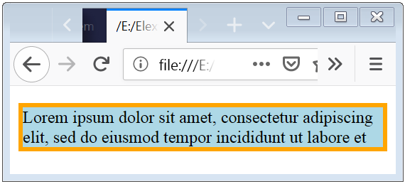
The above syntax shows that how can you apply the border to an HTML Element.
The bellow image shows the result of applying border and here a paragraph and has border of 4px and this border is showing by the color orange.
CSS Border Style Color Radius Width
CSS Border Style is used to specify that, which type of border design should be displayed.
Border Style
| Border Style Designs | Description |
|---|---|
| solid | This shows a straight-line design. |
| dotted | This shows a dotted-line design. |
| dashed | This shows a dashed-line design. |
| double | This shows a double-line design. |
| groove | This shows a 3D groove-line design. |
| inset | This shows a 3D inset-line design. |
| ridge | This shows a 3D ridge-line design. |
| outset | This shows a 3D outset-line design. |
| none | This shows no line design. |
| hidden | This shows a hidden-line design. |
| mix | This shows a mix-line design. |
Example 2 – Different Border Style options and uses
<!DOCTYPE html>
<html>
  <head>
    <style>
		.solid
		{
		 border:1px solid olive;
		}
		.dotted
		{
		  border-style: dotted;
		}
		.dashed
		{
		  border-style: dashed;
		}
		.double
		{
		  border-style: double;
		}
		.groove
		{
		  border-style: groove;
		}
		.ridge
		{
		  border-style: ridge;
		}
		.inset
		{
		  border-style: inset;
		}
		.outset
		{
		  border-style: outset;
		}
		.none
		{
		  border-style: none;
		}
		.hidden
		{
		  border-style: hidden;
		}
		.mix
		{
		  border-style: solid dashed ridge dotted;
		}
	</style>
  </head>
  <body>
    <div>
		<p class="solid">This is a solid  border.</p>
		<p class="dotted">This is a dotted  border.</p>
		<p class="dashed">This is a dashed  border.</p>
		<p class="double">This is a double  border.</p>
		<p class="groove">This is a groove  border.</p>
		<p class="ridge">This is a ridge  border.</p>
		<p class="inset">This is a inset  border.</p>
		<p class="outset">This is a outset  border.</p>
		<p class="mix">This is a mix  border.</p>
		<p class="none">This is a none  border.</p>
		<p class="hidden">This is a hidden  border.</p>
	</div>
  </body>
</html>
The above code shows various designs of border. And bellow is the result of the upper code.
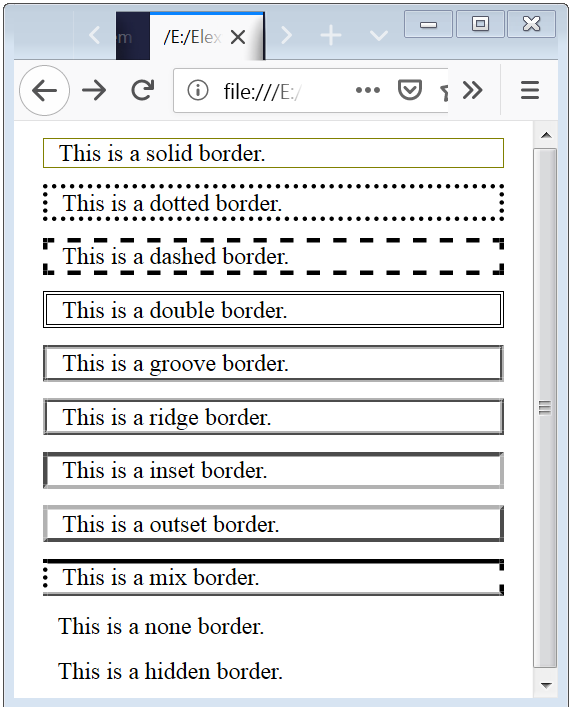
Caution: It is necessary to declare the border-style, because without declaration of border-style the border will not display, it remain transparent.
Border Color
CSS Border Color is used to apply different-different color on the border design.
You can apply Border Color by 3 ways:
- name – specify a color by the name, such as “green”
- RGB – specify a color by the RGB value, such as “rgb(0,128,0)”
- Hex – specify a color by the Hex value, such as “#008000”
Note: If you put only one value to border-color than by default it will apply all four sides of border. But when you put 4 value than color will apply (top-border, right-border, bottom-border, left-border) respectively.
Example 3 – Border Color Property Syntax to improve look and feel
<!DOCTYPE html>
<html>
  <head>
    <style>
	.first
	{
		border-style: solid;
		border-color: lime;
	}
	.second
	{
		border-style: solid;
		border-color: lime red yellow blue;
	}
	</style>
  </head>
  <body>
    <div>
		<p class="first">This is a solid  border with lime color.</p>
		<p class="second">This is a solid  border with 4 color lime on top, red on right, yellow on bottom, blue on left border.</p>
	</div>
  </body>
</html>
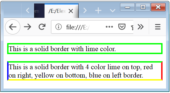
The above syntax is used to apply color ob border.
The second syntax shows that how can you apply different-different color on the border’s four side (top-border, right-border, bottom-border, left-border).
Border Width
CSS Border Width Property is used to specify width of the border of an HTML Element.
If you put only one value to border-width than by default it will apply all four sides of border. But when you put 4 value than width will apply (top-border, right-border, bottom-border, left-border) respectively.
Example 4 – Border Width Syntax
<!DOCTYPE html>
<html>
  <head>
    <style>
    .first
    {
        border-style: solid;
        border-color: lime;
		border-width: 6px;
    }
    .second
    {
        border-style: solid;
        border-color: lime red yellow blue;
		border-width: 6px 7px 8px 9px;
    }
    </style>
  </head>
  <body>
    <div>
        <p class="first">This is a solid  border of width 6px with lime color.</p>
        <p class="second">This is a solid  border with 4 color and 4 width lime on top of width 6px, red on right of width 7px, yellow on bottom of width 8px, blue on left border of width 9px.</p>
    </div>
  </body>
</html>
The above syntax is used to apply width of border.
The second syntax shows that how can you apply different-different width on the border’s four side (top-border, right-border, bottom-border, left-border).
Border Radius
CSS Border Radius Property is used to specify radius of the border’s corner of an HTML Element.
Default border corner’s of the HTML Element is right angle, but with the help of the Border Radius Property you can set the corner’s of the border rounded.
If you put only one value to border-radius than by default it will apply all four sides of border. But when you put 4 value than radius will apply (top-border, right-border, bottom-border, left-border) respectively.
Example 5 – Border Radius Syntax
<!DOCTYPE html>
<html>
  <head>
    <style>
    .first
    {
        border: 3px solid blue;
       	border-radius: 15px;
    }
    .second
    {
        border: 3px solid blue;
        border-radius: 10px 13px 16px 19px;
    }
    </style>
  </head>
  <body>
    <div>
        <p class="first">This is a solid  border of radius 15 px.</p>
        <p class="second">This is a solid  border with 4 value radius than first value apply to the top-left corner, second value apply to the top-right corner, third value apply to the right-bottom corner, fourth value apply to the left-bottom corner of an HTML Element.</p>
    </div>
  </body>
</html>
The above syntax is used to apply radius of border.
The second syntax shows that how can you apply different-different radius on the border’s four side (top-border, right-border, bottom-border, left-border).
CSS Border Top Bottom Left Right
Border Top Property is a shorthand property. Border Top Property is used to apply style, color, width and radius to the top side of border.
Example 6 – Border Top Example Syntax
<!DOCTYPE html>
<html>
  <head>
    <style>
    .first
    {
        border-top-style: solid;
        border-top-color: orange;
        border-top-width: 5px;
        border-top-left-radius: 10px;
        border-top-right-radius: 10px;
    }
    .second
    {
        border-top: 4px solid lime;
        border-top-left-radius: 15px;
        border-top-right-radius: 15px;
    }
    </style>
  </head>
  <body>
    <div>
        <p class="first">This is a solid  border .</p>
        <p class="second">This is an another solid  border.</p>
    </div>
  </body>
</html>
The above syntax is used to apply shorthand property for top of border.
The second syntax shows another way of shorthand property where first value is for width, second value is for style, and third value is for color.
Border Bottom
Border Bottom Property is a shorthand property. Border Bottom Property is used to apply style, color, width and radius to the Bottom side of border
Example 7 – Border Bottom Syntax Property
<!DOCTYPE html>
<html>
  <head>
    <style>
    .first
    {
        border-bottom-style: solid;
       	border-bottom-color: green;
		border-bottom-width: 4px;
		border-bottom-left-radius: 10px;
		border-bottom-right-radius: 10px;
    }
    .second
    {
        border-bottom: 4px solid blue;
       	border-bottom-left-radius: 10px;
		border-bottom-right-radius: 10px;
    }
    </style>
  </head>
  <body>
    <div>
        <p class="first">This is a solid  border .</p>
        <p class="second">This is also a solid  border.</p>
    </div>
  </body>
</html>
The above syntax is used to apply shorthand property for bottom of border.
The second syntax shows another way of shorthand property where first value is for width, second value is for style, and third value is for color.
Border Left
Border Left Property is a shorthand property. Border Left Property is used to apply color, width, style and radius to the Left side of border
Example 8 – Border Left Syntax
<!DOCTYPE html>
<html>
  <head>
    <style>
    .first
    {
        border-left-style: solid;
       	border-left-color: lime;
		border-left-width: 4px;
		border-bottom-left-radius: 17px;
		border-top-left-radius: 15px;
   }
    .second
    {
        border-left: 4px solid blue;
       	border-bottom-left-radius: 10px;
		border-top-left-radius: 15px;
    }
    </style>
  </head>
  <body>
    <div>
        <p class="first">This is a solid  border of color lime .</p>
        <p class="second">This is also another solid border of color blue.</p>
    </div>
  </body>
</html>
The above syntax is used to apply shorthand property for left of border.
The second syntax shows another way of shorthand property where first value is for width, second value is for style, and third value is for color.
Border Right
Border Right Property is a shorthand property. Border Right Property is used to apply color, width, style and radius to the Right side of border
Example 9 – Border Right Syntax
<!DOCTYPE html>
<html>
  <head>
    <style>
    .first
    {
        border-right-style: solid;
       	border-right-color: green;
		border-right-width: 4px;
		border-bottom-right-radius: 10px;
		border-top-right-radius: 10px;
   }
    .second
    {
        border-right: 4px dotted blue;
       	border-bottom-right-radius: 15px;
		border-top-right-radius: 10px;
    }
    </style>
  </head>
  <body>
    <div>
        <p class="first">This is a yellow color  border .</p>
        <p class="second">This is a dotted blue color border.</p>
    </div>
  </body>
</html>
The above syntax is used to apply shorthand property for right of border.
CSS Box Examples
<!DOCTYPE html><html>
  <head>
    <style>
    .first
    {
        border-top-style: solid;
        border-top-color: yellow;
        border-top-width: 15px;

		border-bottom-style: solid;
        border-bottom-color: green;
        border-bottom-width: 25px;

		border-left-style: solid;
        border-left-color: red;
        border-left-width: 30px;

		border-right-style: solid;
        border-right-color: blue;
        border-right-width: 20px;

	}
	.second
	{
		border: 4px solid black;
		border-bottom-right-radius: 13px;
        border-top-right-radius: 25px;
		border-bottom-left-radius: 25px;
        border-top-left-radius: 13px;
		padding: 10px;

	}
	.third
	{
		border: 5px solid black;
		border-bottom-right-radius: 20px;
        border-top-right-radius: 4px;
		border-bottom-left-radius: 20px;
        border-top-left-radius: 4px;
		padding: 10px;
	}

    </style>
  </head>
  <body>
    <div>
        <p class="first">Lorem ipsum ute irure dolor in reprehenderit in voluptate velit esse cillum dolore eu fugiat nulla pariatur. Excepteur sint occaecat cupidatat non proident.</p>
		<p class="second">Lorem ipsum ute irure dolor in reprehenderit in voluptate velit esse cillum dolore eu fugiat nulla pariatur. Excepteur sint occaecat cupidatat non proident.</p>
		<p class="third">Lorem ipsum ute irure dolor in reprehenderit sunt in culpa qui officia deserunt mollit anim id est laborum.Lorem ipsum cillum dolore eu fugiat nulla pariatur.</p>
    </div>
	</body>
</html>
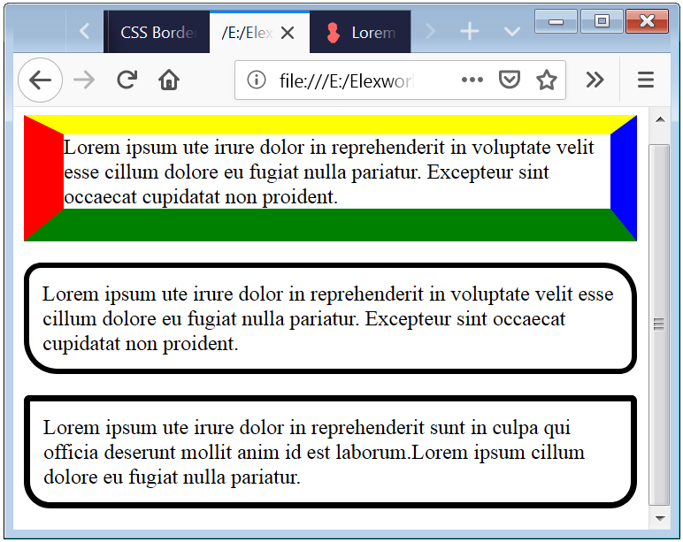
The above code shows the shorthand property for the border.
The second and third style is the best application of the Radius Border property. Means that how and where you can use this Border Properties.

 March 6th, 2019
  Nilesh Chaurasia
  Posted in
  Tags:
Tags: 

Woah! I’m really enjoying the template/theme of this blog. It’s simple, yet effective. A lot of times it’s hard to get that “perfect balance” between usability and visual appearance. I must say you’ve done a superb job with this. Also, the blog loads very fast for me on Firefox. Outstanding Blog!