 June 10th, 2020
  Prerana Kasar
 Bootstrap 4 Progress Bars
The progress bar is used to know about the completion of the work. Bootstrap 4 provides the class to enhance the look and feel of the normal progress bar.
The class .progress and .progress-bar is used to create the progress bar.
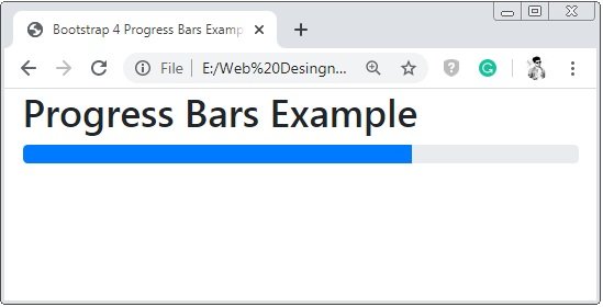
Example 1 – Bootstrap 4 Progress Bar Example
<!DOCTYPE html>
<html>
<head>
    <title>Bootstrap 4 Progress Bars Example</title>
	<!-- link the bootstrap online or through CDN -->
	<link rel="stylesheet" href="https://maxcdn.bootstrapcdn.com/bootstrap/4.5.0/css/bootstrap.min.css">
	<script src="https://ajax.googleapis.com/ajax/libs/jquery/3.5.1/jquery.min.js"></script>
 	<script src="https://cdnjs.cloudflare.com/ajax/libs/popper.js/1.16.0/umd/popper.min.js"></script>
  	<script src="https://maxcdn.bootstrapcdn.com/bootstrap/4.5.0/js/bootstrap.min.js"></script>
</head>
<body>
	<div class="container-fluid">
	  	<h2>Progress Bar Example</h2>
        <div class="progress">
        	<div class="progress-bar" style="width:70%;">

        	</div>
        </div>
    </div>
</body>
</html>
On the above code, we apply the class .progress is applied to the parent container element and class .progress-bar is applied to the child element. And properties width and height are used to set the width and the height of the progress bar.
Bootstrap 4 Progress Bar Labels
To show the percentag of the of the progress bar inside in it.
Example 2 – Bootstrap 4 Progress Bar Labels Example
<!DOCTYPE html>
<html>
<head>
    <title>Bootstrap 4 Progress Bars Example</title>
	<!-- link the bootstrap online or through CDN -->
	<link rel="stylesheet" href="https://maxcdn.bootstrapcdn.com/bootstrap/4.5.0/css/bootstrap.min.css">
	<script src="https://ajax.googleapis.com/ajax/libs/jquery/3.5.1/jquery.min.js"></script>
 	<script src="https://cdnjs.cloudflare.com/ajax/libs/popper.js/1.16.0/umd/popper.min.js"></script>
  	<script src="https://maxcdn.bootstrapcdn.com/bootstrap/4.5.0/js/bootstrap.min.js"></script>
</head>
<body>
	<div class="container-fluid">
	  	<h2>Progress Bar Example</h2>
        <div class="progress">
        	<div class="progress-bar" style="width:70%;">
        		70%
        	</div>
        </div>
    </div>
</body>
</html>
On the above code the value of the progress bar is passes to the child progress bar container.

Bootstrap 4 Colored Progress Bar
Using the background-color classes to the progress bar, the color of the progress by changed to the default color(blue) of the progress bar.
Example 3 – Bootstrap 4 Colored Progress Bar Example
<!DOCTYPE html>
<html>
<head>
    <title>Bootstrap 4 Progress Bars Example</title>
	<!-- link the bootstrap online or through CDN -->
	<link rel="stylesheet" href="https://maxcdn.bootstrapcdn.com/bootstrap/4.5.0/css/bootstrap.min.css">
	<script src="https://ajax.googleapis.com/ajax/libs/jquery/3.5.1/jquery.min.js"></script>
 	<script src="https://cdnjs.cloudflare.com/ajax/libs/popper.js/1.16.0/umd/popper.min.js"></script>
  	<script src="https://maxcdn.bootstrapcdn.com/bootstrap/4.5.0/js/bootstrap.min.js"></script>
</head>
<body>
	<div class="container-fluid">
	  	<h2>Colored Progress Bar Example</h2>
        <div class="progress">
        	<div class="progress-bar bg-success" style="width:40%;">
        		40%
        	</div>
        </div><br>
        <div class="progress">
        	<div class="progress-bar bg-info" style="width:55%;">
        		55%
        	</div>
        </div><br>
        <div class="progress">
        	<div class="progress-bar bg-warning" style="width:70%;">
        		70%
        	</div>
        </div>
    </div>
</body>
</html>
On the above code, we apply a class of background-color to the progress bar container, the colored of the progress bar will be changing as per the applied background-color.

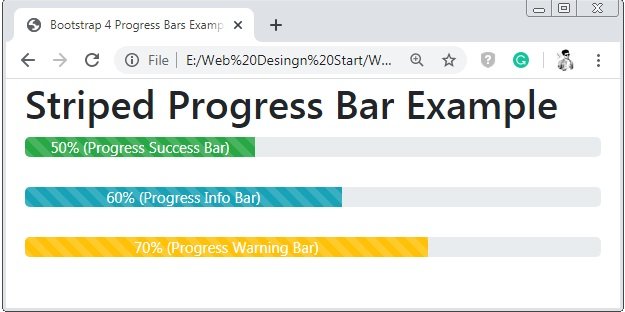
Bootstrap 4 Striped Progress Bar
The class .progress-bar-striped is used to create the stripes to the progress bar.
Example 4 – Bootstrap 4 Striped Progress Bar Example
<!DOCTYPE html>
<html>
<head>
    <title>Bootstrap 4 Progress Bars Example</title>
	<!-- link the bootstrap online or through CDN -->
	<link rel="stylesheet" href="https://maxcdn.bootstrapcdn.com/bootstrap/4.5.0/css/bootstrap.min.css">
	<script src="https://ajax.googleapis.com/ajax/libs/jquery/3.5.1/jquery.min.js"></script>
 	<script src="https://cdnjs.cloudflare.com/ajax/libs/popper.js/1.16.0/umd/popper.min.js"></script>
  	<script src="https://maxcdn.bootstrapcdn.com/bootstrap/4.5.0/js/bootstrap.min.js"></script>
</head>
<body>
	<div class="container-fluid">
	  	<h2>Striped Progress Bar Example</h2>
        <div class="progress">
        	<div class="progress-bar bg-success progress-bar-striped" style="width:40%;">
        		50% (Progress Success Bar)
        	</div>
        </div><br>
        <div class="progress">
        	<div class="progress-bar bg-info progress-bar-striped" style="width:55%;">
        		60% (Progress Info Bar)
        	</div>
        </div><br>
        <div class="progress">
        	<div class="progress-bar bg-warning progress-bar-striped" style="width:70%;">
        		70% (Progress Warning Bar)
        	</div>
        </div>
    </div>
</body>
</html>
On the above code, we apply a class .progress-bar-striped to the progress-bar container to create stripes to the progress-bar.
Bootstrap 4 Animated Progress Bar
The class .progress-bar-striped is used to create the stripes to the progress bar and it is a static striped to make it as ran the class .progress-bar-animated is used.
Example 5 – Bootstrap 4 Animated Progress Bar Example
<!DOCTYPE html>
<html>
<head>
    <title>Bootstrap 4 Progress Bars Example</title>
	<!-- link the bootstrap online or through CDN -->
	<link rel="stylesheet" href="https://maxcdn.bootstrapcdn.com/bootstrap/4.5.0/css/bootstrap.min.css">
	<script src="https://ajax.googleapis.com/ajax/libs/jquery/3.5.1/jquery.min.js"></script>
 	<script src="https://cdnjs.cloudflare.com/ajax/libs/popper.js/1.16.0/umd/popper.min.js"></script>
  	<script src="https://maxcdn.bootstrapcdn.com/bootstrap/4.5.0/js/bootstrap.min.js"></script>
</head>
<body>
	<div class="container-fluid">
	  	<h2>Animated Striped Progress Bar Example</h2>
        <div class="progress">
        	<div class="progress-bar bg-success progress-bar-striped progress-bar-animated" style="width:40%;">
        		50% (Progress Success Bar)
        	</div>
        </div><br>
        <div class="progress">
        	<div class="progress-bar bg-info progress-bar-striped progress-bar-animated" style="width:55%;">
        		60% (Progress Info Bar)
        	</div>
        </div><br>
        <div class="progress">
        	<div class="progress-bar bg-warning progress-bar-striped progress-bar-animated" style="width:70%;">
        		70% (Progress Warning Bar)
        	</div>
        </div>
    </div>
</body>
</html>
On the above code, we apply a class .progress-bar-striped and class .progress-bar-animated is applied to the progress-bar container to create animated stripes to the progress-bar.

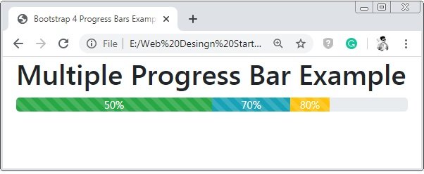
Bootstrap 4 Multiple Progress Bar
To create the multiple progress bar in the single-bar or stacked progress-bar.
Example 6 – Bootstrap 4 Multiple Progress Bar Example
<!DOCTYPE html>
<html>
<head>
    <title>Bootstrap 4 Progress Bars Example</title>
	<!-- link the bootstrap online or through CDN -->
	<link rel="stylesheet" href="https://maxcdn.bootstrapcdn.com/bootstrap/4.5.0/css/bootstrap.min.css">
	<script src="https://ajax.googleapis.com/ajax/libs/jquery/3.5.1/jquery.min.js"></script>
 	<script src="https://cdnjs.cloudflare.com/ajax/libs/popper.js/1.16.0/umd/popper.min.js"></script>
  	<script src="https://maxcdn.bootstrapcdn.com/bootstrap/4.5.0/js/bootstrap.min.js"></script>
</head>
<body>
	<div class="container-fluid">
	  	<h2>Multiple Progress Bar Example</h2>
        <div class="progress">
        	<div class="progress-bar bg-success progress-bar-striped progress-bar-animated" style="width:50%;">
        		50%
        	</div>
        <br>
        	<div class="progress-bar bg-info progress-bar-striped progress-bar-animated" style="width:20%;">
        		70%
        	</div>
       <br>
        	<div class="progress-bar bg-warning progress-bar-striped progress-bar-animated" style="width:10%;">
        		80%
        	</div>
        </div>
    </div>
</body>
</html>
On the above code, we apply all the progress bar container into the single progress container to create a multiple or stacked progress bar.
 Posted in
  Tags:
Tags: 


