 June 5th, 2020
  Prerana Kasar
 Bootstrap 4 Images
Boostrap 4 provides some classes to enhance the style of the image. And also make attractive and responsive. Here you also change the shaps of the images.
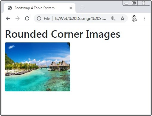
Bootstrap 4 Rounded Images Corners
The class .rounded is used to make the shape of the corner rounded.
Example 1 – Bootstrap 4 Rounded Images Corners Example
<!DOCTYPE html>
<html>
<head>
    <title>Bootstrap 4 Images System</title>
    <!-- link the bootstrap online or through CDN -->
    <link rel="stylesheet" href="https://maxcdn.bootstrapcdn.com/bootstrap/4.5.0/css/bootstrap.min.css">
 	<script src="https://ajax.googleapis.com/ajax/libs/jquery/3.5.1/jquery.min.js"></script>
  	<script src="https://cdnjs.cloudflare.com/ajax/libs/popper.js/1.16.0/umd/popper.min.js"></script>
  	<script src="https://maxcdn.bootstrapcdn.com/bootstrap/4.5.0/js/bootstrap.min.js"></script>
</head>
<body>
    <div class="container" style="padding: 10px;">
    	<h2>Rounded Corner Images</h2>
       <img src="Img/banner2.jpg" class="rounded" width="200" height="150">
    </div>
</body>
</html>
Here we apply the class .rounded is applied to the image tag <img>. The below image shows the corners of the inside image is rounded.
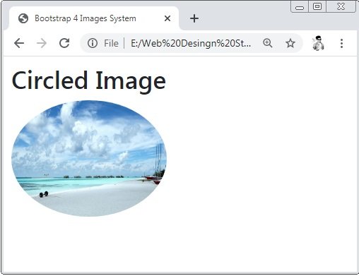
Bootstrap 4 Circle Images
The class .rounded-circle is used to make the shape of the image is a circle
Example 2 – Bootstrap 4 Circle Images Example
<!DOCTYPE html>
<html>
<head>
    <title>Bootstrap 4 Images System</title>
    <!-- link the bootstrap online or through CDN -->
    <link rel="stylesheet" href="https://maxcdn.bootstrapcdn.com/bootstrap/4.5.0/css/bootstrap.min.css">
 	<script src="https://ajax.googleapis.com/ajax/libs/jquery/3.5.1/jquery.min.js"></script>
  	<script src="https://cdnjs.cloudflare.com/ajax/libs/popper.js/1.16.0/umd/popper.min.js"></script>
  	<script src="https://maxcdn.bootstrapcdn.com/bootstrap/4.5.0/js/bootstrap.min.js"></script>
</head>
<body>
    <div class="container" style="padding: 10px;">
    	<h2>Circled Image</h2>
       <img src="Img/banner.jpg" class="rounded-circle" width="200" height="150">
    </div>
</body>
</html>
Here we apply the class .rounded-circle is applied to the image tag <img>. The below image shows the shape of the inside image is circled.
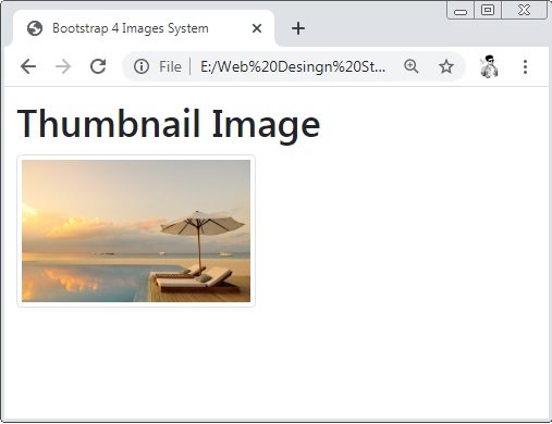
Bootstrap 4 Thumbnail Images
The class .img-thumbnail is used to make a light-grey color boundary to all sides of the image.
Example 3 – Bootstrap 4 Thumbnail Images Example
<!DOCTYPE html>
<html>
<head>
    <title>Bootstrap 4 Images System</title>
    <!-- link the bootstrap online or through CDN -->
    <link rel="stylesheet" href="https://maxcdn.bootstrapcdn.com/bootstrap/4.5.0/css/bootstrap.min.css">
 	<script src="https://ajax.googleapis.com/ajax/libs/jquery/3.5.1/jquery.min.js"></script>
  	<script src="https://cdnjs.cloudflare.com/ajax/libs/popper.js/1.16.0/umd/popper.min.js"></script>
  	<script src="https://maxcdn.bootstrapcdn.com/bootstrap/4.5.0/js/bootstrap.min.js"></script>
</head>
<body>
    <div class="container" style="padding: 10px;">
    	<h2>Thumbnail Image</h2>
       <img src="Img/banner3.jpg" class="img-thumbnail" width="200" height="150">
    </div>
</body>
</html>
Here we apply the class .img-thumbnail is applied to the image tag <img>. The below image shows the shape of the inside image has light-grey color bordered to all side of the image..
Bootstrap 4 Images Alignment
To align the image left or right the classess .float-left for left alignment and .float-right for right alignment.
Example 4 – Bootstrap 4 Images Alignment Example
<!DOCTYPE html>
<html>
<head>
    <title>Bootstrap 4 Images System</title>
    <!-- link the bootstrap online or through CDN -->
    <link rel="stylesheet" href="https://maxcdn.bootstrapcdn.com/bootstrap/4.5.0/css/bootstrap.min.css">
 	<script src="https://ajax.googleapis.com/ajax/libs/jquery/3.5.1/jquery.min.js"></script>
  	<script src="https://cdnjs.cloudflare.com/ajax/libs/popper.js/1.16.0/umd/popper.min.js"></script>
  	<script src="https://maxcdn.bootstrapcdn.com/bootstrap/4.5.0/js/bootstrap.min.js"></script>
</head>
<body>
    <div class="container">
    	<h2>Left Alignment Image</h2>
       	<img src="Img/banner3.jpg" class="img-thumbnail float-left" width="200" height="150">
       	<h2 style="text-align: right;">Right Alignment Image</h2>
       	<img src="Img/banner2.jpg" class="img-thumbnail float-right" width="200" height="150">
    </div>
</body>
</html>
Here we apply the class .float-left and .float-right to the image tag. The below image shows the alignment of the image.

Bootstrap 4 Centered Images
To align the image center the classes .mx-auto and .d-block bot are used. Here .mx-auto is for margin:auto; and .d-block is for display: block;
Example 5 – Bootstrap 4 Centered Images Example
<!DOCTYPE html>
<html>
<head>
    <title>Bootstrap 4 Images System</title>
    <!-- link the bootstrap online or through CDN -->
    <link rel="stylesheet" href="https://maxcdn.bootstrapcdn.com/bootstrap/4.5.0/css/bootstrap.min.css">
 	<script src="https://ajax.googleapis.com/ajax/libs/jquery/3.5.1/jquery.min.js"></script>
  	<script src="https://cdnjs.cloudflare.com/ajax/libs/popper.js/1.16.0/umd/popper.min.js"></script>
  	<script src="https://maxcdn.bootstrapcdn.com/bootstrap/4.5.0/js/bootstrap.min.js"></script>
</head>
<body>
    <div class="container">
    	<h2>Centered Alignment Image</h2>
       	<img src="Img/banner3.jpg" class="mx-auto d-block" width="200" height="150">
    </div>
</body>
</html>
Here we apply the class .mx-auto and d-block are applied to image tag to make image alignment centerd.

Bootstrap 4 Responsive Images
The class .img-fluid is used to make the class fully responsive which means that the full image will adjust in sizes of screen.
Example 6 – Bootstrap 4 Responsive Images Example
<!DOCTYPE html>
<html>
<head>
    <title>Bootstrap 4 Images System</title>
    <!-- link the bootstrap online or through CDN -->
    <link rel="stylesheet" href="https://maxcdn.bootstrapcdn.com/bootstrap/4.5.0/css/bootstrap.min.css">
 	<script src="https://ajax.googleapis.com/ajax/libs/jquery/3.5.1/jquery.min.js"></script>
  	<script src="https://cdnjs.cloudflare.com/ajax/libs/popper.js/1.16.0/umd/popper.min.js"></script>
  	<script src="https://maxcdn.bootstrapcdn.com/bootstrap/4.5.0/js/bootstrap.min.js"></script>
</head>
<body>
    <div class="container">
    	<h2>Responsive Image</h2>
       	<img src="Img/banner3.jpg" class="img-fluid" width="200" height="150">
    </div>
</body>
</html>
Here we apply the class .img-fluid is applied to the image tag to make the image responsive. To check the responsive image you have to change the size of the browser’s window.
 Posted in
  Tags:
Tags: 


