 April 17th, 2019
  Nilesh Chaurasia
 CSS Text Shadow Property
CSS Text Shadow property is used to produce a shadow effect to the text.
This property is used to make an artistic text and through this, you can enhance the look of the website.
Example 1- Shadow Property effect in the h2 tag
<!DOCTYPE html>
<html>
  <head>
	<style>
	  .shadow
	  {
	    text-shadow:2px 4px;
		color:orange;
	  }
	  .shadow1
	  {
		text-shadow:2px 6px;
		color:lightgreen;
	  }
	</style>
  </head>

  <body>
	<h1>Example with h2 HTML element</h1>
	<h2 class="shadow">Elex Tutorial - Best Learning Experience</h2>
	<h2 class="shadow1">Elex Tutorial - Best Learning Experience</h2>
  </body>
</html>
Here we apply CSS Property text-shadow. And below screen shot shows how this property will work.

HTML Text Shadow with Glow and Blur Effects
You also change the shadow color and effects as your requirement to make the text more interesting and artistic.
Example 2- Shadow on h2 HTML element with blur effects
<!DOCTYPE html>
<html>
  <head>
	<style>
	  .shadow
	  {
	    text-shadow:2px 4px 8px #F7AC49;
		color:orange;
	  }
	  .shadow1
	  {
		text-shadow:2px 3px #E4AEEF;
		color: #BA0BDC;
	  }
	</style>
  </head>

  <body>
	<h1>Example HTML code</h1>
	<h2 class="shadow">Elex Tutorial - Best Learning Experience</h2>
	<h2 class="shadow1">Elex Tutorial - Best Learning Experience</h2>
  </body>
</html>
The above code shows how can you enhance the look of text by text-shadow property.

If you want neon effect in your text than you have use the below code.
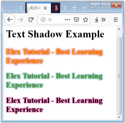
Example 3- Neon-Effect with Text Shadow
<!DOCTYPE html>
<html>
  <head>
	<style>
	  .shadow
	  {
	    text-shadow: 0 0 3px #FF0000, 0 0 6px #8B0000;
		color:orange;
	  }
	  .shadow1
	  {
		text-shadow:0 0 3px #008B8B, 0 0 5px #20B2AA;
		color: #6B8E23;
	  }
	  .shadow2
	  {
		text-shadow:0 0 3px #FF1493, 0 0 5px #FF69B4;
	  }
	</style>
  </head>

  <body>
	<h1>Text Shadow Example</h1>
	<h2 class="shadow">Elex Tutorial - Best Learning Experience</h2>
	<h2 class="shadow1">Elex Tutorial - Best Learning Experience</h2>
	<h2 class="shadow2">Elex Tutorial - Best Learning Experience</h2>
  </body>
</html>
The above code shows how can you apply the colors to your text and change the shadow-effect of the text.
 Posted in
  Tags:
Tags: 


