 April 27th, 2019
  Nilesh Chaurasia
 CSS Layout
CSS Layout is a technique which is used to create multiple columns based web page design. In this tutorial 2 columns & 3 columns, layout code examples are presented.
Normal Flow
Normal Flow means that how the browser will display the HTML Elements. If you use block level elements than it will display with the next line.
Example 1 – Normal Flow Of HTML Layout
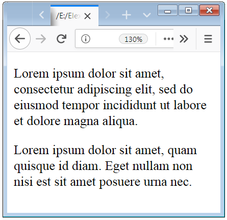
<!DOCTYPE html>
<html>
  <body>
	<div>
		<p>Lorem ipsum dolor sit amet, consectetur adipiscing elit, sed do eiusmod tempor incididunt ut labore et dolore magna aliqua.</p>
	</div>
	<div>
		<p>Lorem ipsum dolor sit amet, quam quisque id diam. Eget nullam non nisi est sit amet posuere urna nec.</p>
	</div>
  </body>
</html>
In the above code, we do not apply any of the CSS properties to the HTML Element. And below screenshot shows how it will be displayed with the normal flow.
Two Columns CSS Layout Example Code Designs
Here we creating a simple 2 columns layout designs by the use of some CSS Properties.
Example 2 – Two-Columns HTML Layout Design Technqe
<!DOCTYPE html>
<html>
  <head>
    <style>
      .container
        {

        }
      .left-sidebar
        {
          float:left;
          width:50%;
          height:220px;
          background-color:red;
        }
      .right-sidebar
        {
          float:right;
          width:50%;
          height:220px;
          background-color:blue;
        }
    </style>
  </head>

  <body>
    <div class="container">
        <div class="left-sidebar">
			<h3>Column I</h3>
			<p>Non arcu risus quis varius. Tempor commodo ullamcorper a lacus vestibulum sed arcu non odio. Ultricies leo integer malesuada nunc vel. Est ullamcorper eget nulla facilisi etiam dignissim.</p>
        </div>

        <div class="right-sidebar">
			<h3>Column II</h3>
			<p>Lorem ipsum dolor sit amet, consectetur adipiscing elit, sed do eiusmod tempor incididunt ut labore et dolore magna aliqua. Amet mattis vulputate enim nulla aliquet porttitor lacus luctus.</p>
        </div>
    </div>

  </body>
</html>
In the above code, we apply some CSS properties to the HTML Elements. And below screenshot shows how it will be displayed with the two-columns.

Three Columns CSS Layout Tutorial with code
Here we creating a simple three columns layout design by the use of some CSS Properties to enhance the look of the layout
Example 3 – Three-Columns HTML Layout with float property
<!DOCTYPE html>
<html>
  <head>
    <style>
      .container
        {

        }
      .left-sidebar
        {
          float:left;
          width:25%;
          background-color:yellow;
        }
      .left-sidebar-inner
        {
          background-color:white;
          height:180px;
          margin:10px;
        }
      .main
        {
          float:left;
          width:50%;
          background-color:orange;
        }
      .main-inner
        {
          background-color:white;
          height:180px;
          margin:10px;
        }
     .right-sidebar
        {
          float:right;
          width:25%;
          background-color:brown;
        }
     .right-sidebar-inner
        {
          background-color:white;
          height:180px;
          margin:10px;
        }
     .cleaner
        {
          clear:both;
        }
    </style>
  </head>

  <body>
    <div class="container">
        <div class="left-sidebar">
            <div class="left-sidebar-inner">
				<h3>Column I</h3>
                <p>Lorem ipsum in massa tempor nec feugiat. Elit duis tristique sollinibh.</p>
            </div>
        </div>

        <div class="main">
            <div class="main-inner">
				<h3>Column II</h3>
				<p> Quis blandit turpis cursus in hac habitasse. Tortor dignissim scelerisque convallis aenean et tortor at.</p>
            </div>
        </div>

        <div class="right-sidebar">
            <div class="right-sidebar-inner">
				<h3>Column III</h3>
				<p>Turpis massa tincidunt dui ut. Imperdiet proin fermentum leo vel orci.</p>
            </div>
        </div>

        <div class="cleaner">
        </div>
    </div>

  </body>
</html>
In the above code, we apply some CSS properties to the HTML Elements. And below screenshot shows how it will be displayed with the three-columns.

Two Columns Layout Design With Header Footer
Here we creating a simple two columns layout design with header and footer by the use of some CSS Properties.
Example 4 – Two-Columns Layout Design with header and footer area.
<!DOCTYPE html>
<html>
  <head>
    <style>
		.container
		{
		}
		.header
		{
			background-color:yellow;
			border: 1px solid yellow;
        }
		.header-inner
		{
			background-color:white;
			height:40px;
			margin:10px;
		}
		.left-sidebar
		{
			float:left;
			width:40%;
			height:150px;
			background-color:orange;
		}
		.left-sidebar-inner
		{
			background-color:white;
			height:130px;
			margin:10px;
		}
		.right-sidebar
		{
			float:right;
			width:60%;
			height:150px;
			background-color:green;
		}
		.right-sidebar-inner
		{
			background-color:white;
			height:130px;
			margin:10px;
		}
		.cleaner
		{
			clear:both;
		}
		.footer
		{
			height:60px;
			background-color:brown;
			padding:1px;
		}
		.footer-inner
		{
			background-color:white;
			height:40px;
			margin:9px;
		}
    </style>
  </head>

  <body>
    <div class="container">
		<div class="header">
			<div class="header-inner">
			</div>
		</div>

        <div class="left-sidebar">
            <div class="left-sidebar-inner">

            </div>
        </div>

        <div class="right-sidebar">
            <div class="right-sidebar-inner">

            </div>
        </div>

        <div class="cleaner">
        </div>

        <div class="footer">
            <div class="footer-inner">

            </div>
        </div>
    </div>

  </body>
</html>
In the above code, we apply some CSS properties to the HTML Elements. And below screenshot shows how it will be displayed with the two-columns, header and footer.

Caution:You also change the width of left-sidebar and right-sidebar as your web page layout requirement.
Three Columns Layout Design With Header Footer
Here we creating a simple three columns layout design with header and footer by the use of some CSS Properties.
Example 5 – Three-Columns Layout Design Example with header and footer area
<!DOCTYPE html>
<html>
  <head>
    <style>
		.container
		{
		}
		.header
		{
			background-color:brown;
			border: 1px solid brown;
        }
		.header-inner
		{
			background-color:white;
			height:40px;
			margin:10px;
		}
		.left-sidebar
		{
			float:left;
			width:20%;
			height:150px;
			background-color:orange;
		}
		.left-sidebar-inner
		{
			background-color:white;
			height:130px;
			margin:10px;
		}
		.main
		{
			float:left;
			width:60%;
			height:150px;
			background-color:blue;
		}
		.main-inner
		{
			background-color:white;
			height:130px;
			margin:10px;
		}
		.right-sidebar
		{
			float:right;
			width:20%;
			height:150px;
			background-color:green;
		}
		.right-sidebar-inner
		{
			background-color:white;
			height:130px;
			margin:10px;
		}
		.cleaner
		{
			clear:both;
		}
		.footer
		{
			height:60px;
			background-color:yellow;
			padding:1px;
		}
		.footer-inner
		{
			background-color:white;
			height:40px;
			margin:9px;
		}
    </style>
  </head>

  <body>
    <div class="container">
		<div class="header">
			<div class="header-inner">
			</div>
		</div>

        <div class="left-sidebar">
            <div class="left-sidebar-inner">

            </div>
        </div>

        <div class="main">
            <div class="main-inner">

            </div>
        </div>

        <div class="right-sidebar">
            <div class="right-sidebar-inner">

            </div>
        </div>

        <div class="cleaner">
        </div>

        <div class="footer">
            <div class="footer-inner">

            </div>
        </div>
    </div>

  </body>
</html>
In the above code, we apply some CSS properties to the HTML Elements. And below screenshot shows how it will be displayed with the three-columns, header and footer.

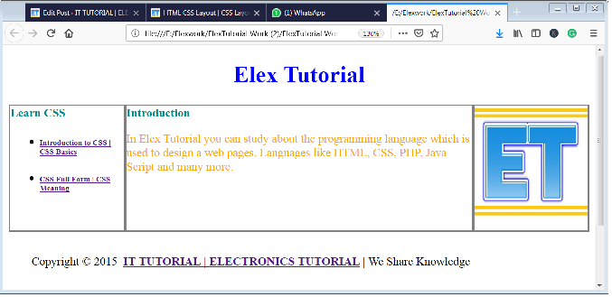
How Can You Actually Apply These Layout To Your Web Page?
Here we creating a simple layout design to design a web page.
Example 6 – Three-Columns Layout Design with Content in the columns
<!DOCTYPE html>
<html>
<head>
<style>
.container
{
}
.header
{
text-align: center;
color: blue;
}
.header-inner
{
background-color:white;
margin:10px;
}
.left-sidebar
{
float:left;
width:20%;
}
.left-sidebar-inner
{
background-color:white;
margin:5px;
}
.main
{
float:left;
width:60%;
}
.main-inner
{
background-color:white;
margin:10px;
}
.right-sidebar
{
float:right;
width:20%;
}
.right-sidebar-inner
{
background-color:white;
margin:10px;
}
.cleaner
{
clear:both;
}
.footer
{
padding:1px;
}
.footer-inner
{
background-color:white;
margin:9px;
}
</style>
</head>
<body>
<div class="container">
<div class="header">
<div class="header-inner">
<h1>Elex Tutorial</h1>
</div>
</div>
<div class="left-sidebar">
<div class="left-sidebar-inner">
<div>
<h4 style="color:darkcyan;">Learn CSS</h4>
<ul>
<li>
<h6><a href="https://elextutorial.com/learn-css/introduction-css-css-basics/">Introduction to CSS | CSS Basics</a></h6>
</li>
<li>
<h6><a href="https://elextutorial.com/learn-css/css-full-form-css-meaning/">CSS Full Form | CSS Meaning</a></h6>
</li>
</ul>
</div>
</div>
</div>
<div class="main">
<div class="main-inner">
<h4 style="color:darkcyan;">Introduction</h4>
<p style="color:orange;">In Elex Tutorial you can study about the programming language which is used to design a web pages. Languages like HTML, CSS, PHP, Java Script and many more.</p>
</div>
</div>
<div class="right-sidebar">
<div class="right-sidebar-inner">
<img src="logo.jpg" width="100%" style="border:1px solid blue;">
</div>
</div>
<div class="cleaner">
</div>
<div class="footer">
<div class="footer-inner">
<div>
Copyright © 2015 <a href="https://elextutorial.com"><strong>IT TUTORIAL | ELECTRONICS TUTORIAL</strong></a> | We Share Knowledge
</div>
</div>
</div>
</div>
</body>
</html>
In the above code, we apply some CSS properties to the HTML Elements. And below screenshot shows how it will be displayed the three-columns layout with content.
 Posted in
  Tags:
Tags: 


