 May 21st, 2020
  Prerana Kasar
 How to Install Bootstrap 4
Bootstrap 4 Grid system create the whole page through the series of 12 columns which are fully responsive. The width of one column is approx 8.33%.
Classes Of Grid System
The below lists are the classes of grid system.
- lg class is used for the large size screens(laptop, desktop) whose pixel is 1200px or greater.
- md class is used for the medium size screens(small lappies) whose pixel is between 992px-1200px.
- sm class is used for the small size screens (Tablets, phones) whose pixel is between 768px-990px.
- xs class is used for the extra small screens (small phones) whose pixel is less than 768px..
Bootstrap 4 Grid System Having Single Column
To create grid system the class col-sm/md/lg/xs is used with the number of column as you required. When we have to create the single coloum than aplly the class .col-md-12.
Example 1 – Bootstrap 4 Grid System Having a single Column .
<!DOCTYPE html>
<html>
<head>
    <title>Bootstrap Grid System</title>
    <!-- link the bootstrap online or through CDN -->
    <link rel="stylesheet" href="https://maxcdn.bootstrapcdn.com/bootstrap/4.5.0/css/bootstrap.min.css">
  	<script src="https://ajax.googleapis.com/ajax/libs/jquery/3.5.1/jquery.min.js"></script>
  	<script src="https://cdnjs.cloudflare.com/ajax/libs/popper.js/1.16.0/umd/popper.min.js"></script>
  	<script src="https://maxcdn.bootstrapcdn.com/bootstrap/4.5.0/js/bootstrap.min.js"></script>
   </head>
<body>
    <div class="container">
        <div class="row">
            <div class="col-md-12" style="background-color: lightgrey; text-align: justify;">
                <h2 align="center">Heading 1</h2>
                <p>Lorem ipsum dolor sit amet, consectetur adipisicing elit, sed do eiusmod, quis nostrud exercitation ullamco laboris nisi ut aliquip ex ea commodo, sunt in culpa qui officia deserunt mollit anim id est laborum.Tempor dunt ut labore et dolore magna aliqua. Ut enim ad minim veniam,
                quis nostrud exercitation ullamco piatur. Excepteur sint occaecat cupidatat non proident, sunt in culpa qui officia deserunt mollit anim id est laborum.</p>
            </div>
        </div>
    </div>
</body>
</html
On the above code the class .row applied inside the container to create the row. Than applied the size of the column with having css properties.
Here the column size is decalred by the class .col-md-12 to container tag for single column. Here 12 is used for single column because grid system have 12 columns.

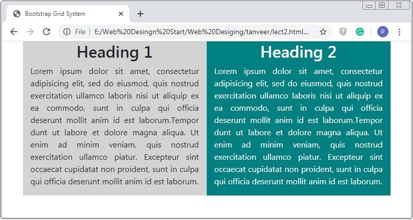
Bootstrap 4 Grid System Having 2 Equal Columns
To create the two equal columns of medium size apply the class .col-md-6.
Example 2 – Bootstrap 4 Grid System Having 2 Equal Columns
<!DOCTYPE html>
<html>
<head>
    <title>Bootstrap Grid System</title>
    <!-- link the bootstrap online or through CDN -->
    <link rel="stylesheet" href="https://maxcdn.bootstrapcdn.com/bootstrap/4.5.0/css/bootstrap.min.css">
  	<script src="https://ajax.googleapis.com/ajax/libs/jquery/3.5.1/jquery.min.js"></script>
  	<script src="https://cdnjs.cloudflare.com/ajax/libs/popper.js/1.16.0/umd/popper.min.js"></script>
  	<script src="https://maxcdn.bootstrapcdn.com/bootstrap/4.5.0/js/bootstrap.min.js"></script>
   </head>
<body>
    <div class="container">
        <div class="row">
            <div class="col-md-6" style="background-color: lightgrey; text-align: justify;">
                <h2 align="center">Heading 1</h2>
                <p>Lorem ipsum dolor sit amet, consectetur adipisicing elit, sed do eiusmod, quis nostrud exercitation ullamco laboris nisi ut aliquip ex ea commodo, sunt in culpa qui officia deserunt mollit anim id est laborum.Tempor dunt ut labore et dolore magna aliqua. Ut enim ad minim veniam, quis nostrud exercitation ullamco piatur. Excepteur sint occaecat cupidatat non proident, sunt in culpa qui officia deserunt mollit anim id est laborum.</p>
            </div>
             <div class="col-md-6" style="background-color: teal; color:white	; text-align: justify;">
                <h2 align="center">Heading 2</h2>
                <p>Lorem ipsum dolor sit amet, consectetur adipisicing elit, sed do eiusmod, quis nostrud exercitation ullamco laboris nisi ut aliquip ex ea commodo, sunt in culpa qui officia deserunt mollit anim id est laborum.Tempor dunt ut labore et dolore magna aliqua. Ut enim ad minim veniam, quis nostrud exercitation ullamco piatur. Excepteur sint occaecat cupidatat non proident, sunt in culpa qui officia deserunt mollit anim id est laborum.</p>
            </div>
        </div>
    </div>
</body>
</html>
On the above code the class .row applied inside the container to create the row. Than applied the size of the column with having css properties.
Here the column size is decalred by the class .col-md-6 to container tag for single column. Here 6 is used for single column because grid system have 12 columns. To create 2 columns than you have to apply 2 containers of 6-6 size.
Bootstrap 4 Grid System Having 2 Unequal Columns
To create the two unequal columns of medium size apply the class as you want the size of column but the sum of both sizes not greater than 12 or smaller.
Example 3 – Bootstrap 4 Grid System Having 2 Unequal Columns
<!DOCTYPE html>
<html>
<head>
    <title>Bootstrap Grid System</title>
    <!-- link the bootstrap online or through CDN -->
    <link rel="stylesheet" href="https://maxcdn.bootstrapcdn.com/bootstrap/4.5.0/css/bootstrap.min.css">
  	<script src="https://ajax.googleapis.com/ajax/libs/jquery/3.5.1/jquery.min.js"></script>
  	<script src="https://cdnjs.cloudflare.com/ajax/libs/popper.js/1.16.0/umd/popper.min.js"></script>
  	<script src="https://maxcdn.bootstrapcdn.com/bootstrap/4.5.0/js/bootstrap.min.js"></script>
   </head>
<body>
    <div class="container">
        <div class="row">
            <div class="col-md-7" style="background-color: lightgrey; text-align: justify;">
                <h2 align="center">Heading 1</h2>
                <p>Lorem ipsum dolor sit amet, consectetur adipisicing elit, sed do eiusmod, quis nostrud exercitation ullamco laboris nisi ut aliquip ex ea commodo, sunt in culpa qui officia deserunt mollit anim id est laborum.Tempor dunt ut labore et dolore magna aliqua. Ut enim ad minim veniam, quis nostrud exercitation ullamco piatur. Excepteur sint occaecat cupidatat non proident, sunt in culpa qui officia deserunt mollit anim id est laborum.</p>
            </div>
             <div class="col-md-5" style="background-color: teal; color:white	; text-align: justify;">
                <h2 align="center">Heading 2</h2>
                <p>Lorem ipsum dolor sit amet, consectetur adipisicing elit, sed do eiusmod, quis nostrud exercitation ullamco laboris nisi ut aliquip ex ea commodo, sunt in culpa qui officia deserunt mollit anim id est laborum. Tempor dunt ut labore et dolore magna aliqua. Ut enim ad minim veniam, quis nostrud exercitation ullamco piatur.</p>
            </div>
        </div>
    </div>
</body>
</html>
On the above code the class .row applied inside the container to create the row. Than applied the size of the column with having css properties.
Here the column size is decalred as col-md-5 and col-md-7 as the rquirement of the coloumns. The column size of class .col-md-7 is greater than the column of size class col-md-5.
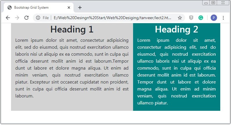
Caution: Similarly from the above example to create the columns of required size but you have to decalared class col-md for the rquired number of columns. And must have the total of size of columns is 12.
 Posted in
  Tags:
Tags: 


