 June 6th, 2020
  Prerana Kasar
 Bootstrap 4 Buttons
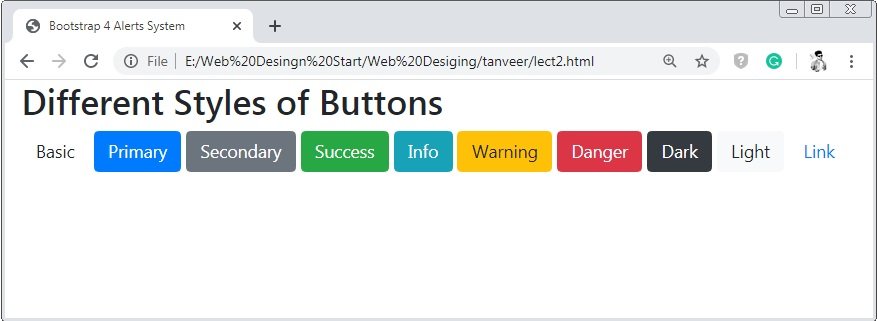
Bootstrap 4 provides classes to enhance the look and feel of the button. Bootstrap 4 provides several different classes to style the buttons. And these button classes have diffrent purpose.
Bootstrap 4 has class .brn to create button from different tags. The classes .btn-primary, btn-secondary, btn-success, btn-info, btn-warning, btn-danger, btn-dark, btn-light, btn-link
Example 1 – Bootstrap 4 Buttons Example
<!DOCTYPE html>
<html>
<head>
    <title>Bootstrap 4 Buttons System</title>
    <!-- link the bootstrap online or through CDN -->
    <link rel="stylesheet" href="https://maxcdn.bootstrapcdn.com/bootstrap/4.5.0/css/bootstrap.min.css">
 	<script src="https://ajax.googleapis.com/ajax/libs/jquery/3.5.1/jquery.min.js"></script>
  	<script src="https://cdnjs.cloudflare.com/ajax/libs/popper.js/1.16.0/umd/popper.min.js"></script>
  	<script src="https://maxcdn.bootstrapcdn.com/bootstrap/4.5.0/js/bootstrap.min.js"></script>
</head>
<body>
    <div class="container-fluid">
       	<h2>Different Styles of Buttons</h2>
        <button type="button" class="btn">Basic</button>
        <button type="button" class="btn btn-primary">Primary</button>
        <button type="button" class="btn btn-secondary">Secondary</button>
        <button type="button" class="btn btn-success">Success</button>
        <button type="button" class="btn btn-info">Info</button>
        <button type="button" class="btn btn-warning">Warning</button>
        <button type="button" class="btn btn-danger">Danger</button>
        <button type="button" class="btn btn-dark">Dark</button>
        <button type="button" class="btn btn-light">Light</button>
        <button type="button" class="btn btn-link">Link</button>
    </div>
</body>
</html>
On the above code, we use a button tag to create the button. And the class .btn are applied to this button tag to create the buttons and the different buttons classes are used to enhance the look and feel of the button.
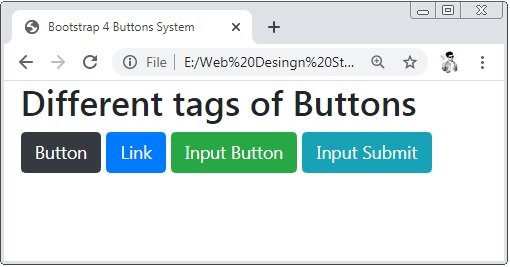
Bootstrap 4 Buttons with Different Tags
Bootstrap 4 have diffrent tags to create buttons. The tags are <a>, <buttons> and <inputs>
Example 2 – Bootstrap 4 Buttons with Different Tags Example
<!DOCTYPE html>
<html>
<head>
    <title>Bootstrap 4 Buttons System</title>
    <!-- link the bootstrap online or through CDN -->
    <link rel="stylesheet" href="https://maxcdn.bootstrapcdn.com/bootstrap/4.5.0/css/bootstrap.min.css">
 	<script src="https://ajax.googleapis.com/ajax/libs/jquery/3.5.1/jquery.min.js"></script>
  	<script src="https://cdnjs.cloudflare.com/ajax/libs/popper.js/1.16.0/umd/popper.min.js"></script>
  	<script src="https://maxcdn.bootstrapcdn.com/bootstrap/4.5.0/js/bootstrap.min.js"></script>
</head>
<body>
    <div class="container">
       	<h2>Different tags of Buttons</h2>
        <button type="button" class="btn btn-dark">Button</button>
        <a href="#" class="btn btn-primary" role="button">Link</a>
        <input type="button" class="btn btn-success" value="Input Button">
        <input type="submit" class="btn btn-info" value="Input Submit">
    </div>
</body>
</html>
On the above code, we use different tags to create the buttons.
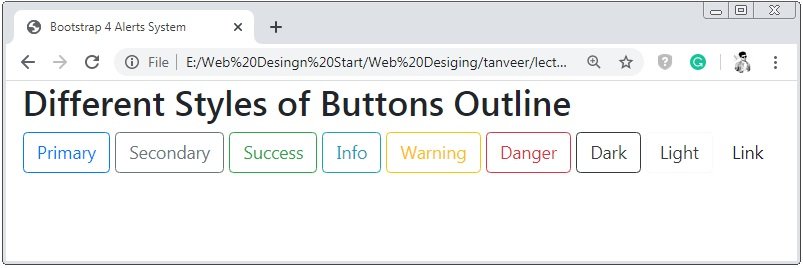
Bootstrap 4 Buttons Outline
Bootstrap 4 provides the btn-outline class to create the bordered button. But you have to apply this class with the different styled button classes like primary, success dark and so on.
Example 3 – Bootstrap 4 Buttons Outline Example
<!DOCTYPE html>
<html>
<head>
    <title>Bootstrap 4 Alerts System</title>
    <!-- link the bootstrap online or through CDN -->
    <link rel="stylesheet" href="https://maxcdn.bootstrapcdn.com/bootstrap/4.5.0/css/bootstrap.min.css">
 	<script src="https://ajax.googleapis.com/ajax/libs/jquery/3.5.1/jquery.min.js"></script>
  	<script src="https://cdnjs.cloudflare.com/ajax/libs/popper.js/1.16.0/umd/popper.min.js"></script>
  	<script src="https://maxcdn.bootstrapcdn.com/bootstrap/4.5.0/js/bootstrap.min.js"></script>
</head>
<body>
    <div class="container-fluid">
       	<h2>Different Styles of Buttons Outline</h2>
        <button type="button" class="btn btn-outline-primary">Primary</button>
        <button type="button" class="btn btn-outline-secondary">Secondary</button>
        <button type="button" class="btn btn-outline-success">Success</button>
        <button type="button" class="btn btn-outline-info">Info</button>
        <button type="button" class="btn btn-outline-warning">Warning</button>
        <button type="button" class="btn btn-outline-danger">Danger</button>
        <button type="button" class="btn btn-outline-dark">Dark</button>
        <button type="button" class="btn btn-outline-light text-dark">Light</button>
        <button type="button" class="btn btn-outline-link">Link</button>
    </div>
</body>
</html>
On the above code, we apply the class btn and btn-outline to create bordered button. Read the above code carefully to know how the btn-outline works.
Bootstrap 4 Button Sizes
Bootstrap 4 provides classes to set the size of the buttons. Bootstrap 4 have three sizes of buttons. The sizes are large, medium and small.
Example 4 – Bootstrap 4 Button Sizes Example
<!DOCTYPE html>
<html>
<head>
    <title>Bootstrap 4 Alerts System</title>
    <!-- link the bootstrap online or through CDN -->
    <link rel="stylesheet" href="https://maxcdn.bootstrapcdn.com/bootstrap/4.5.0/css/bootstrap.min.css">
 	<script src="https://ajax.googleapis.com/ajax/libs/jquery/3.5.1/jquery.min.js"></script>
  	<script src="https://cdnjs.cloudflare.com/ajax/libs/popper.js/1.16.0/umd/popper.min.js"></script>
  	<script src="https://maxcdn.bootstrapcdn.com/bootstrap/4.5.0/js/bootstrap.min.js"></script>
</head>
<body>
    <div class="container-fluid">
       	<h2>Different Sizes of Buttons</h2>
        <button type="button" class="btn btn-lg btn-primary">Large</button>
        <button type="button" class="btn btn-secondary">Medium</button>
        <button type="button" class="btn btn-sm btn-success">Small</button>
    </div>
</body>
</html>
On the above code, we apply the class btn-lg and btn-sm are applied to the button to create the large and small size of the button. And the default size of the button is medium size.

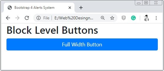
Bootstrap 4 Block Level Buttons
Bootstrap 4 provides class .btn-block to create the full-width button of the parent element.
Example 5 – Bootstrap 4 Block Level Buttons Example
<!DOCTYPE html>
<html>
<head>
    <title>Bootstrap 4 Alerts System</title>
    <!-- link the bootstrap online or through CDN -->
    <link rel="stylesheet" href="https://maxcdn.bootstrapcdn.com/bootstrap/4.5.0/css/bootstrap.min.css">
 	<script src="https://ajax.googleapis.com/ajax/libs/jquery/3.5.1/jquery.min.js"></script>
  	<script src="https://cdnjs.cloudflare.com/ajax/libs/popper.js/1.16.0/umd/popper.min.js"></script>
  	<script src="https://maxcdn.bootstrapcdn.com/bootstrap/4.5.0/js/bootstrap.min.js"></script>
</head>
<body>
    <div class="container-fluid">
       	<h2>Block Level Buttons</h2>
        <button type="button" class="btn btn-block btn-primary">Full Width Button</button>
    </div>
</body>
</html>
On the above code, we apply the class btn-block to the button tag to create the full-width button.
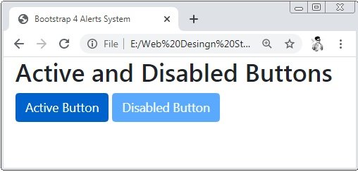
Bootstrap 4 Active/Disabled Buttons
Bootstrap 4 provides class .active and attribute disabled to create clickable and non-clickable state buttons.
Example 6 – Bootstrap 4 Active Or Disabled Buttons Example
<!DOCTYPE html>
<html>
<head>
    <title>Bootstrap 4 Alerts System</title>
    <!-- link the bootstrap online or through CDN -->
    <link rel="stylesheet" href="https://maxcdn.bootstrapcdn.com/bootstrap/4.5.0/css/bootstrap.min.css">
 	<script src="https://ajax.googleapis.com/ajax/libs/jquery/3.5.1/jquery.min.js"></script>
  	<script src="https://cdnjs.cloudflare.com/ajax/libs/popper.js/1.16.0/umd/popper.min.js"></script>
  	<script src="https://maxcdn.bootstrapcdn.com/bootstrap/4.5.0/js/bootstrap.min.js"></script>
</head>
<body>
    <div class="container-fluid">
       	<h2>Active and Disabled Buttons</h2>
        <button type="button" class="btn btn-primary active">Active Button</button>
        <button type="button" class="btn btn-primary" disabled>Disabled Button</button>
    </div>
</body>
</html>
On the above code, we apply the class active and attribute disabled to the button tag. Here the button the active button is clickable but when you put the cursor on the disabled button it has seen a arrow.
Bootstrap 4 Spinner Buttons
Bootstrap 4 provides class spinner-bordered to create the spinner in the buttons.
Example 7 – Bootstrap 4 Spinner Buttons Example
<!DOCTYPE html>
<html>
<head>
    <title>Bootstrap 4 Alerts System</title>
    <!-- link the bootstrap online or through CDN -->
    <link rel="stylesheet" href="https://maxcdn.bootstrapcdn.com/bootstrap/4.5.0/css/bootstrap.min.css">
 	<script src="https://ajax.googleapis.com/ajax/libs/jquery/3.5.1/jquery.min.js"></script>
  	<script src="https://cdnjs.cloudflare.com/ajax/libs/popper.js/1.16.0/umd/popper.min.js"></script>
  	<script src="https://maxcdn.bootstrapcdn.com/bootstrap/4.5.0/js/bootstrap.min.js"></script>
</head>
<body>
    <div class="container-fluid">
       	<h2>Spinner Buttons</h2>
        <button type="button" class="btn btn-primary">
        	<span class="spinner-border spinner-border-sm"></span>
        </button>
        <button type="button" class="btn btn-primary">
        	<span class="spinner-border spinner-border-sm"></span>
        	Loading...
        </button>
        <button type="button" class="btn btn-primary">
        	<span class="spinner-grow spinner-grow-sm"></span>
        	Loading...
        </button>
    </div>
</body>
</html>
On the above code, we apply the class spinner-bordered and spinner-bordered-sm to the span tag to create the spinner. And this span tag is wrapped by the button tag to create the spinner buttons.

 Posted in
  Tags:
Tags: 


