 June 6th, 2020
  Prerana Kasar
 Bootstrap 4 Alerts
Bootstrap 4 provides alter classes to create predefined alert box messages. These alert classes are work with contextual classes. Without these contextual classes, only .alert class will not work.
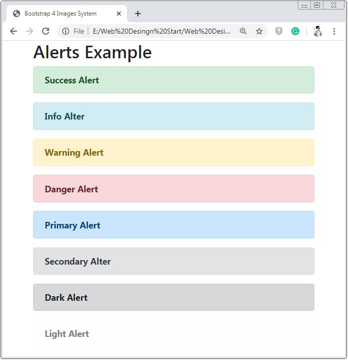
These Contextual classes indicated different-different actions and alerts.
- alert-success : Indicates positive and successful action.
- alert-info : Indicates informative actions.
- alert-warning : Indicates warning and need to actions.
- alert-danger : Indicates dangerous actions.
- alert-primary : Indicates an important actions.
- alert-secondary : Indicates less important actions.
- alert-dark : Not indicates any actions but create dark-grey color alert box.
- alert-light : Not indicates any actions but create light-grey color alert box.
Example 1 – Bootstrap 4 Alerts Example
<!DOCTYPE html>
<html>
<head>
    <title>Bootstrap 4 Alerts System</title>
    <!-- link the bootstrap online or through CDN -->
    <link rel="stylesheet" href="https://maxcdn.bootstrapcdn.com/bootstrap/4.5.0/css/bootstrap.min.css">
 	<script src="https://ajax.googleapis.com/ajax/libs/jquery/3.5.1/jquery.min.js"></script>
  	<script src="https://cdnjs.cloudflare.com/ajax/libs/popper.js/1.16.0/umd/popper.min.js"></script>
  	<script src="https://maxcdn.bootstrapcdn.com/bootstrap/4.5.0/js/bootstrap.min.js"></script>
</head>
<body>
    <div class="container">
       	<h2>Alerts Example</h2>
        <div class="alert alert-success">
            <b>Success Alert</b>
        </div>
        <div class="alert alert-info">
            <b>Info Alter</b>
        </div>
        <div class="alert alert-warning">
            <b>Warning Alert</b>
        </div>
        <div class="alert alert-danger">
            <b>Danger Alert</b>
        </div>
        <div class="alert alert-primary">
            <b>Primary Alert</b>
        </div>
        <div class="alert alert-secondary">
            <b>Secondary Alter</b>
        </div>
        <div class="alert alert-dark">
            <b>Dark Alert</b>
        </div>
        <div class="alert alert-light">
            <b>Light Alert</b>
        </div>
    </div>
</body>
</html>
On the above code, we use .alert class with contextual classes. Through these contextual classes, alert boxes have different color and different look & feel.
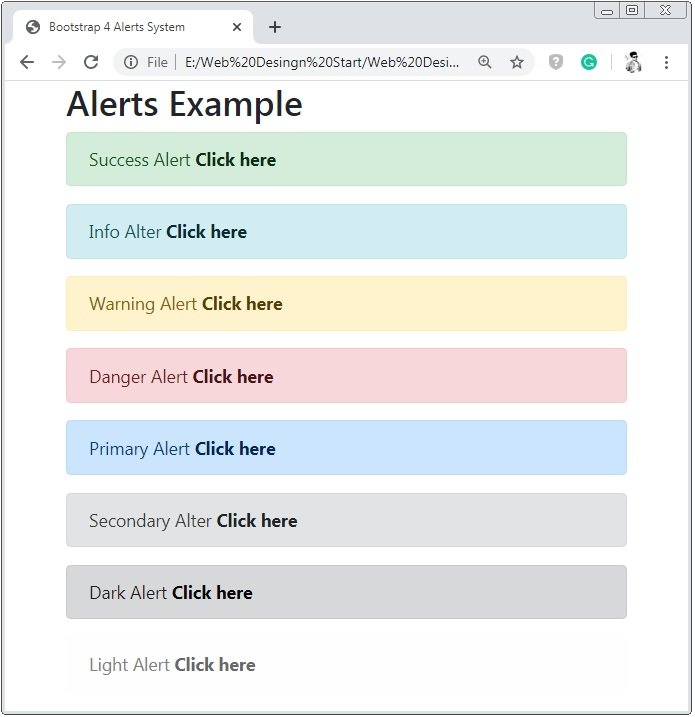
Bootstrap 4 Alert Links
Bootstrap 4 provides a class .alert-link to create alert links.
Example 2 – Bootstrap 4 Alert Links Example
<!DOCTYPE html>
<html>
<head>
    <title>Bootstrap 4 Alerts System</title>
    <!-- link the bootstrap online or through CDN -->
    <link rel="stylesheet" href="https://maxcdn.bootstrapcdn.com/bootstrap/4.5.0/css/bootstrap.min.css">
 	<script src="https://ajax.googleapis.com/ajax/libs/jquery/3.5.1/jquery.min.js"></script>
  	<script src="https://cdnjs.cloudflare.com/ajax/libs/popper.js/1.16.0/umd/popper.min.js"></script>
  	<script src="https://maxcdn.bootstrapcdn.com/bootstrap/4.5.0/js/bootstrap.min.js"></script>
</head>
<body>
    <div class="container">
       	<h2>Alerts Example</h2>
        <div class="alert alert-success">
            Success Alert <a href="#" class="alert-link">Click here</a>
        </div>
        <div class="alert alert-info">
            Info Alter <a href="#" class="alert-link">Click here</a>
        </div>
        <div class="alert alert-warning">
            Warning Alert <a href="#" class="alert-link">Click here</a>
        </div>
        <div class="alert alert-danger">
            Danger Alert <a href="#" class="alert-link">Click here</a>
        </div>
        <div class="alert alert-primary">
            Primary Alert <a href="#" class="alert-link">Click here</a>
        </div>
        <div class="alert alert-secondary">
            Secondary Alter <a href="#" class="alert-link">Click here</a>
        </div>
        <div class="alert alert-dark">
            Dark Alert <a href="#" class="alert-link">Click here</a>
        </div>
        <div class="alert alert-light">
            Light Alert <a href="#" class="alert-link">Click here</a>
        </div>
    </div>
</body>
</html>
On the above code, we use .alert with contextual classes to the container tag. And class .alert-link is applied to the link tag to create alert link.
Bootstrap 4 Closing Alerts
Bootstrap 4 provides class .close and alert-dismissible to create a closable alter links or box.
Example 3 – Bootstrap 4 Closing Alerts Example
<!DOCTYPE html>
<html>
<head>
<title>Bootstrap 4 Alerts System</title>
<!-- link the bootstrap online or through CDN -->
<link rel="stylesheet" href="https://maxcdn.bootstrapcdn.com/bootstrap/4.5.0/css/bootstrap.min.css">
<script src="https://ajax.googleapis.com/ajax/libs/jquery/3.5.1/jquery.min.js"></script>
<script src="https://cdnjs.cloudflare.com/ajax/libs/popper.js/1.16.0/umd/popper.min.js"></script>
<script src="https://maxcdn.bootstrapcdn.com/bootstrap/4.5.0/js/bootstrap.min.js"></script>
</head>
<body>
<div class="container">
<h2>Closing Alerts Example</h2>
<div class="alert alert-success alert-dismissible">
<a href="#" class="close" data-dismiss="alert" aria-lable="close">×</a>
<b>Success Alert Closing Link</b>
</div>
<div class="alert alert-info alert-dismissible">
<a href="#" class="close" data-dismiss="alert" aria-lable="close">×</a>
<b>Info Alert Closing Link</b>
</div>
</div>
</body>
</html>
On the above code, we use .alert-dismissible to the alert container and apply class .close to the button tag and also apply an attribute data-dismiss=” alert”.
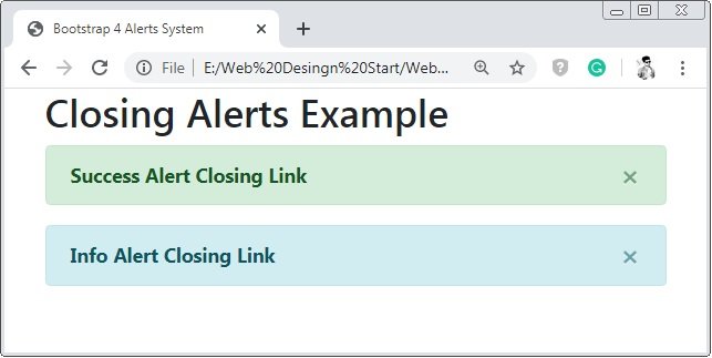
Caution: Here “×” is used to create the cross or closing icon.
Bootstrap 4 Animated Alerts
When we close the alert by clicking on the cross icon the alert box close directly and it seen very bad.
To improve this effect bootstrap provide class .fade and class.show to make this effect attractive by fading at the closing time.
Example 4 – Bootstrap 4 Animated Alerts Example
<!DOCTYPE html>
<html>
<head>
<title>Bootstrap 4 Alerts System</title>
<!-- link the bootstrap online or through CDN -->
<link rel="stylesheet" href="https://maxcdn.bootstrapcdn.com/bootstrap/4.5.0/css/bootstrap.min.css">
<script src="https://ajax.googleapis.com/ajax/libs/jquery/3.5.1/jquery.min.js"></script>
<script src="https://cdnjs.cloudflare.com/ajax/libs/popper.js/1.16.0/umd/popper.min.js"></script>
<script src="https://maxcdn.bootstrapcdn.com/bootstrap/4.5.0/js/bootstrap.min.js"></script>
</head>
<body>
<div class="container">
<h2>Animated Alerts xample</h2>
<div class="alert alert-success alert-dismissible fade show">
<button type="button" class="close" data-dismiss="alert">×</button>
<b>Success Alert Closing Alert</b>
</div>
</div>
</body>
</html>
On the above code, we use apply class .fade and .show to the alert container to add the fading effect to the alert box.
 Posted in
  Tags:
Tags: 


