 November 10th, 2019
  Prerana Kasar
 Bootstrap Grid System
Bootstrap grid system creates the whole page through the series of 12 columns. And the grids are fully responsive. If you want more block you can group the column as per the requirement.
In other word bootstrap grid system apply the series of the flex container linearly. Maximum you can use 12 columns. One columns have approx 8.33% of width.
Classes Of Grid System
The below lists are the class of grid system.
- lg class is used for the large size screens(laptop, desktop) whose pixel is 1200px or greater.
- md class is used for the medium size screens(small lappies) whose pixel is between 992px-1200px
- sm class is used for the small size screens (Tablets, phones) whose pixel is between 768px-990px
- xs class is used for the extra small screens (small phones) whose pixel is less than 768px.
Syntax – Bootstrap Grid System
<body>
	<div class="row">
		<div class="col-grid_class-column_">

		</div>
		<div class="col-grid_class-column_">

		</div>
		<div class="col-grid_class-column_">

		</div>
	</div>
</body>
Example: 1 – Bootstrap Grid System Having a single Column
<!DOCTYPE html>
<html>
<head>
    <title>Bootstrap Grid System</title>
    <!-- link the bootstrap online or through CDN -->
    <link rel="stylesheet" href="https://maxcdn.bootstrapcdn.com/bootstrap/3.3.7/css/bootstrap.min.css" integrity="sha384-BVYiiSIFeK1dGmJRAkycuHAHRg32OmUcww7on3RYdg4Va+PmSTsz/K68vbdEjh4u" crossorigin="anonymous">
   </head>
<body>
	<div class="container">
    	<div class="row">
        	<div class="col-md-12" style="background-color: lightgreen; text-align: justify;">
        		<h2 align="center">Heading 1</h2>
            	<p>Lorem ipsum dolor sit amet, consectetur adipisicing elit, sed do eiusmod, quis nostrud exercitation ullamco laboris nisi ut aliquip ex ea commodo, sunt in culpa qui officia deserunt mollit anim id est laborum.Tempor dunt ut labore et dolore magna aliqua. Ut enim ad minim veniam,
            	quis nostrud exercitation ullamco piatur. Excepteur sint occaecat cupidatat non proident, sunt in culpa qui officia deserunt mollit anim id est laborum.</p>
        	</div>
        </div>
    </div>
</body>
</html>
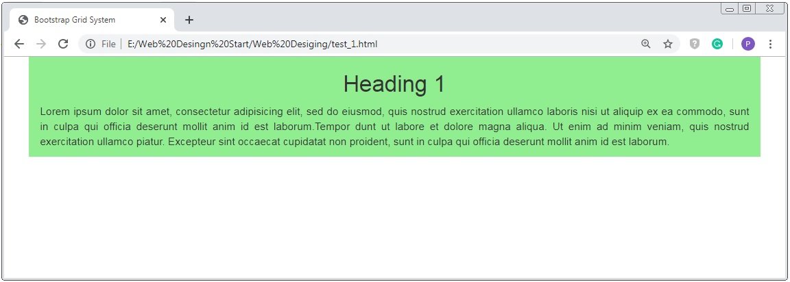
On the above coding here we use the a column of medium size. And below image shows that how a column will be generated.
Here first we create a row through <div class=”row”> inside the container <div class=”container”> than apply the column size through <div class=”col-md-12″> and also apply some inline css. Now define the content inside this <div> and than use this <div> tag for single time for one column.
Here we use <div class=”col-md-12″> because grid system have 12 columns. If you want single column than you have to use full column size 12.
Bootstrap Grid System Example of 2 Equal Columns
Example: 2 – Bootstrap Grid System Have 2 equal Columns
<!DOCTYPE html>
<html>`
<head>
    <title>Bootstrap Grid System</title>
    <!-- link the bootstrap online or through CDN -->
    <link rel="stylesheet" href="https://maxcdn.bootstrapcdn.com/bootstrap/3.3.7/css/bootstrap.min.css" integrity="sha384-BVYiiSIFeK1dGmJRAkycuHAHRg32OmUcww7on3RYdg4Va+PmSTsz/K68vbdEjh4u" crossorigin="anonymous">
   </head>
<body>
	<div class="container">
    	<div class="row">
        	<div class="col-md-6" style="background-color: lightgreen;">
        		<h2 align="center">Heading 1</h2>
            	<p>Lorem ipsum dolor sit amet, consectetur adipisicing elit, sed do eiusmod, quis nostrud exercitation ullamco laboris nisi ut aliquip ex ea commodo, sunt in culpa qui officia deserunt mollit anim id est laborum.Tempor dunt ut labore et dolore magna aliqua. Ut enim ad minim veniam,
            	quis nostrud exercitation ullamco piatur. Excepteur sint occaecat cupidatat non proident, sunt in culpa qui officia deserun[t mollit anim id est laborum.</p>
        	</div>
        	<div class="col-md-6" style="background-color: lightpink;">
        		<h2 align="center">Heading 2</h2>
            	<p>Lorem ipsum dolor sit amet, consectetur adipisicing elit, sed do eiusmod, quis nostrud exercitation ullamco laboris nisi ut aliquip ex ea commodo, sunt in culpa qui officia deserunt mollit anim id est laborum. Tempor dunt ut labore et dolore magna aliqua. Ut enim ad minim veniam,
            	quis nostrud exercitation ullamco piatur. Excepteur sint occaecat cupidatat non proident, sunt in culpa qui officia deserun[t mollit anim id est laborum.</p>
        	</div>
    	</div>
    </div>
</body>
</html>
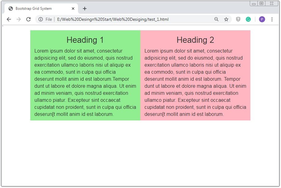
On the above coding here we use the 2 equal columns of medium size.
Here first we create a row through <div class=”row”> inside the container <div class=”container”> than apply the columns size through <div class=”col-md-6″> and also apply some inline css. Now define the content inside this <div> and than use this <div> tag for 2 time for 2 columns.
Here we use <div class=”col-md-6″> because grid system have 12 columns if you want 2 equal column than you have to divide “12” into 2 equal parts i.e. “6”. Thats why we use <div class=”col-md-6″>
Bootstrap Grid System Example of 2 Unequal Columns
Example: 3 – Bootstrap Grid System Have 2 Unequal Columns
<!DOCTYPE html>
<html>`
<head>
    <title>Bootstrap Grid System</title>
    <!-- link the bootstrap online or through CDN -->
    <link rel="stylesheet" href="https://maxcdn.bootstrapcdn.com/bootstrap/3.3.7/css/bootstrap.min.css" integrity="sha384-BVYiiSIFeK1dGmJRAkycuHAHRg32OmUcww7on3RYdg4Va+PmSTsz/K68vbdEjh4u" crossorigin="anonymous">
   </head>
<body>
	<div class="container">
    	<div class="row">
        	<div class="col-md-4" style="background-color: lightgreen;">
        		<h2 align="center">Heading 1</h2>
            	<p>Lorem ipsum dolor sit amet, consectetur adipisicing elit, sed do eiusmod, quis nostrud exercitation ullamco laboris nisi ut aliquip ex ea commodo, sunt in culpa qui officia deserunt mollit anim id est laborum.</p>
        	</div>
        	<div class="col-md-8" style="background-color: lightblue;">
        		<h2 align="center">Heading 3</h2>
            	<p>Lorem ipsum dolor sit amet, consectetur adipisicing elit, sed do eiusmod, quis nostrud exercitation ullamco laboris nisi ut aliquip ex ea commodo, sunt in culpa qui officia deserunt mollit anim id est laborum. Tempor dunt ut labore et dolore magna aliqua. Ut enim ad minim veniam,
            	quis nostrud exercitation ullamco piatur. Excepteur sint occaecat cupidatat non proident, sunt in culpa qui officia deserun[t mollit anim id est laborum. Sunt in culpa qui officia deserun[t mollit anim id est laborum</p>
        	</div>
    	</div>
    </div>
</body>
</html>
On the above coding here we use the 2 unequal columns of medium size. And below image shows that how the columns will be generated.
Here first we create a row through <div class=”row”> inside the container <div class=”container”> than apply the columns size through <div class=”col-md-4″> and <div class=”col-md-8″>and also apply some inline css. Now define the content inside this <div> and than use this <div> tag for 2 time for 2 columns.
Here we use <div class=”col-md-4″> because first part is smaller than the another part. So here we use the small column size “4” than the another through <div class=”col-md-4″> and another column size is of “8” through <div class=”col-md-8″>

Note: The partition size of the required column is depend on required columns. But the sum of the all size of column is equal to “12” not more.
Bootstrap Grid System Example of 3 Equal Columns
Example: 4 – Bootstrap Grid System Have 3 Equal Columns
<!DOCTYPE html>
<html>
<head>
    <title>Bootstrap Grid System</title>
    <!-- link the bootstrap online or through CDN -->
    <link rel="stylesheet" href="https://maxcdn.bootstrapcdn.com/bootstrap/3.3.7/css/bootstrap.min.css" integrity="sha384-BVYiiSIFeK1dGmJRAkycuHAHRg32OmUcww7on3RYdg4Va+PmSTsz/K68vbdEjh4u" crossorigin="anonymous">
   </head>
<body>
    <div class="container">
        <div class="row">
            <div class="col-md-4" style="background-color: lightgreen;">
                <h2 align="center">Heading 1</h2>
                <p>Lorem ipsum dolor sit amet, consectetur adipisicing elit, sed do eiusmod, quis nostrud exercitation ullamco laboris nisi ut aliquip ex ea commodo, sunt in culpa qui officia deserunt mollit anim id est laborum.</p>
            </div>
            <div class="col-md-4" style="background-color: lightblue;">
                <h2 align="center">Heading 2</h2>
                <p>Lorem ipsum dolor sit amet, consectetur adipisicing elit, sed do eiusmod, quis nostrud exercitation ullamco laboris nisi ut aliquip ex ea commodo, sunt in culpa qui officia deserunt mollit anim id est laborum.</p>
            </div>
            <div class="col-md-4" style="background-color: lightpink;">
                <h2 align="center">Heading 3</h2>
                <p>Lorem ipsum dolor sit amet, consectetur adipisicing elit, sed do eiusmod, quis nostrud exercitation ullamco laboris nisi ut aliquip ex ea commodo, sunt in culpa qui officia deserunt mollit anim id est laborum.</p>
            </div>
        </div>
    </div>
</body>
</html>
On the above coding here we use the 3 equal columns of medium size.
Here we use <div class=”col-md-4″> because here we want 3 equal size part of 12 columns so we used <div class=”col-md-4″> for all three parts.
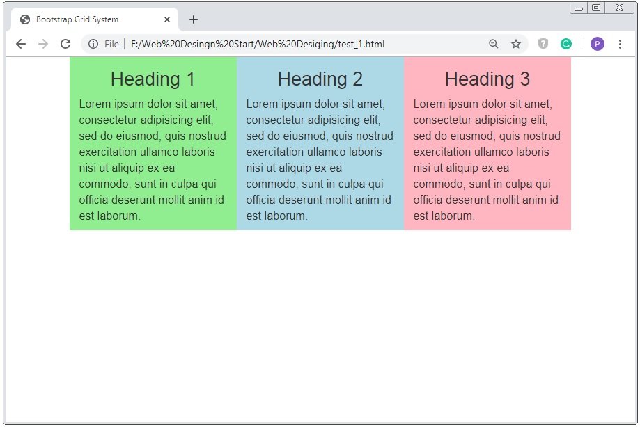
Caution: <div class=”col-md-4″> here 4 is the partition of the 12 columns suppose that if you want 4 equal columns than you have to use the <div class=”col-md-3″>
 Posted in
  Tags:
Tags: 


Have you ever considered about including a little bit more than just your articles? I mean, what you say is important and all. But just imagine if you added some great images or video clips to give your posts more, “pop”! Your content is excellent but with pics and video clips, this website could certainly be one of the best in its field. Superb blog!